This blog explains how to customize D3 charts I.e. adding target lines other than axis lines and change background color of particular region.
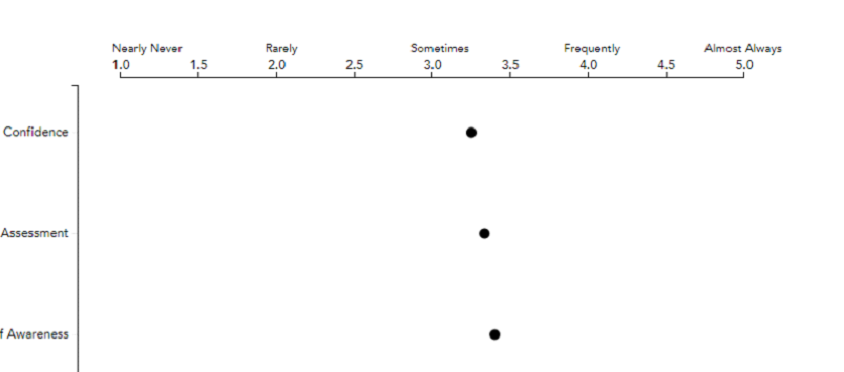
Consider the below chart which plots dots based on the data related to ‘Confidence’,’Assessment’ and ‘Awareness’

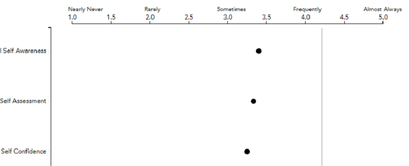
Add Target lines
If we want to add target lines on Y axis at particular places, add below code:
svg.append("g")
.attr("class", "y axis")
.append("line")
.attr("x1", 310)
.attr("x2", 310)
.attr("y2", 300)
.style("stroke", "#aaa");
This adds lines at 514 position on X axis of length 300 with ‘#000’ colour.
X and Y coordinates are calculated based on the scale used.The scale used here is 50.
The output would be as shown:

Add Background colour
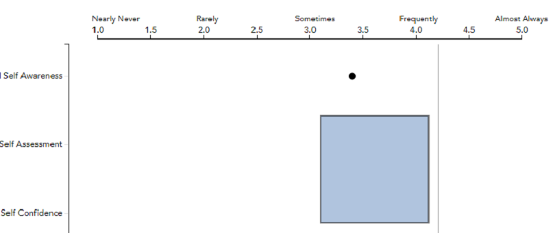
If we want to change background colour for some part of region, add below code:
svg.append("rect")
.attr("x", 350)
.attr("y", 100)
.attr("width", 150)
.attr("height", 150)
.attr("fill", "#dfe4db");
This adds colour ‘#dfe4db’ at particular coordinates mentioned with height and width provided.
The output would be as shown:

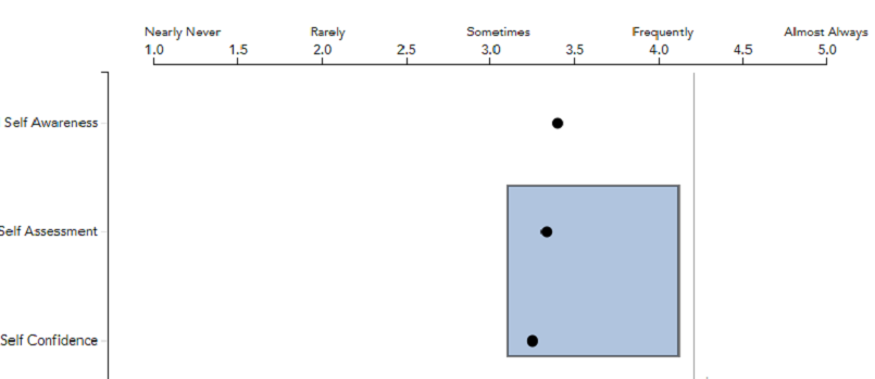
But, here we have a problem that the dotted lines are invisible. To get rid of this issue, the above piece of code must be added immediate after declaring xaxis and yaxis and before plotting the dotted lines.
After changing the position of the code, the output is as shown:

Thank You
Mounika Pulimamidi
