In this article you will learn how to transform adhoc charts into other charts using scripts. Open or create a chart report using Adhoc. Also, with your data you can create your own customize report using Helical Insight. For your understanding, we have used a bar chart.
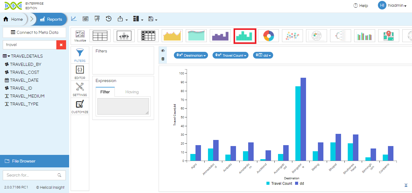
Default View of a Generated Chart

Here, we have requested for Bar chart so it is visible. Similarly, you can request for other charts as well such as Line Chart, Area Chart, Spline Chart, Area Spline Chart, and so on. Also, you can see the selected chart type as highlighted in the above image will remain same after transformation. To transform you will require a Javascript Code.
Now, to transform one of the Bar to other chart say Line Chart.
Javascript Code:
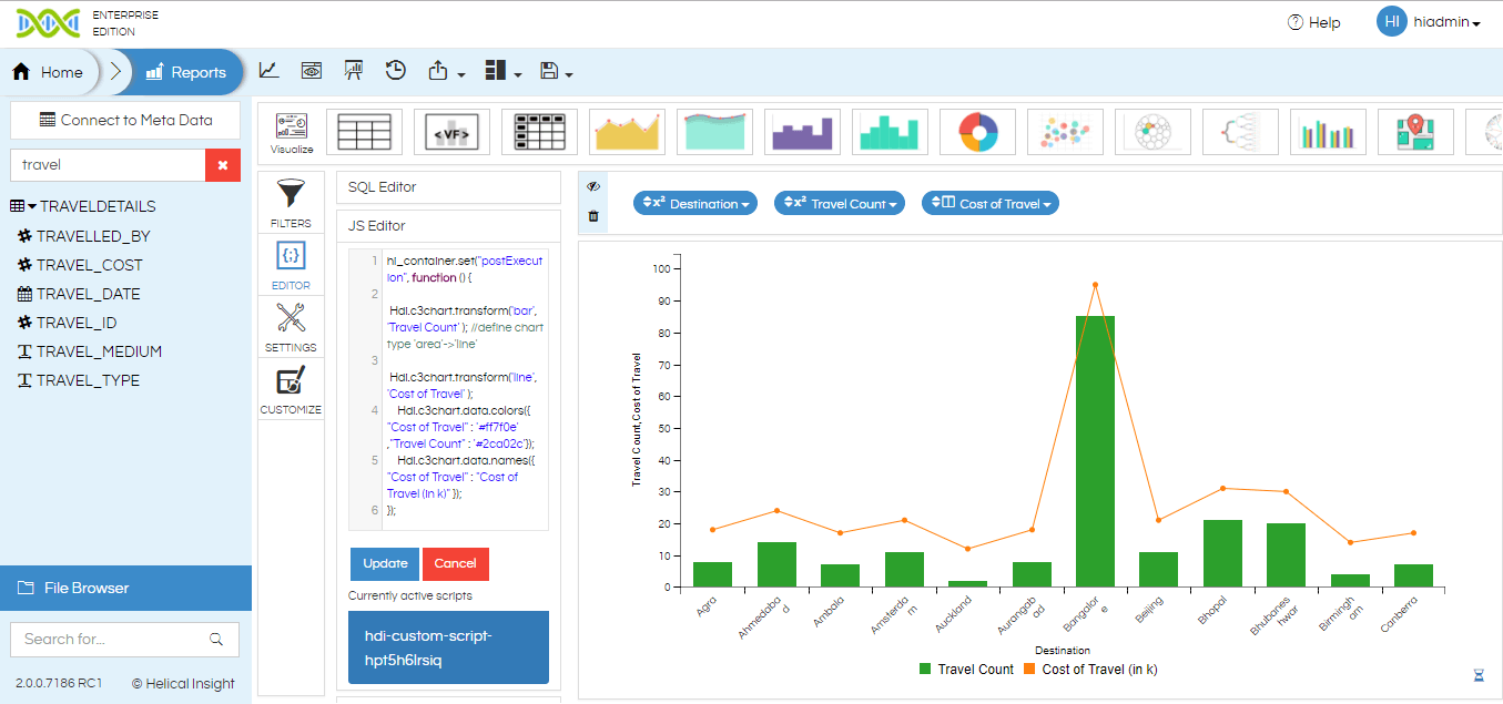
hi_container.set("postExecution", function () { Hdi.c3chart.transform('bar', 'Travel Count' );//define chart type 'area'->'line'Hdi.c3chart.transform('line', 'Cost of Travel' ); Hdi.c3chart.data.colors({ "Cost of Travel" : '#ff7f0e' ,"Travel Count" : '#2ca02c'}); Hdi.c3chart.data.names({ "Cost of Travel" : "Cost of Travel (in k)" }); });
Output

Javascript Code:
hi_container.set("postExecution", function () {
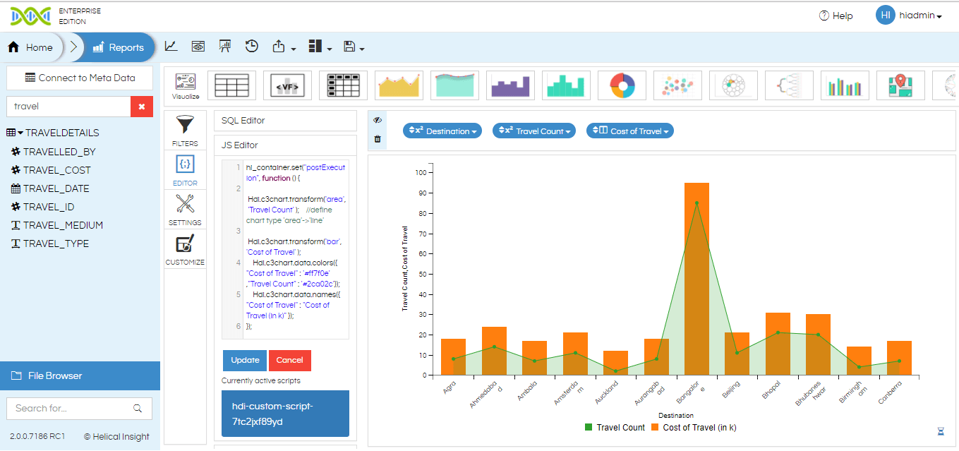
    Hdi.c3chart.transform('area', 'Travel Count' );    //define chart type 'area'->'line'
    Hdi.c3chart.transform('bar', 'Cost of Travel' );
    Hdi.c3chart.data.colors({ "Cost of Travel" : '#ff7f0e' ,"Travel Count" : '#2ca02c'});
    Hdi.c3chart.data.names({ "Cost of Travel" : "Cost of Travel (in k)" });
});
Output

Similarly, you can transform your chart into various other chart type using script. Other chart type includes bar chart, line chart, area chart, spline chart, are spline chart and so on. In addition, you can also perform other customization using CSS and Javascript code.
For more info, contact us at support@helicalinsight.com

