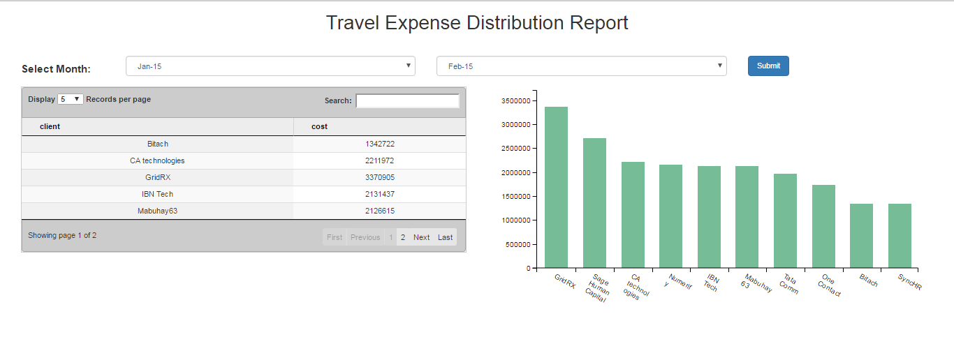
Now, that we have made a dashboard with multiple reports (How To Create Dashboard In Helical Insight CE), we will see how we can change the look and feel of the dashboard by adding color, images etc.
Since the customization is done in an HTML markup, user can easily add any JavaScript functionalities in<script> tag and also can request Ajax calls if required in the dashboard. User can also add any CSS on elements and also can override existing element styles using !important. All the changes should be done in Template.html file.
In this article, we are making few customizations on the Dashboard to make it aesthetically more pleasing. For example:
- Changing the background color.
- Adding background image.
- Changing font size, color etc of the text.
For now the dashboard is looking as shown in the image below.

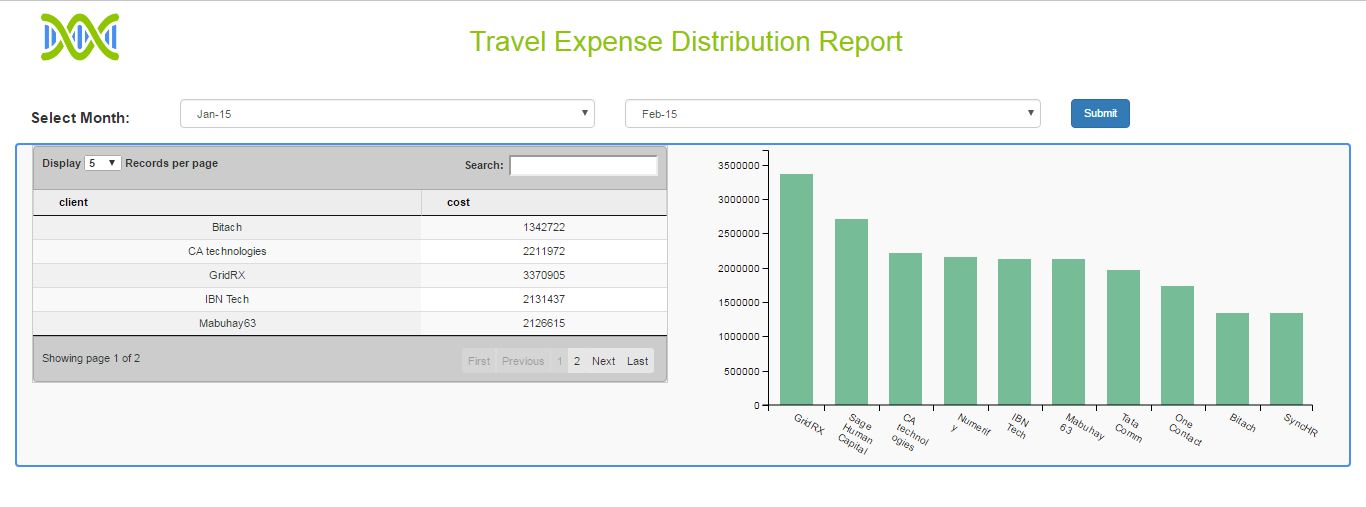
Starting with changing the heading. See the image below.

As seen in the above image we have made following changes:-
- Added a logo which on click will open the Helical Insight site.
- Changed the font color of the heading.
In the below code snippet check the changes made.
<div class="col-sm-12 travel_expense_dashboard">
    <div class="row" id="heading">
	<div class="col-sm-2" id="home_image">
	    <a href="https://www.helicalinsight.com/">
		<img width="80px" height="50px" src="getExternalResource.html?path=Template Folder/logo-hi.png" />
	    </a>
	</div>
        <div class="col-sm-10" >
	    <h1 style="text-align:center;padding-right:20%">Travel Expense Distribution Report</h1>
        </div>
    </div>
    - - - - - - -
    - - - - - - -
</div>
See the description below for the above code snippet:-
- Inside the <div> with class travel_expense_dashboard ,where the entire dashboard will be rendered, we have defined a div with an id
headingwhere the dashboard heading will be rendered. - Inside heading again there are two <div> tags.
- One will hold the logo image and another will have text for the dashboard heading.
- To make our logo image act as link , we will give the image inside the <a> tag and the ‘href’ attribute is the site address.
- Image is given a particular height and width as per requirement and give the path to the logo image in the syntax:-
<img width="80px" height="50px"src="getExternalResource.html?path=Template Folder/logo-hi.png" />
Here, inside ‘src’ attribute give the path where you have put the image.
Note:- You need not give the full path of the image inside your PC, just the path of the file inside hi-repository.
In our case it is present inside Template folder with name logo-hi.png thus the path will be Template Folder/logo-hi.png.
Now apply CSS on the ID and CLASS inside <style> tag in Template.Html file as shown below:-
#heading{ background-color:#ffffff; //Background is to remain white padding:10px; color:#90c601; //Color of the text is given hex color code. }
We have given some inline CSS as well to the <h1> tag as shown in the code below.
<div class="row" id="heading">
    <div class="col-sm-2" id="home_image">
        <a href="https://www.helicalinsight.com/">
            <img width="80px" height="50px"  src="getExternalResource.html?path=Template Folder/logo-hi.png" />
	</a>
    </div>
    <div class="col-sm-10" >
        <h1 style="text-align:center;padding-right:20%" >Travel Expense Distribution Report</h1>
    </div>
</div>
Now, we will be giving border to the 2 reports(Bar, table) and will be changing their background color by giving the appropriate CSS on the corresponding class reportsDiv.
The HTML for the two reports is as follows:-
<div class="rowreportsDiv"> <div class="col-sm-6" id="tableChart"></div> <div class="col-sm-6" id="barChart"></div> </div>
Now giving CSS to the defined ids.
To give border simply add CSS on the class reportsDiv in the style tag.
<style>
     - - - - -
     - - - - -
    .reportsDiv {
        background: #f9f9f9;    // To give background color to both the reports.
        border: solid 2px #498ef2;  // Give border to the entire div with color
        border-radius:4px;        // Give border some radius.
    }
    - - - - - -
    - - - - - -
</style>

In the above figure, the table chart is touching the border at the top. We can give somepadding on the IDtableChart defined for the table. See the following code snippet where we will give CSS on the IDtableChart for giving the padding at the top.
<style>
    - - - - -
    - - - - -
    tableChart#tableChart {
        padding-top:25px;
    }
    - - - - -
    - - - - -
</style>
Now save the file and run the report to see the following output.

You can also give a back ground image to the dashboard.
