This is the first or default visualization that you will see when you generate the report. This is also a first place to start before applying any other visualization as this shows the exact result of your search parameters and perhaps the most commonly used visualization option. Table visualization can show any number of dimension and measures. Tabular visualization can even show the data when no GroupBy is applied on dimension and no aggregate function is applied on measures.
Basic report
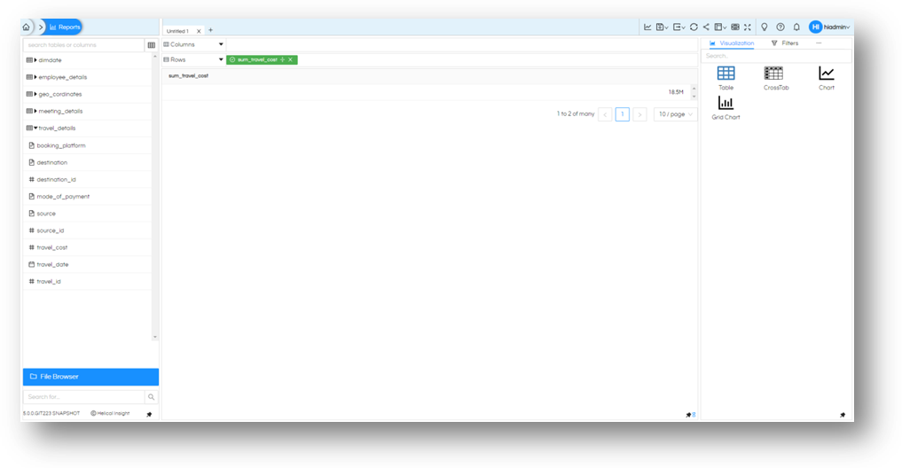
Let us drag the total_cost field into any one place (Column/Rows) and click generate. (By default, the numeric field will be aggregated to sum). You will see the sum of all the travel_cost in database.

Tables can be generated only for single field as well. Even if the output is one single value. (even if it null)
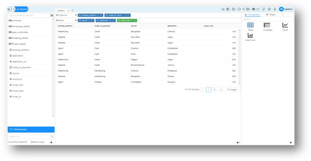
Now let us drag some more fields to this. booking_platform and mode_of¬_payment into Columns and source and destination into Rows along with already existing sum of travel_cost.

You will see all columns and rows are shown as columns in output. This is the exact result that you get output from your database. Means, the Table does not distribute rows and columns.
By default, aggregation is applied and all numeric fields sum will be applied, and all non-numeric fields will be group by. If you want to remove aggregation, you will have to remove it on all fields that are part of the report.
Let us remove the aggregation and run the same report

The result shows the difference, now the values are coming as individual entries of the database.
Pagination
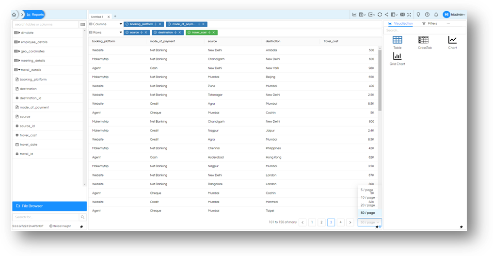
Let us give a little attention for a moment at the bottom right of this report. We see that we have ‘1 to 10 of many’. It is evident that this is not showing all the rows that exist in the result set. This is the feature of the application that we paginate the reports so that the response is faster and user do not wait till all the rows are received from the database. You can browse for next set of rows by going to next page (i.e. Page 2 in this case) or click on right arrow. Let’s try to take a look at next couple of pages and see if everything is working. Further you can change number of rows that you want to see on the screen. You can choose to see up to 50 rows of information and the number of records that you are looking are also shown accordingly.

Sorting
The information can be sorted by using the sort icon next to field name in Columns and Rows and cycle through as ascending order, descending order or no sorting on this field. You can have more than one sorting fields and the query generated will pick it up accordingly.

Marks
There are some more options on the Table to make it more useful than just text and numbers. You can go to ‘Marks’ from the right hand panel, if it is not shown on screen click on meatball icon to see more options and select ‘Marks’ and expand All. You will see option to change color and size of the text in the table. You can use this to segregate information based on your needs. Let us drag booking_platform in color and sum of travel_cost in size. Now each value will be coloured based on which booking platform it was created on, and the cost will determine the size of the text.

This is one other way to highlight some important transactions based on needs.
The points to note are:
- Irrespective of the fields dragged into rows or columns, you will see them in the columns only, just as the way you would expect the SQL select statement to execute.
- By default, all non-numeric fields (text, dates, …) will be grouped, all numeric filed will be summed up. You can click on the field and remove these applied functions.
- The output will be as you see on directly running SQL query
Thank You,
Helical Insight
