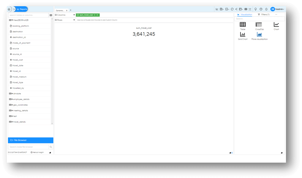
The new Visualization option introduced in Helical Insight is that of Card widget. It gives an option to generate a single value output for reports. Like total sales of current month, or Profit YTD. It generates the single value output as shown below. There is even an option of adding a subchart kind of option as well below the card.
When you drag any measure and simply click on “More Visualization” it creates a card visualization as shown below.
Marks
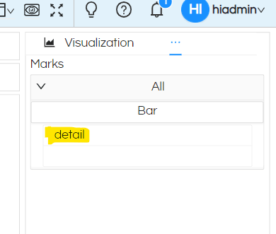
Now go to Marks section and you will notice a portion called “Details”.
You can drag any field here and based on that dragged field we can see the breakup of the total number as a subchart visualization (in this case it will show a breakup of total travel_cost sum of travel_cost). Let us add travel_date to the color option and generate the report again.
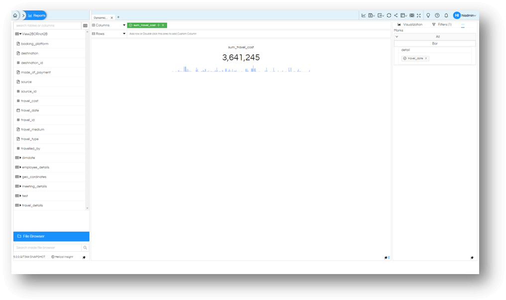
You will notice that the card widget shows a split of cost of travel based on dates of travel and a mini bar chart is displayed.

You can change this bar graph to a line or area and from the marks option. Or you can drag another field to marks to see the breakup of the cost of travel.
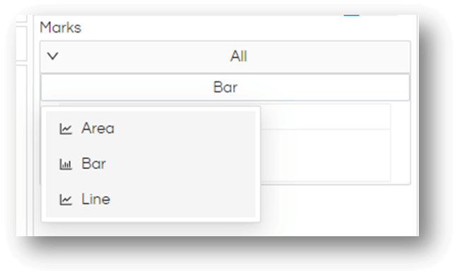
A line chart with source used as details

Now that you have one more visualization at your disposal, use it as you need it.
The field which you have dragged, you can even apply any DBfunction also and use it (simply clicking on the dragged column will allow you to do that).
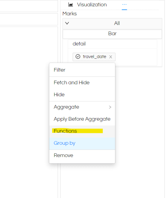
Like in this specific example, we will apply a MonthName dbfunction. Hence the bars or lines will have 12 points/bars in it for 12 months. Refer to this blog to learn how to apply DBfunction

Thank You,
Helical Insight
