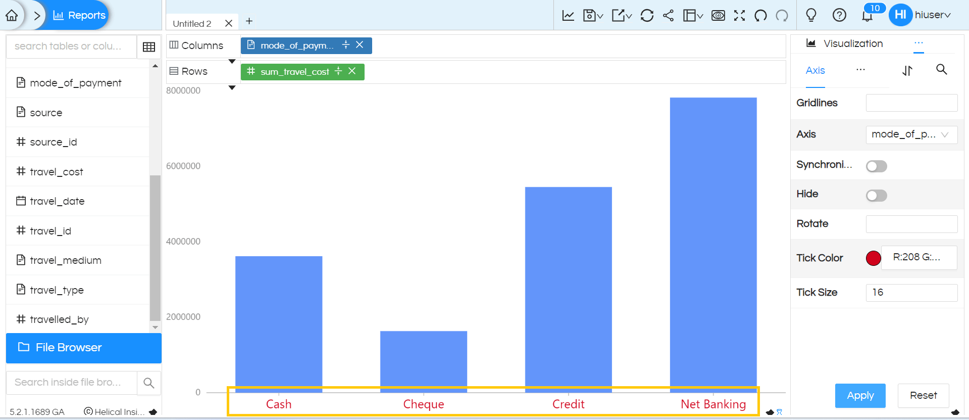
NOTE: From version 5.2.1, we have added option of specifying the tick size and color which we have covered at the end of the blog.
These, as the name suggests, will be applicable for your axis charts like: Line Charts, Bar Charts, Area Charts etc of Open Source BI product Helical Insight v 5.0 GA onwards. These options help you to manage your grid and axes of your charts like enable/disable grid lines, hide or show axis, specify the axis range. You can navigate these options under Properties Module.
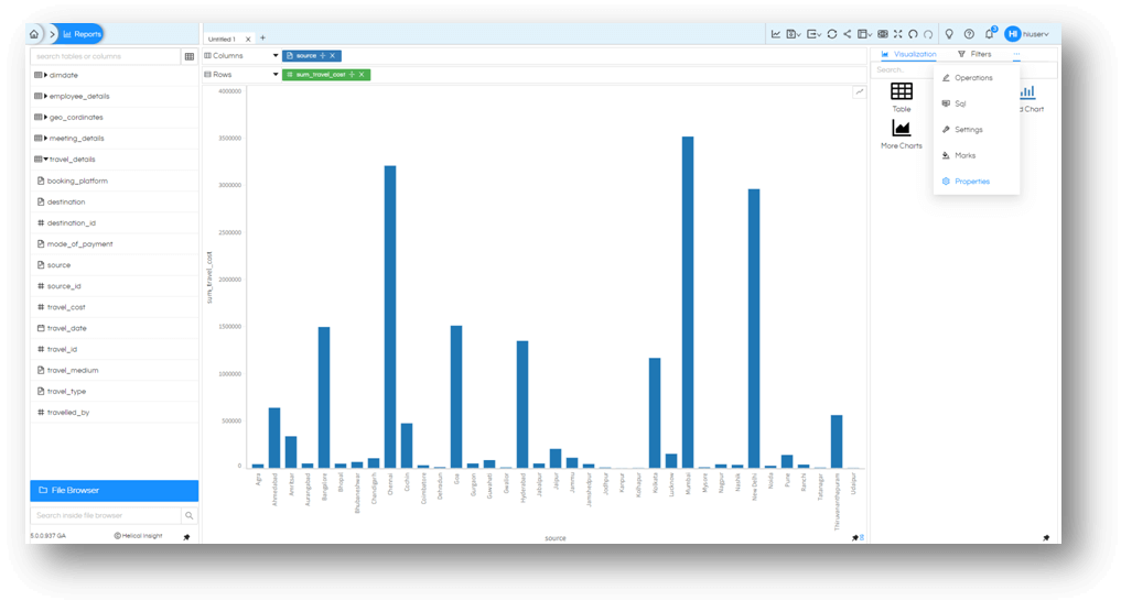
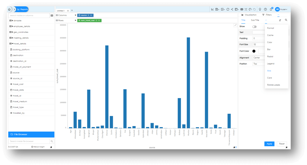
Then choose the meatball icon again and select Axis.
Grid lines
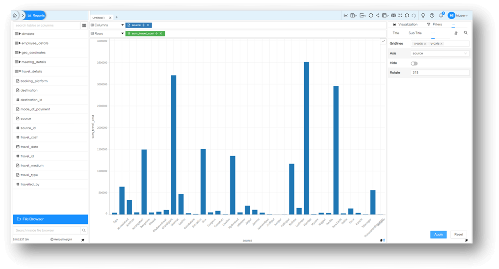
Once you are at this module, you will have option to enable or disable gridlines for X-Axis or Y-Axis or both.

Rotate the axis tick labels
By default the charts are created in such a way that axis ticks are intelligently oriented for easier visibility and no overlap. However you still have option to control your axis tick marks.
For dimensions or measures you can control the values on the axis by rotating it as you may seem fit for your needs. You can enter both positive and negative values. Like Source in this example, we have enabled rotation of 315° (or-45°).
Axis ranges
In case of Measures like sum_travel_cost in this example, we can also control the range of the axis. By default the chart axis range is dynamically created using the minimum value and maximum value preset in the chart.
However using this option you can specify the minimum value and maximum value of the range selector.
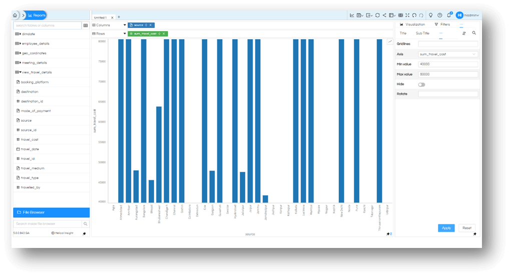
If you need you can also have the negative values of axis range also.

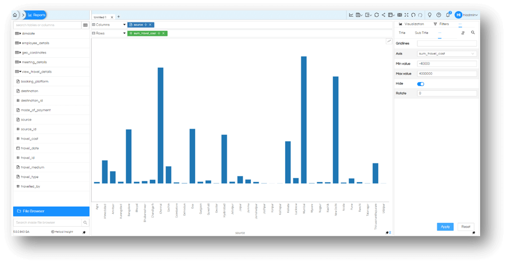
Hiding Axis
If you want you can simply hide the axis altogether for both dimension and measure as per you need. For measure, if you want to hide keeping the range, even that is possible.
Synchronize: In the latter version of Helical Insight, a new option called Synchronize has also appeared. Generally when you have two measures, in a grid chart, it creates Y1 and Y2 axis. But with this synchronize option you can use the same scale for two different measures on a combined chart.
Go to properties by clicking meatball icon besides the visualization, within the visualization again click on the meatball icon and go to Axis there you will find the Synchronize option
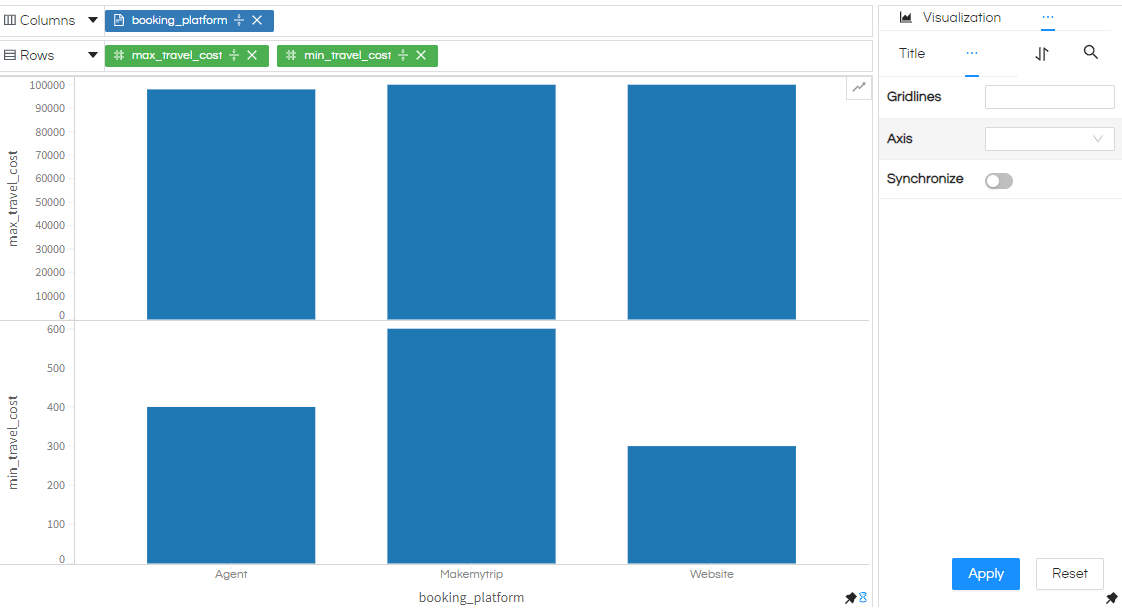
If you use two measures in a grid chart, it creates two different charts. In those cases we need to use “Combine” option. To do that, click on the meatball icon besides the visualization and select Marks, in that tick the Combine option and generate. you will observe both bar graphs are combined and two y axis are present.
Whereas in case of “More Charts” there is no need to do that since here it will create, by default, in a single visualization.
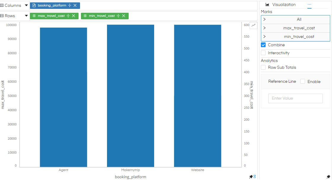
To view it more clearly make any one of two measures to line. You can do that in same Marks, click on the column which you want to make line in Marks section. There you will observe a dropdown, select Line in it.
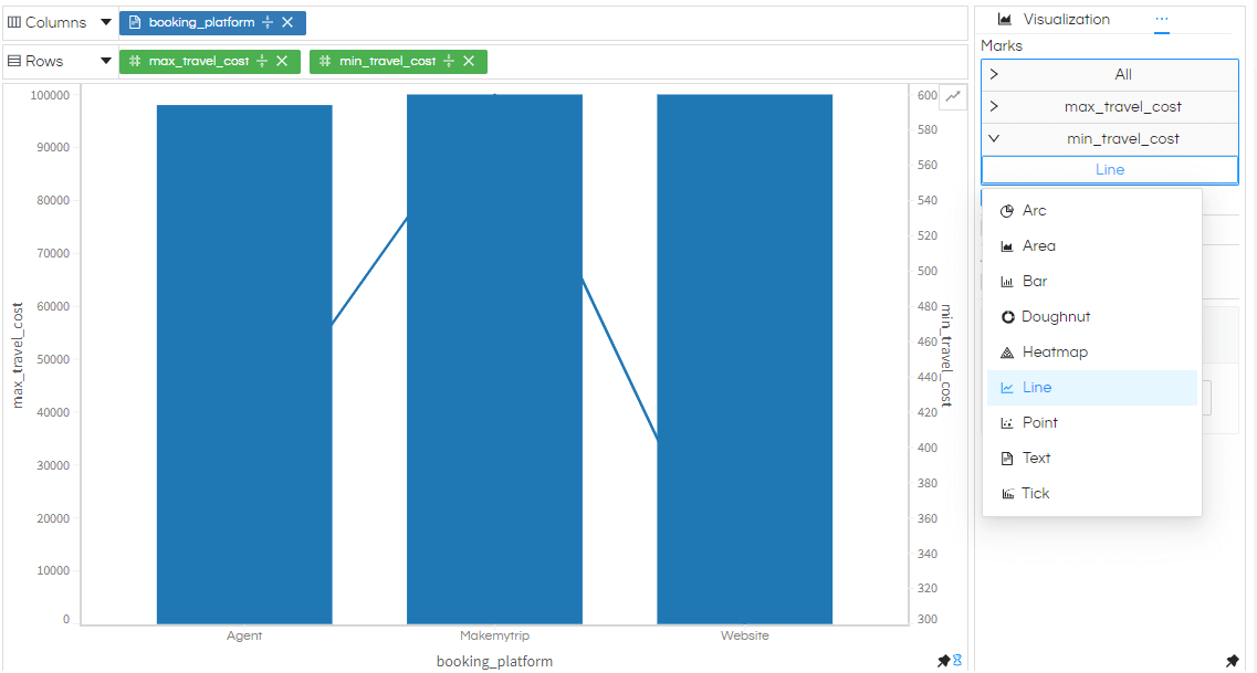
Here min_travel_cost made as a Line.
Now you can observe that the bar and graph are generating based on two different axis. To botih visualizations generate based on one axis You can toggle the Synchronize option.
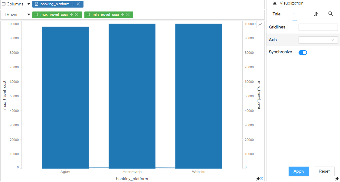
After toggling the Synchronize option you will observe both line and bar graph are coming based on one axis. This synchronize is especially useful when we want to compare the dataset with each other, hence it is important that they both come from the same axis only.
These gives you precise control over how your axis charts will be rendered. Use it to your advantage only with Helical Insight 5.0
Change Axis tick color and font size:
In order to change Axis tick color and font size, open Properties section and choose “Axis”
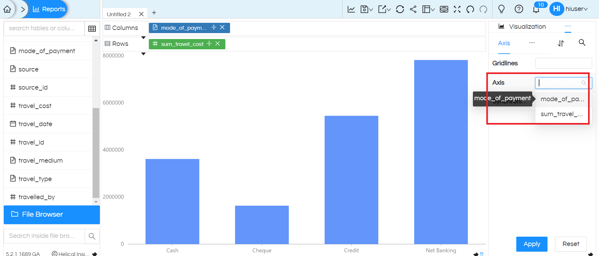
Change font size and select the color according to our requirements
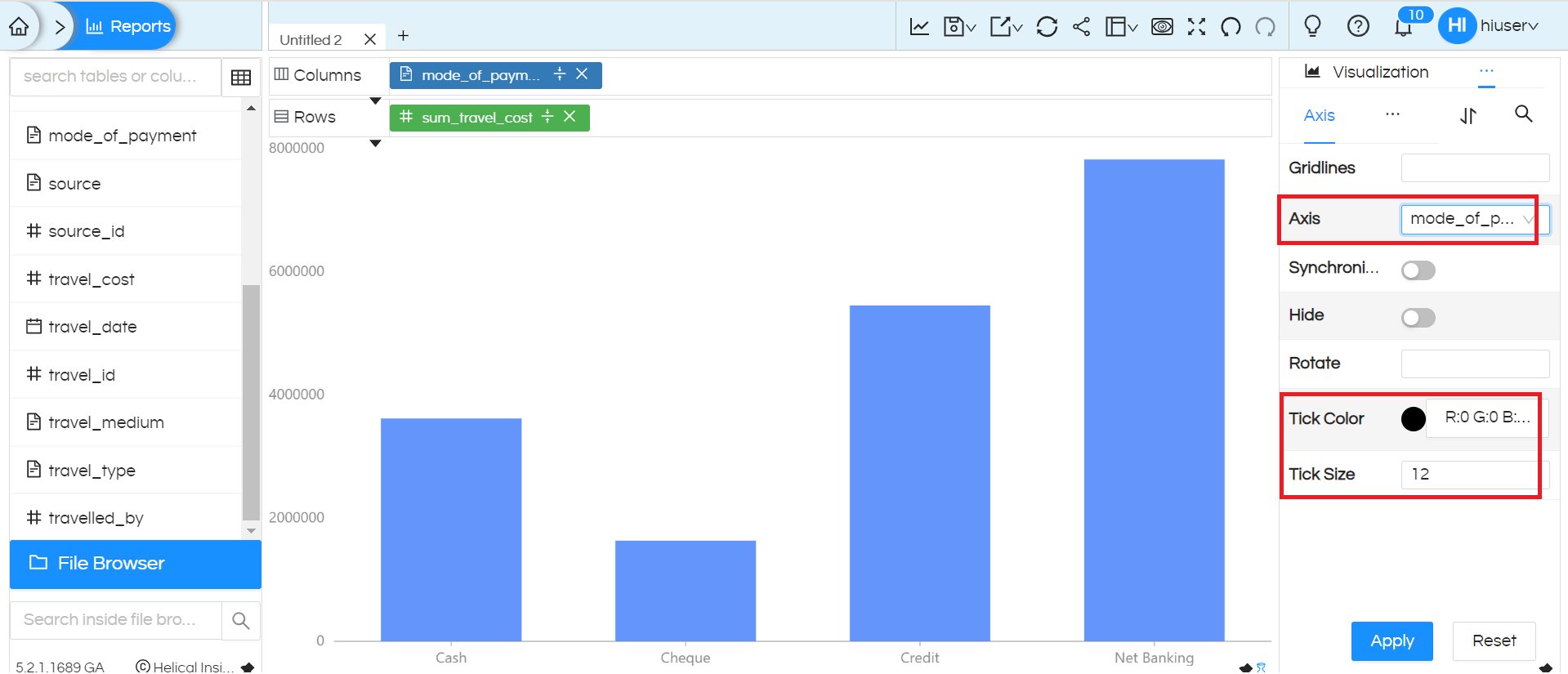
Click on Apply to see the changes
