In this blog, we have learned about how to create Grid chart visualization in Open Source BI Helical Insight application version 5. Now we will see one additional feature called “Combine”.
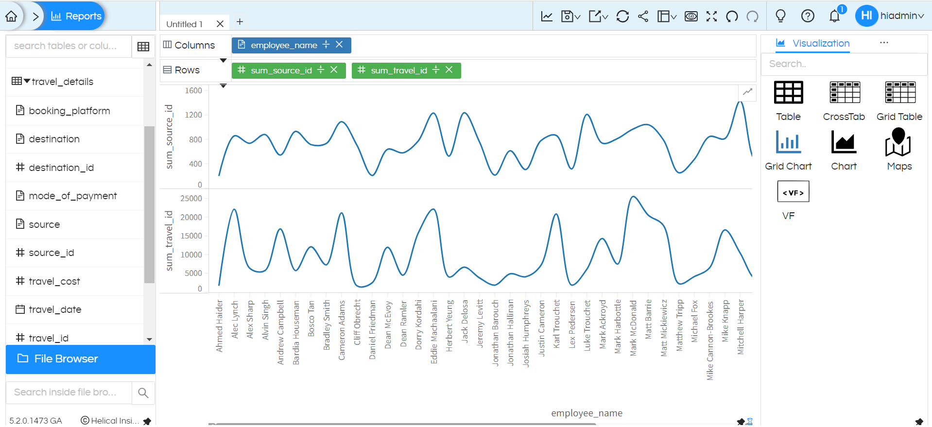
In grid chart, when more than one measure is present then it creates multiple set of charts. For example if you see below image, it has 2 measures in rows (i.e. sum_source_id, sum_travel_id) and it has created 2 different line charts.

But we can have requirements wherein we may want to have multiple measures but in a single chart. For implementing that we can use an option called “Combine” which works fine from version 5.2 onwards (5.2.0.1473 GA)
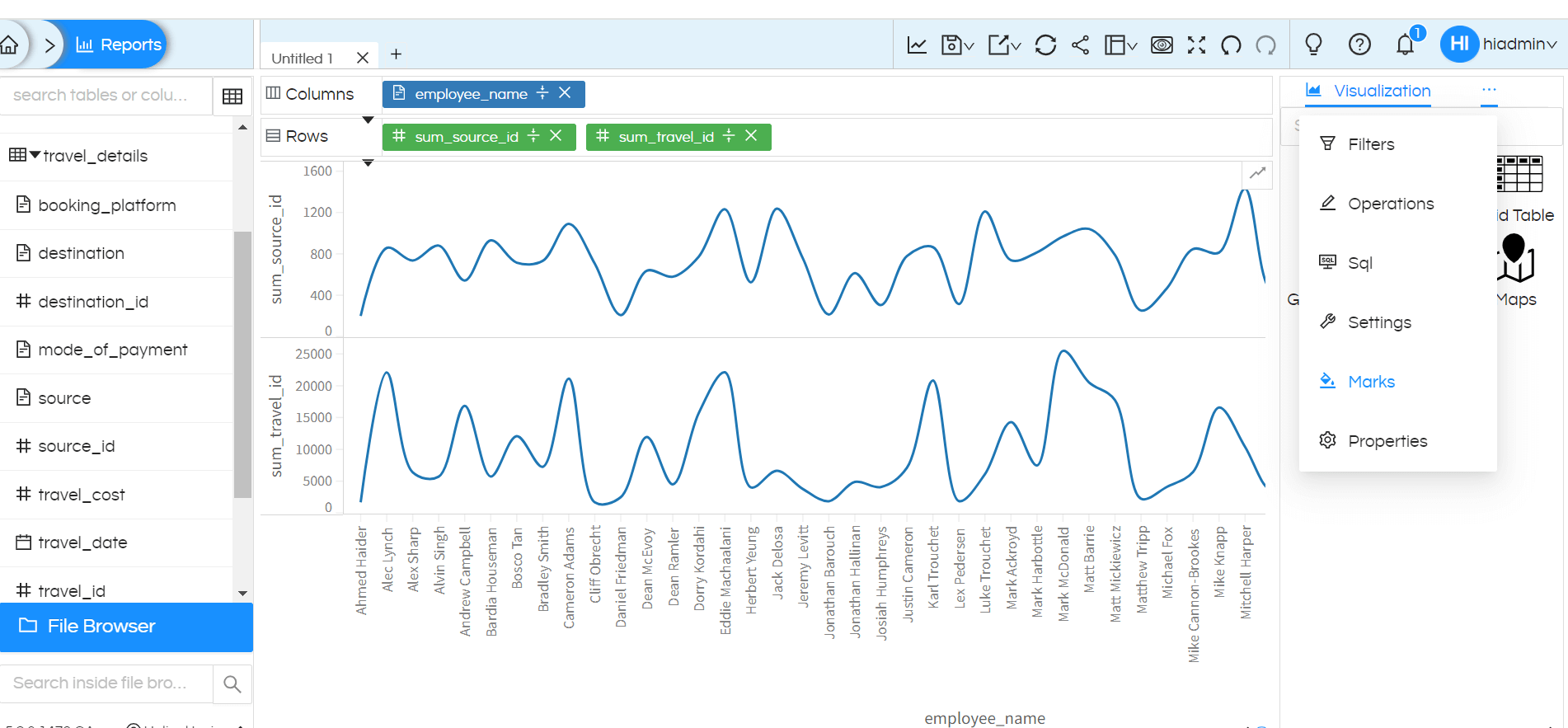
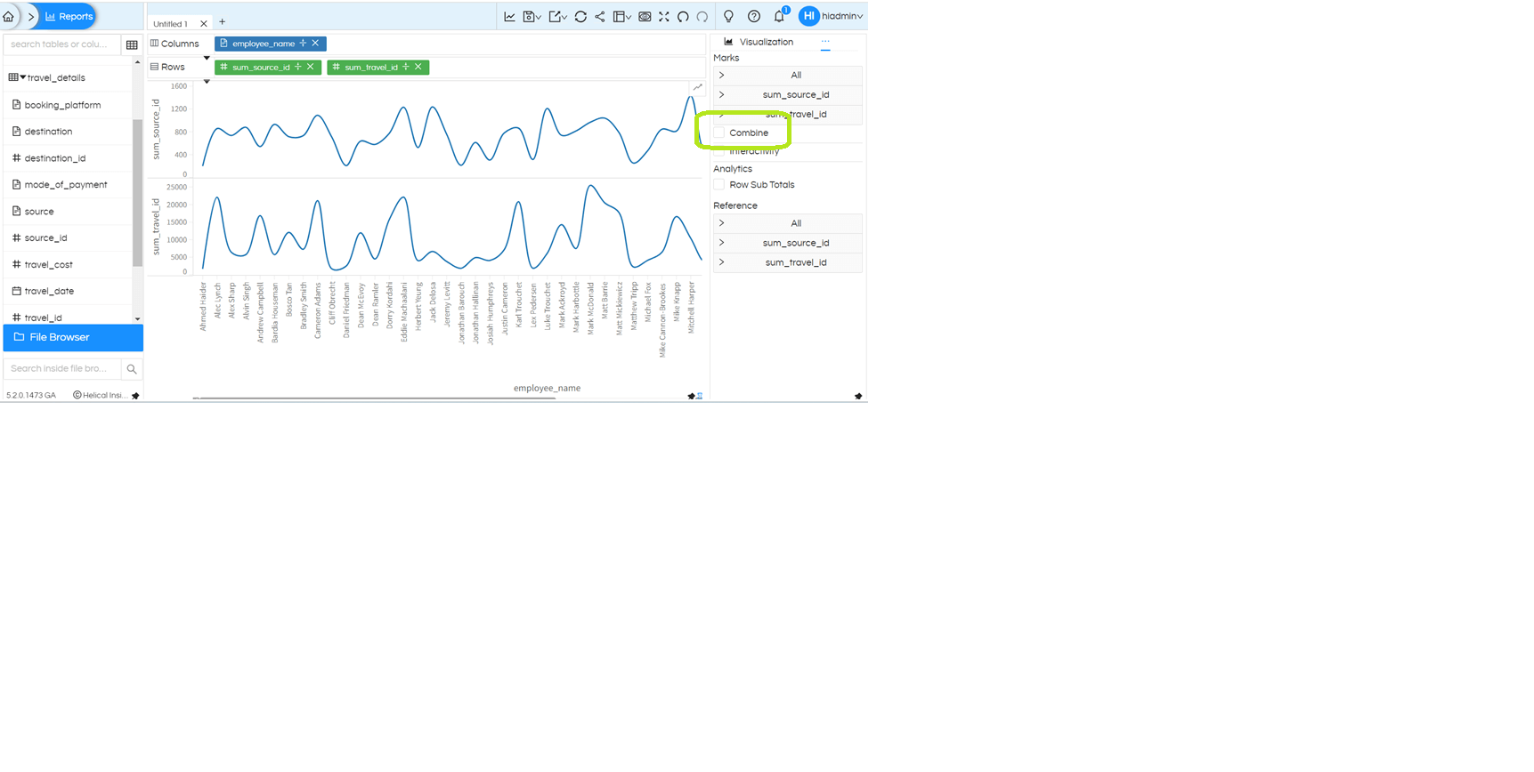
You can see this option under “Marks” for Grid Charts as shown in below screenshots:


Once you tick the “Combine”, the resultant output will be combination chart within single frame. You can have combination chart of bar-line, line-line etc. If you would like to change the visualization type for any other measure click on that specific measure and expand it, then change the visualization type accordingly.
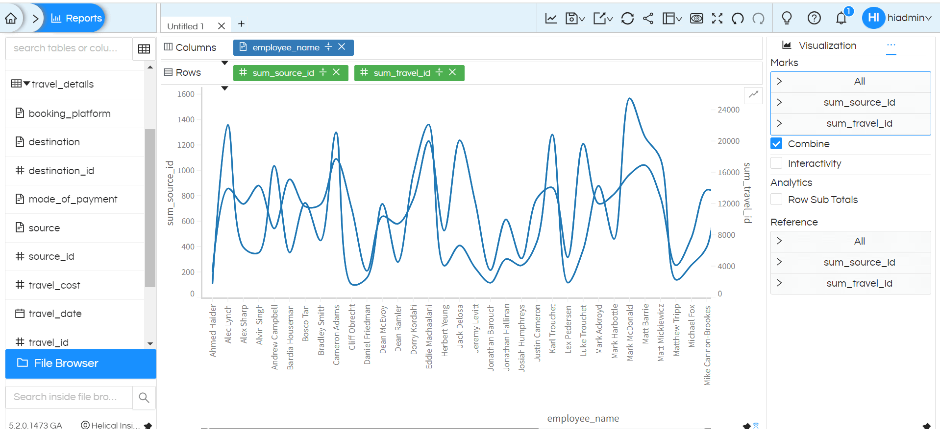
Below is the result about enabling the option “Combine”:

Similarly, you can use for even more number of measures. First measure is used to plot Y1 and second measure is used to plot Y2.
In case of combine charts, in many cases, we may want to use same axis. Then axis customizations options can be used.
