Open Source BI product Helical Insight comes with plenty of default visualization options. There could be occasions in which some other custom chart might be required. thing else might also be required over and above what is by default available. From version 5.2 onwards we have included VF option in Helical Insight application which can allow . This document is about explaining the usage of VF in Helical Insight application.
VF option is available under Hreport (Reports module) that allows to create customand use custom JS react charts of AntD, MuzeJScharting engine. In this below blog we have covered how to use the same.
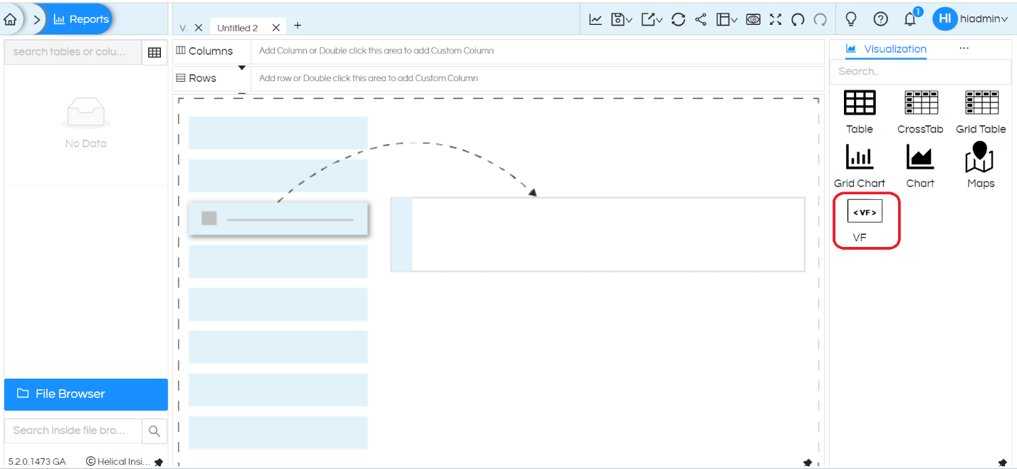
VF can use the libraries and data present in Reports. You can create new functions to extract the desired visualization. We have to code these functions into React.
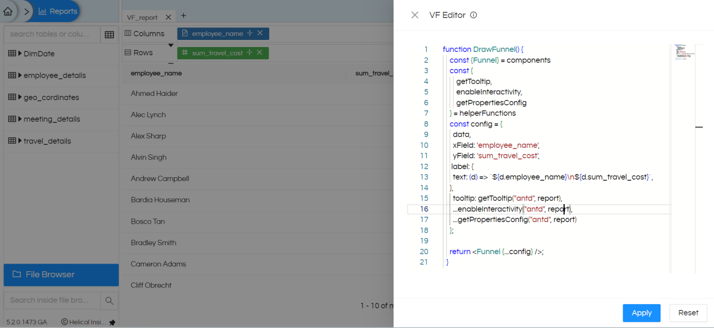
When you click on the VF icon, an editor will get open. Reference image as below:
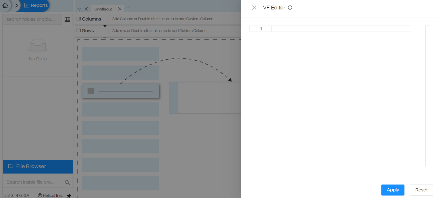
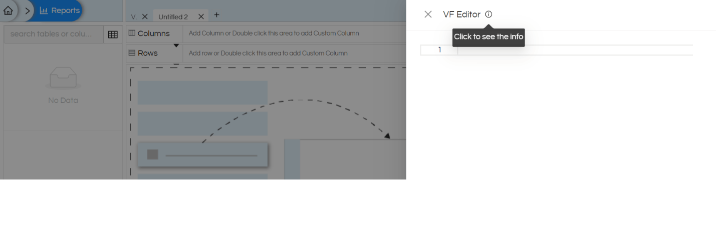
For more information about VF and for checking out few ready to use samples, you can refer this i icon.
Access Variables:
VF has access to the following variables:
- data: The current report’s data which gets generated from your field selections from Rows and Columns.
- report: The current active report which contains all the data about the current report.
- components: This contains all the components that you can use.
- helperFunctions: This contains helper functions to enhance chart creation. In below examples it is shown how you can utilise these helper functions.
With helper function we add this below code and this will allow (in most of the cases) to enable interactivity (like drill down, drill through, inter panel communication by clicking on it), tooltip and other things. This will help in having a consistent experience across any of the visualizations that are being used.
    const {

        getTooltip,

        enableInteractivity,

        getPropertiesConfig

    } = helperFunctions
Sample Working Example:
Below code is responsible for generating a Funnel chart which is not directly available in the product.
Firstly, we have created a tabular report by dragging dropping 2 fields (1 dimension and 1 measure).
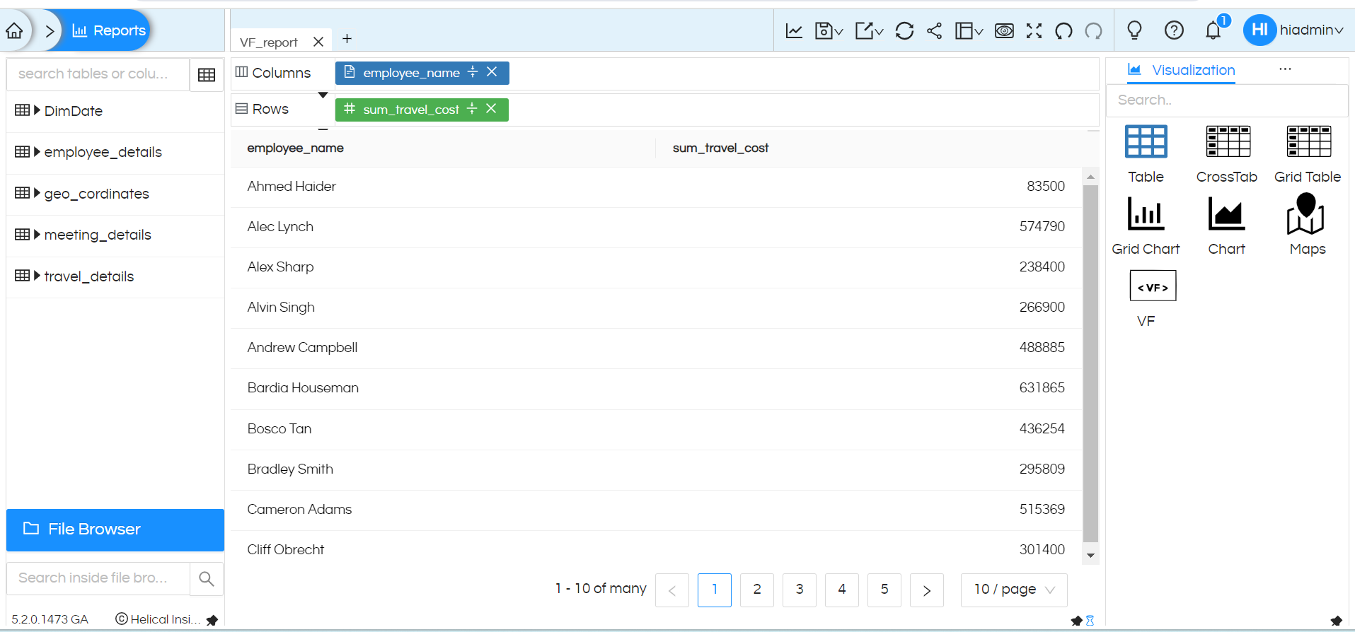
In order to convert into Funnel chart visualization, we have added below code into VF editor. This code is taken from AntD Funnel chart sample:
functionDrawFunnel() {

    const {Funnel} = components

    const {

        getTooltip,

        enableInteractivity,

        getPropertiesConfig

    } = helperFunctions

    constconfig = {

      data,

      xField: 'employee_name',    //this field is the name of your dimension

      yField: 'sum_travel_cost',//this field is the name of your measure

     label: {

      text: (d) =>`${d.employee_name}\n${d.sum_travel_cost}`,  //whatever you want to show as label that field put here

    },

      tooltip: getTooltip("antd", report),

      ...enableInteractivity("antd", report),

      ...getPropertiesConfig("antd", report)

    };


    return<Funnel {...config} />;

  }
NOTE: Please change the dimension, measure field names as per your field names which you have used to create the report.
After adding this code into VF Editor, click on Apply button.
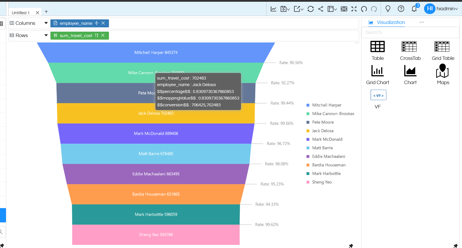
This way we can create different visualization using VF.
Reach out on support@helicalinsight.com in case of any questions.

