This feature is available starting from Helical 5.2.1. With it, we can create a column by adding multiple measure columns into it. This feature enhances the ability to analyze and present data in a more meaningful and flexible way, catering to various reporting and visualization needs.
In this blog we are going to cover one use case in which we want to use 2 measures and plot them next to each other in the same canvas (rather than 2 separate charts) using grid charts.
Steps to be followed :
Select ‘Marks’ menu from the right pane menu. If it is not displayed on screen, click on meatball menu (3 dots) icon to see more options.
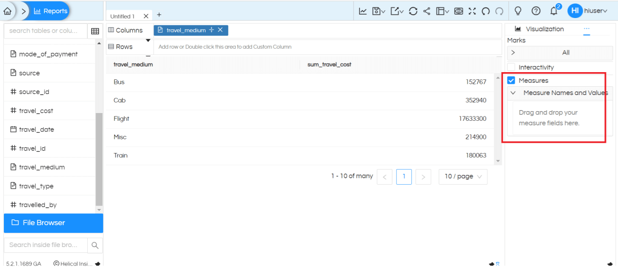
You can see a Measures option which you have to enable using the checkbox.
Added two measures i.e. source_id and destination_id to Measures by dragging it from the left metadata section here.
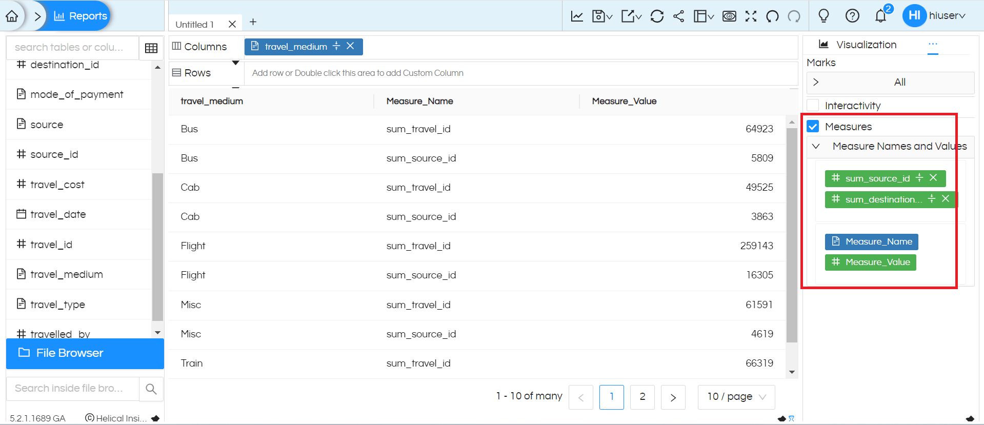
We can see that it has created Measure_Name and Measure_Value in the measures section as soon as we drag fields there.
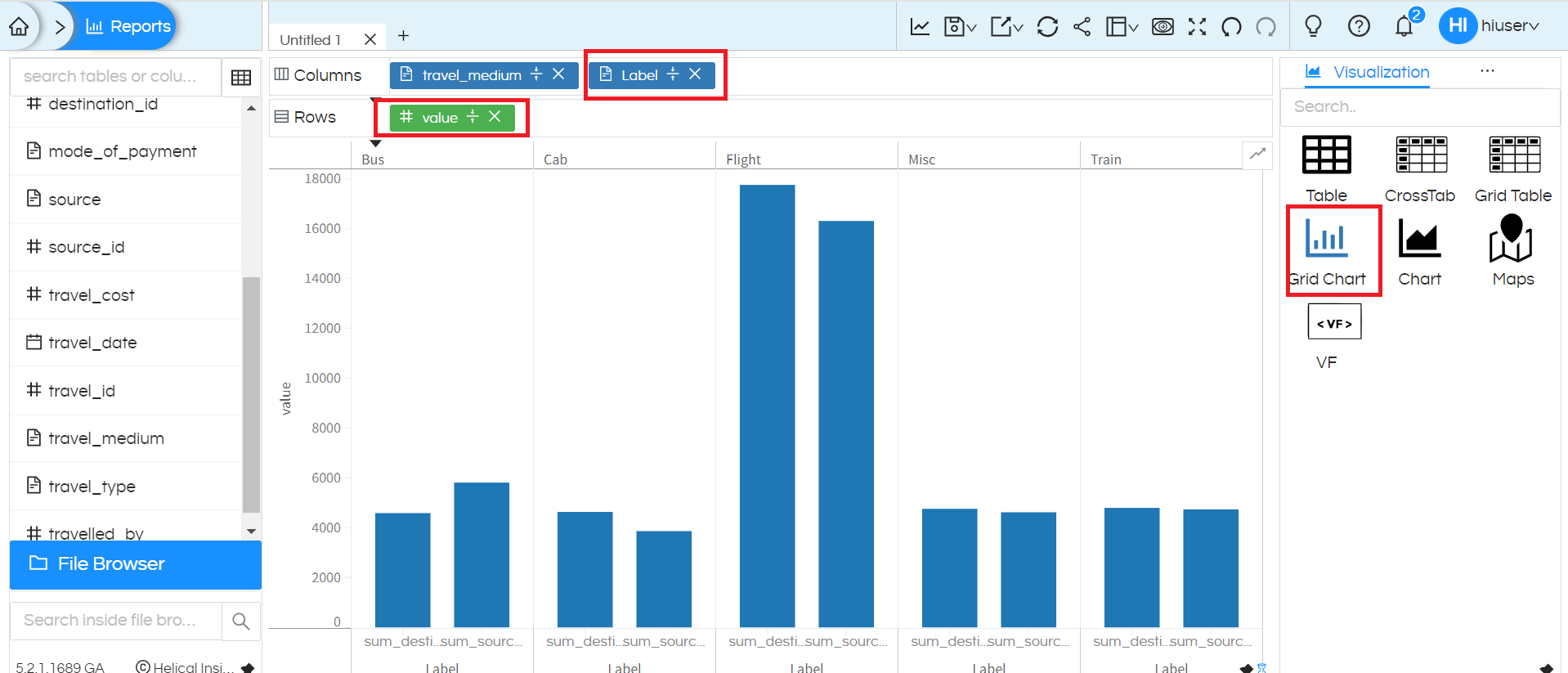
From the Measures place, now drag this Measure_Name and Measure_Value in the required rows/columns area.
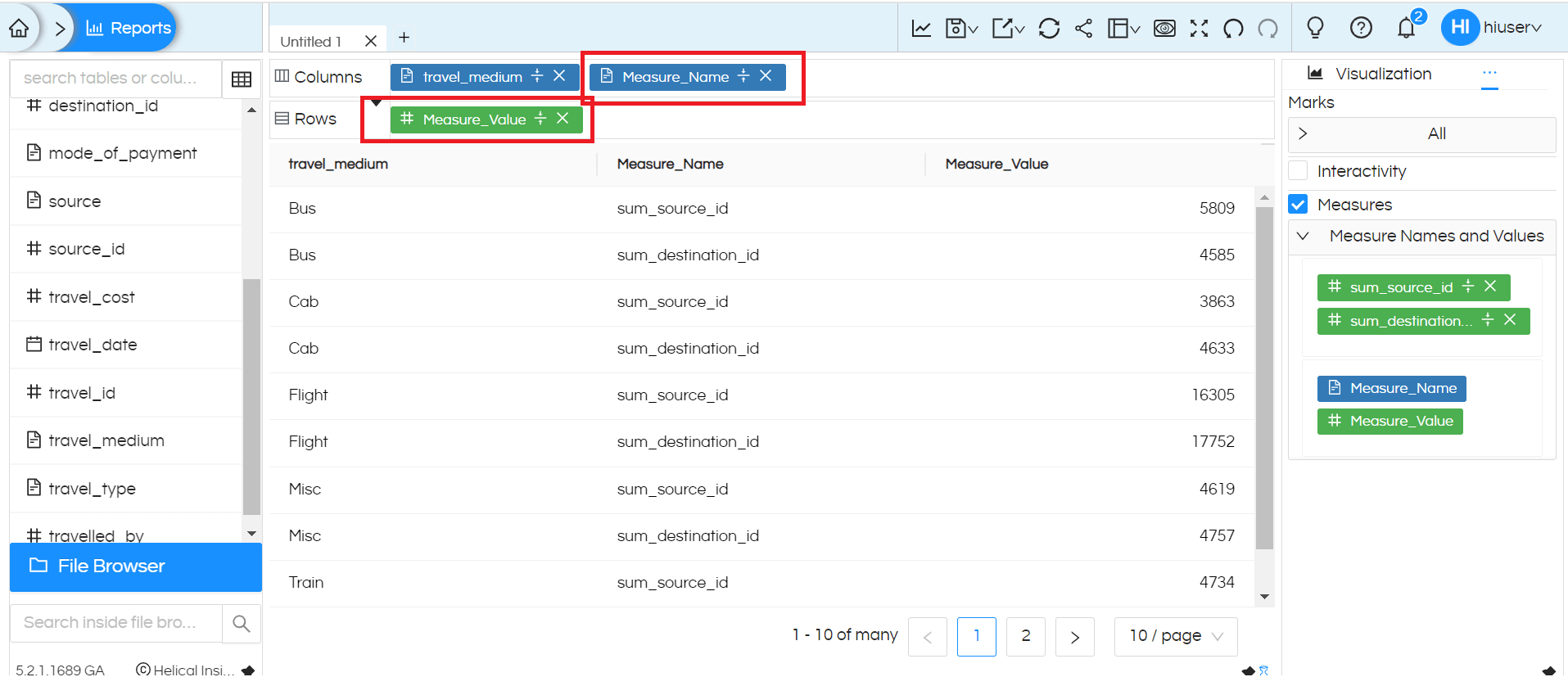
Now we can generate charts using these columns as shown below,
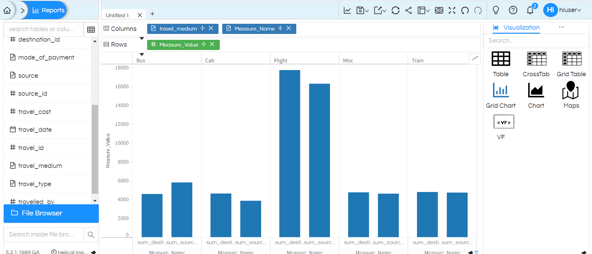
We can rename and use these column names for easier understanding by double clicking there.
Please reach out to support@helicalinsight.com in case of any questions.
