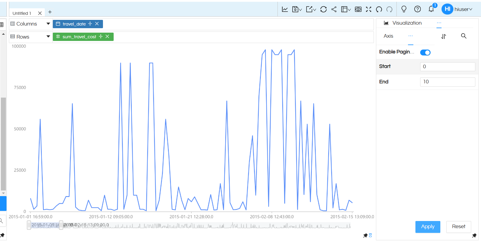
From enterprise version 5.2.2 of Open source BI Helical Insight, a new sub chart option has been introduced. This new sub chart options you to pan in pan out (zoom in zoom out) or have a subchart kind of option below an axis chart. This is especially useful when you have lot of data points and it can allow you to see some area in greater detail.M
In this document we cover how to use this specific functionality in more detail.
(a) Drag drop the required dimension and measures and create an axis chart (like Bar chart, line chart, Area chart etc).
(b) NOTE: This property is only applicable for “Charts” and not applicable to “Grid Charts”
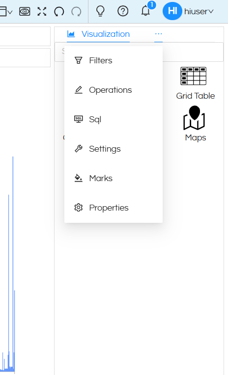
(c) Click on the three dots next to Visualization option and open Properties.

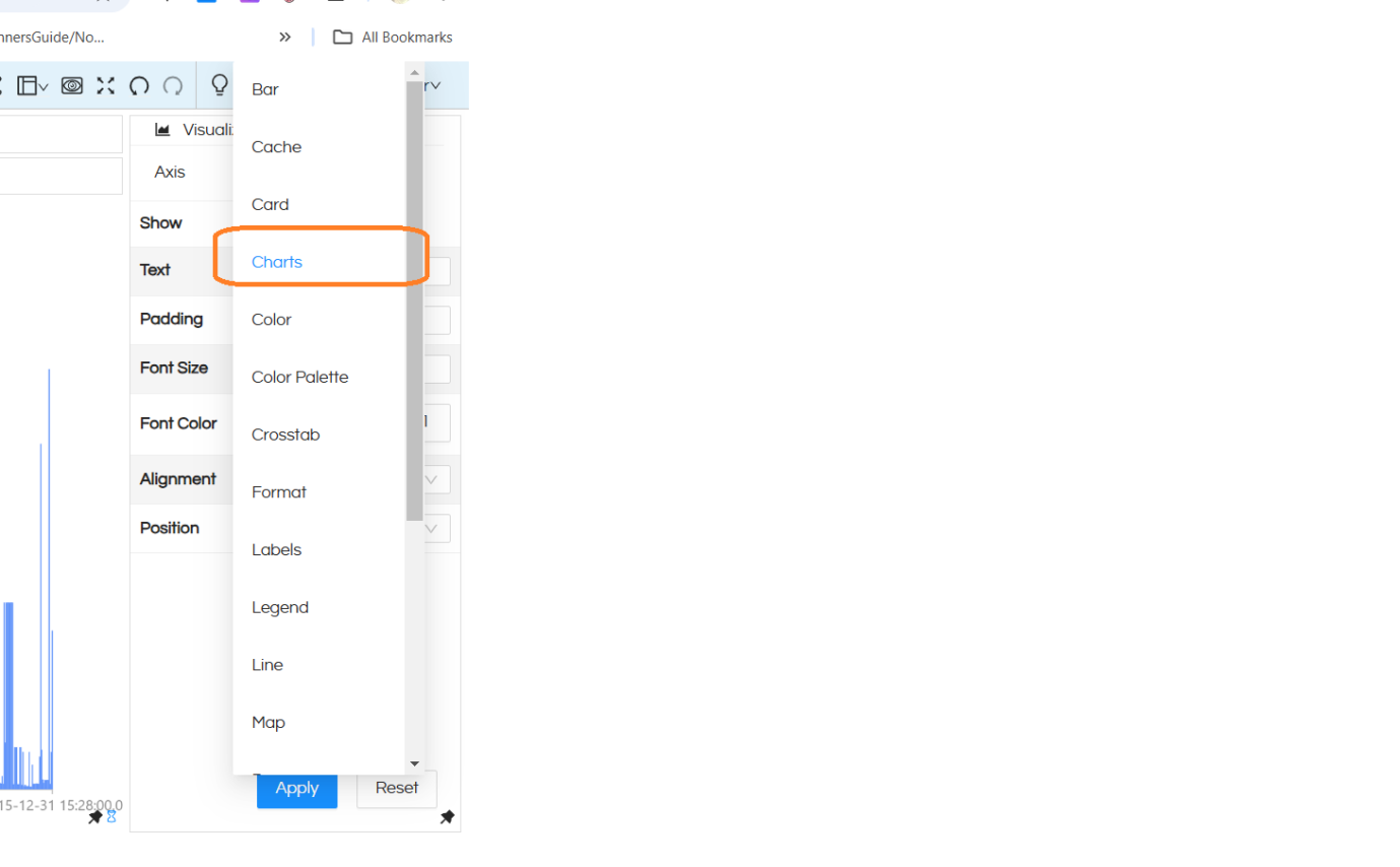
(d) Then when the Properties area is open, then click on Charts option

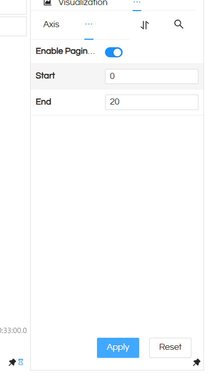
(e) Now in this UI, you can enable slider for chart. This option will add the slider in the chart in x axis , it is only applicable for charts with axes and for Chart type visualization only. This property is for percentage (0-100%) of records shown as per data.

Start: This property will allow to specify the starting point of the subchart when the report opens by default. This is in terms of percentage. Though when the chart is being viewed, a user can always change the size and position of the slider.
End: This property will allow to specify the ending point of the subchart when the report opens by default. This is in terms of percentage. Though when the chart is being viewed, a user can always change the size and position of the slider.

