Open Source BI product Helical Insight has introduced a new color customization is added called as Color Palette. Color palette can allow you to very quickly apply a color palette with good vibrant colors and make your visualizations look better. Apart from this color palette option, Helical Insight also has a color property which can be used to specify colors or color gradient.
In this blog, we will explore how to customize the color of any visualization in the Helical Insight application.
For reference, we are taking the example of a Grid Chart with the Bar option, and we have also added a dimension to the Color property of Marks as shown below.
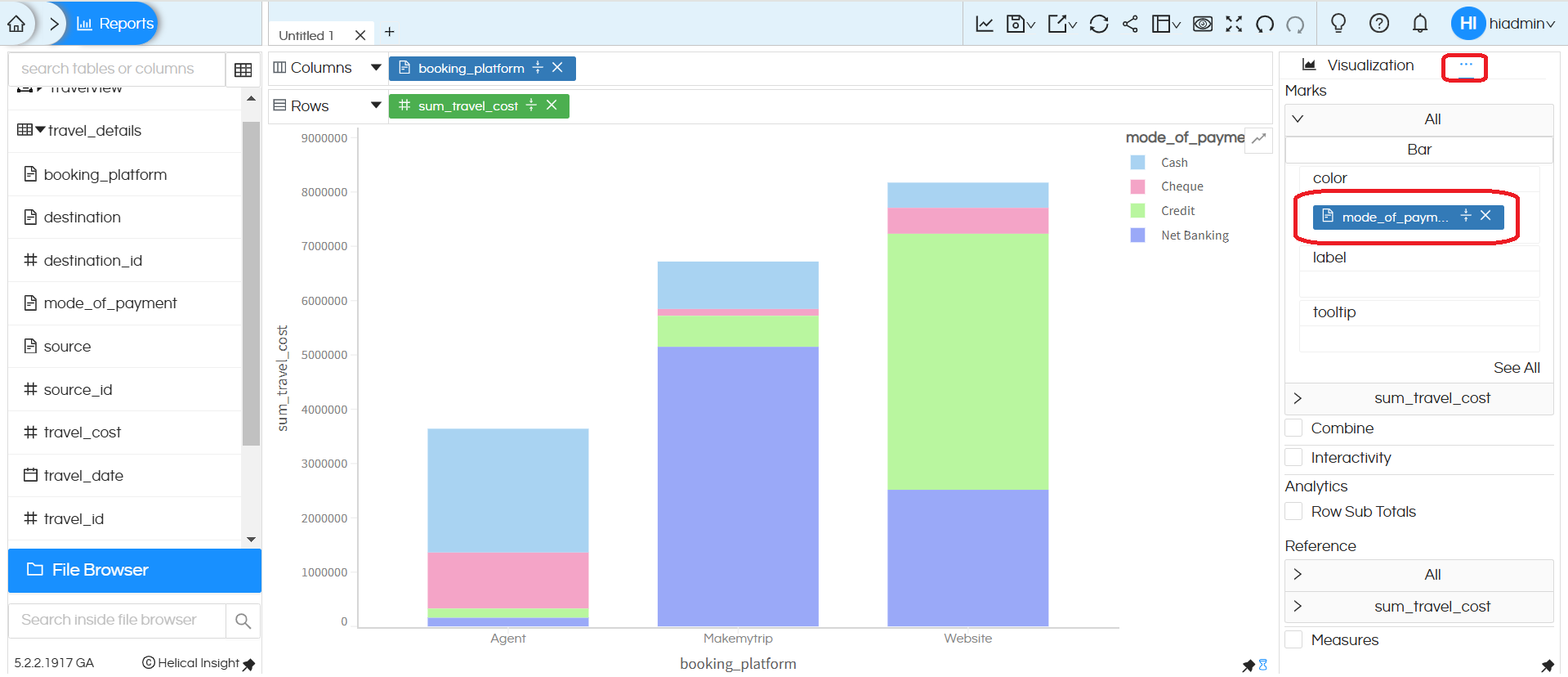
1. Select the meatball icon in the top-right corner. A list of additional menu options will appear. From this list, select ‘Properties‘,’ then choose ‘Color Palette‘
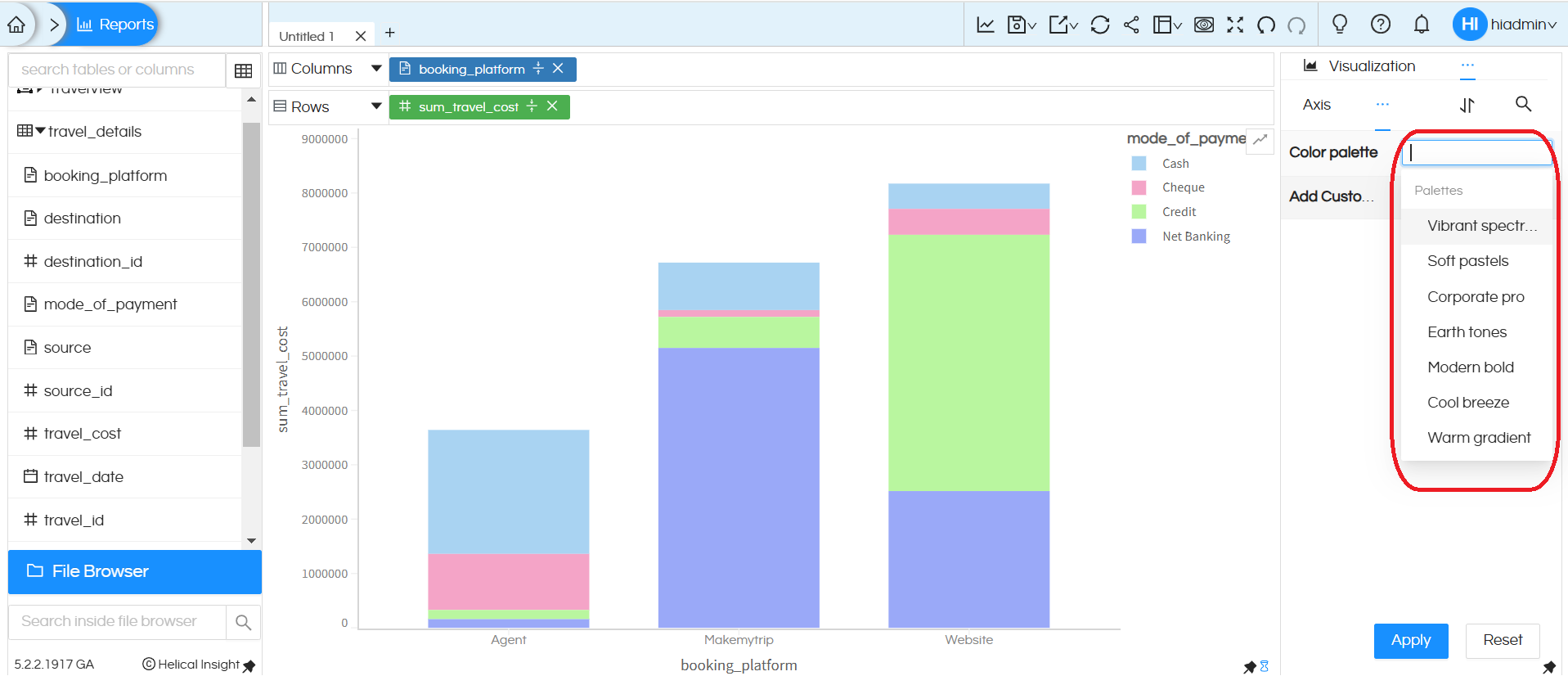
2. The color palette has two properties: selecting a prebuilt color theme or creating a custom theme with your own colors
Selecting an inbuilt color theme
If we click on the empty box in front of the color palette property, a dropdown list of inbuilt color themes appears. We can select one or multiple values at a time.
If a single value is selected, only the colors from that theme are applied. Each theme has got 10 colors. If multiple values are selected, then first 10 colors will be picked from the first theme followed by second theme etc. If you only select 1 theme then the colors can get repeated after first 10 unique colors of that theme.
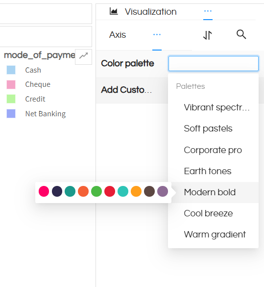
On hovering over the dropdown values, the color sequence is displayed
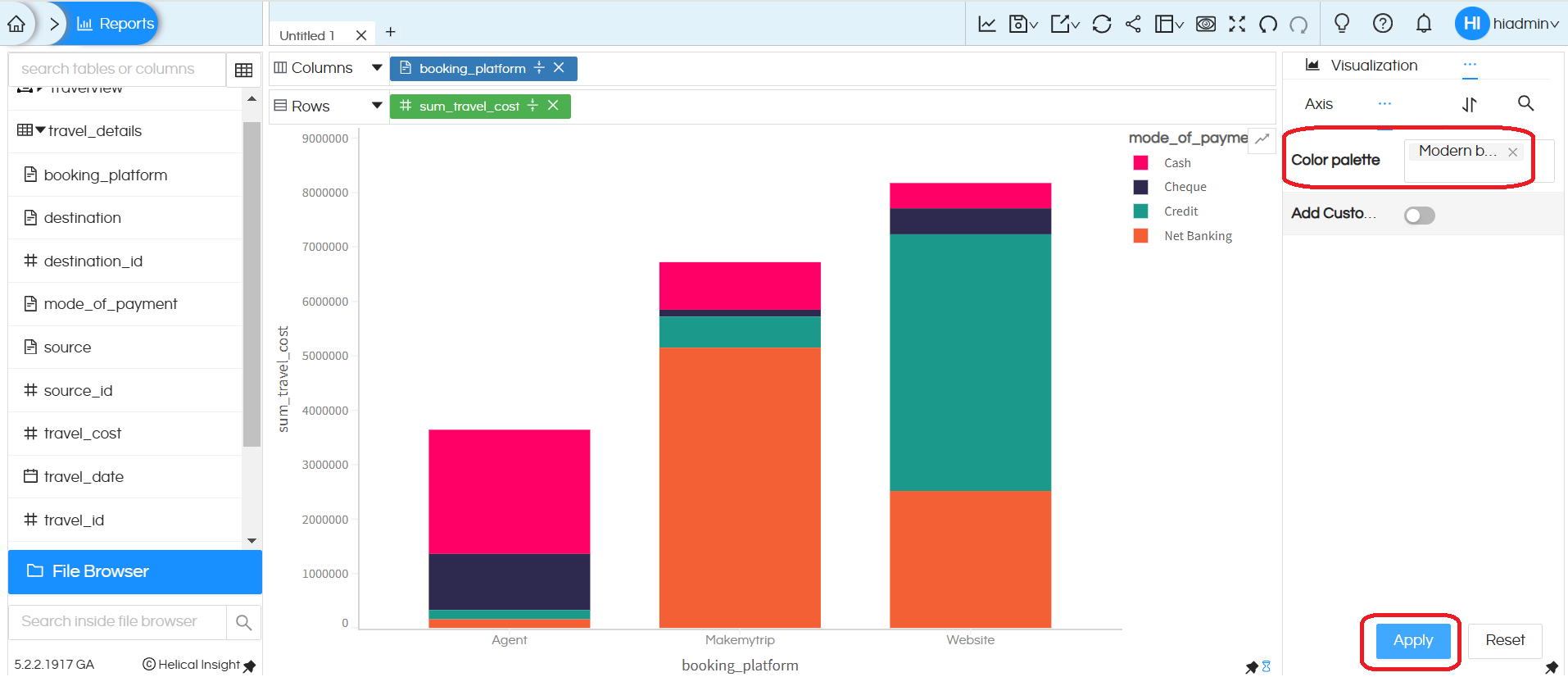
In this example we have selected ‘Modern Bold’ and clicked on ‘Apply’, now we can see that the color theme has been applied
Color theme with multiple options
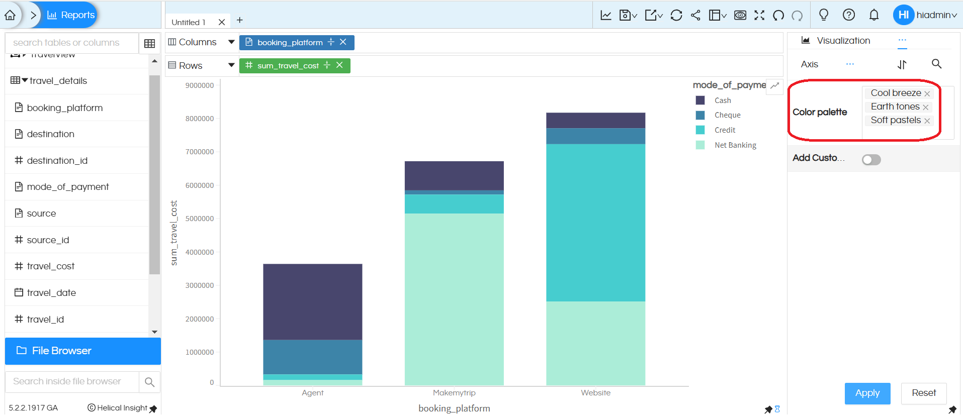
Creating a custom theme :
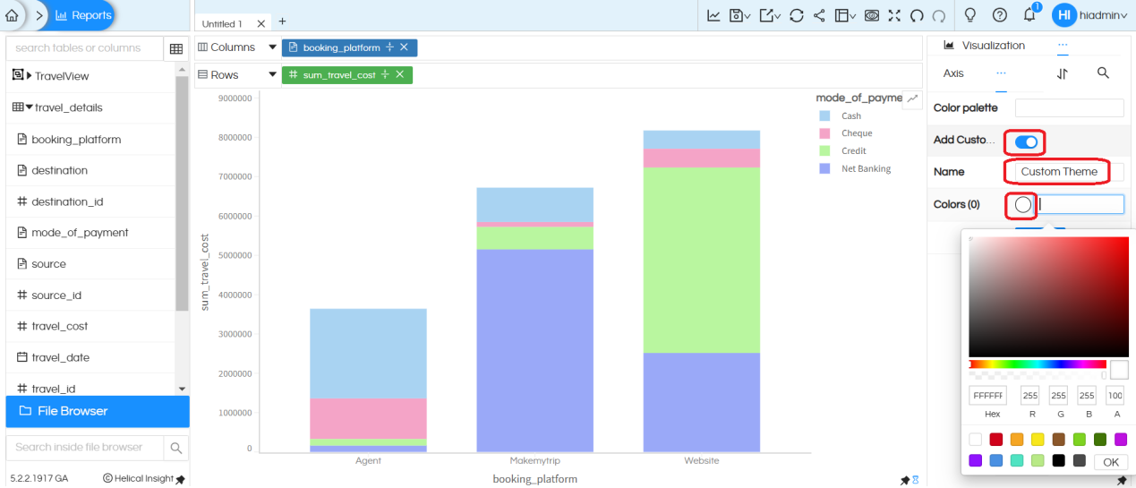
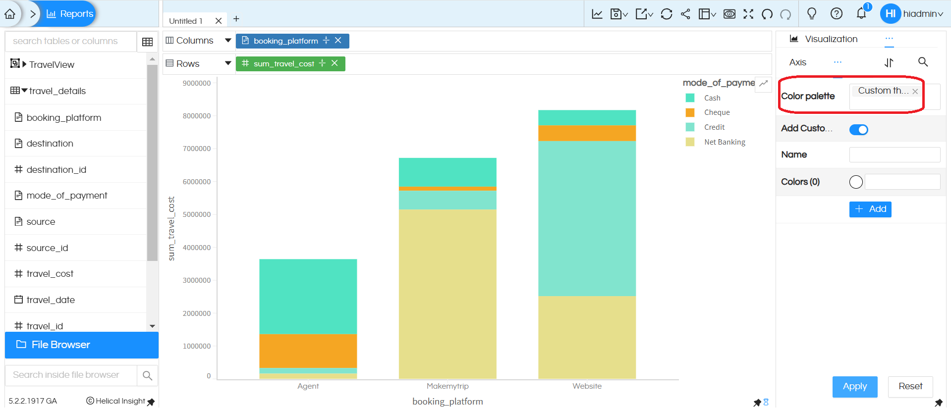
You can also create your own custom theme also. Enable the ‘Add Custom Colors‘ toggle, provide a custom theme name, and ability to add 10 colors using the color picker. (You must choose 10 colors in order to add them as a theme and give that theme a name of your choice)
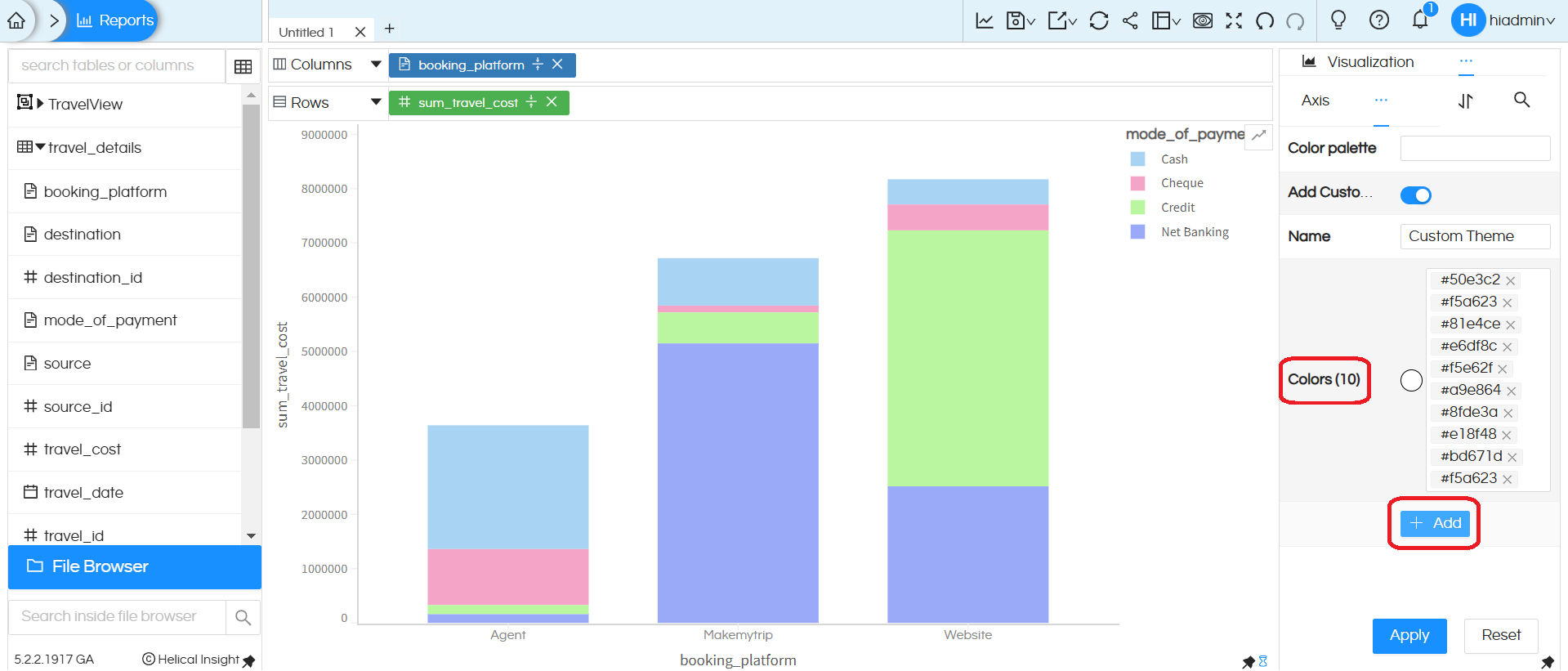
We can add max 10 colors only, after adding colors we should click on Add button so that it will be added in the Color Palette drop down list.
Now, we should choose the custom theme from the Color Palette. As shown below, it will be displayed in the dropdown.
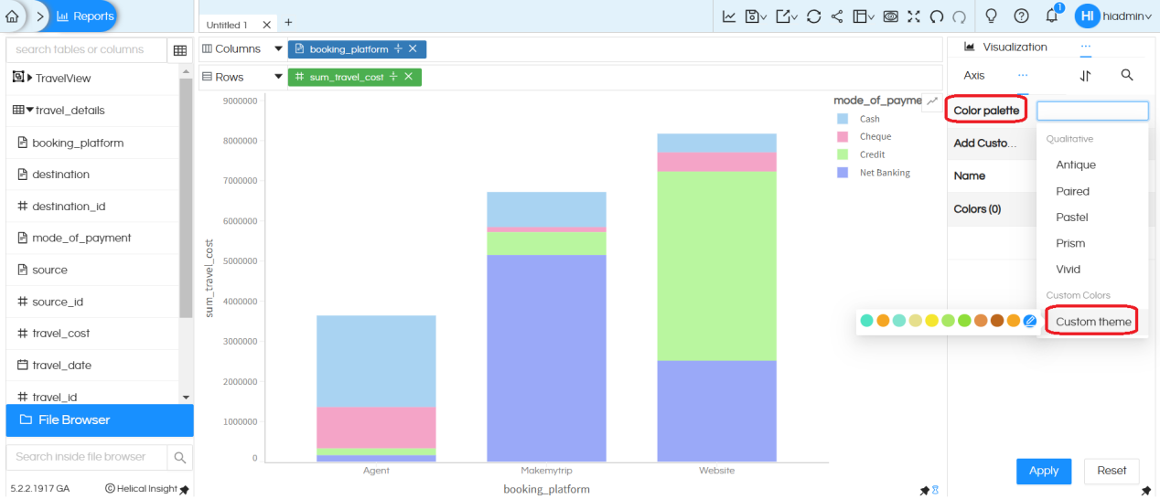
After selecting the custom theme, click on ‘Apply’
Note: This color palette property is applicable to Grid Charts and Charts, but not to table, crosstab, or grid table.
For Grid Charts, it works with dimensions in the Marks.
For Charts, it works with both dimensions and measures in the Marks
If we select the color using both the ‘Color‘ property and also using Color Palette, then ‘Color‘ property overrides the color palette theme.
