In this blog, we shall see how to create a stacked bar chart in Helical Insight.
To create stacked bar charts, the first dimension (shown on the axis) will be the first column. Each data item to be shown in the stack should be shown in separate columns. Hence in certain cases you might have to manipulate your data accordingly.
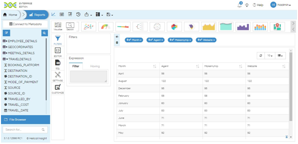
Lets say if you want to show the monthly sales on different booking platforms (where the stack will show the distribution on different platforms), the tabular report will be as shown in the image:

Click on the Stacked Bar Chart icon in the visualization ribbon. You can use arrow icon to navigate to that chart or use search option as well to search for Stacked Bar Chart.

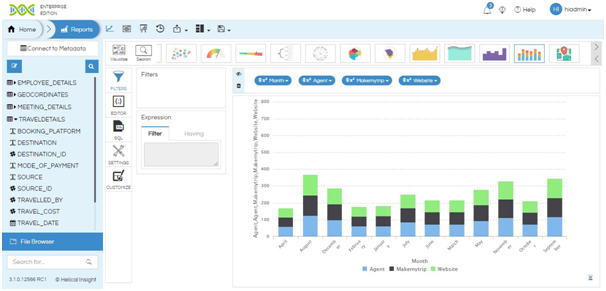
The stacked bar chart is created as shown below.

