These, as the name suggests, will be applicable for your axis charts like: Line Charts, Bar Charts, Area Charts etc. These options help you to manage your grid and axes of your charts like you can do things like enable disable grid lines, rotate the axis tickes by a specific angle for easier readability, specify the range of the axis etc.
You can use these options under Properties section.
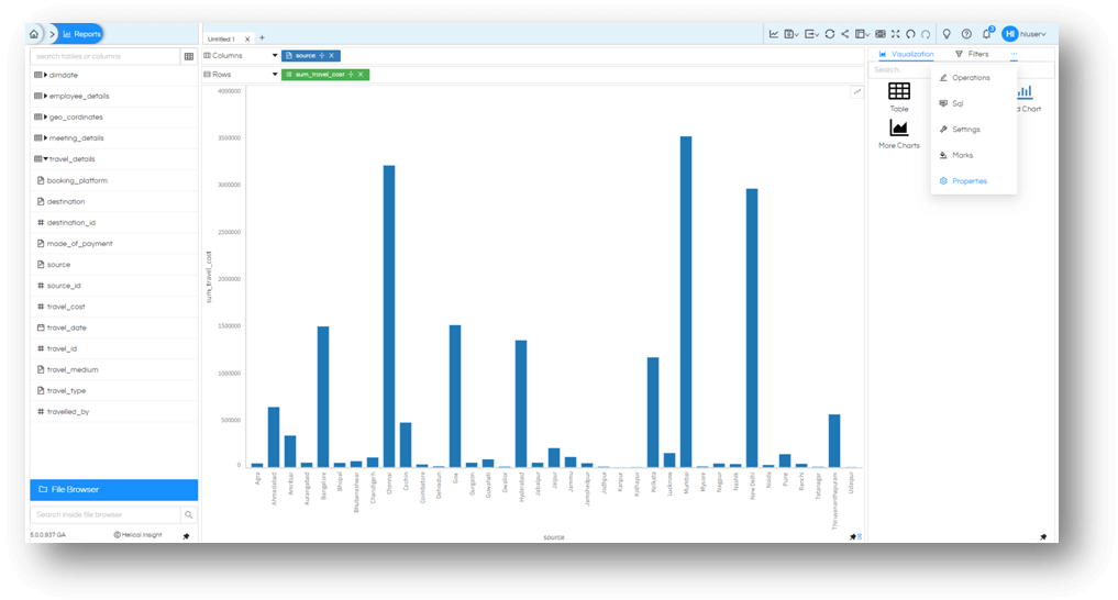
Then choose the meatball icon again and select Axis.

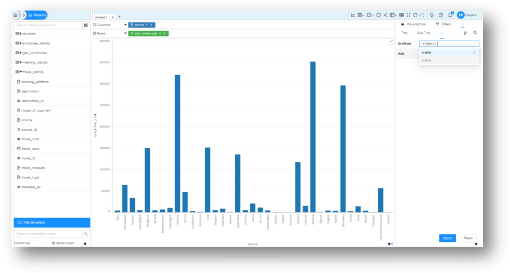
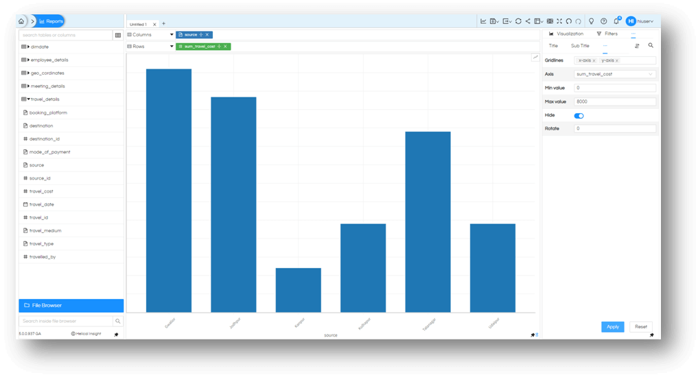
Once you are at this module, you will have option to enable or disable gridlines for X-Axis or Y-Axis or both.
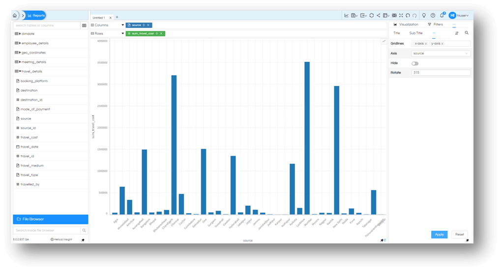
You will also have option to control your axis tick marks and ranges for measures or hide the axis altogether. For dimensions you can control the values on the axis by rotating it as you may seem fit for your needs. You can enter both positive and negative values. Like Source in this example, we have enabled rotation of 315° (or-45°).
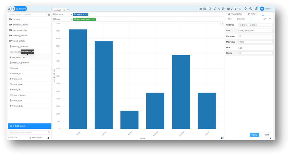
In case of Measures like sum_travel_cost in this example, we can also control the range of the axis.
If you want you can simply hide the axis altogether.
These gives you precise control over how your axis charts will be rendered. Use it to your advantage only with Open Source BI product Helical Insight 5.0 onwards.
