In this blog we are going to cover and provide an overview of dashboard designer module. The dashboard designer module of version 5.0 has undergone major changes making the entire process of applying filters and making reports listen to it much more simple, handling the resizing without affecting the alignment and much more.
Adding Reports to Dashboard
To begin with, let us select the Dashboard Designer module from the Navigation Bar. It will load a blank canvas for you. With the “Tool Shelf” on the top left
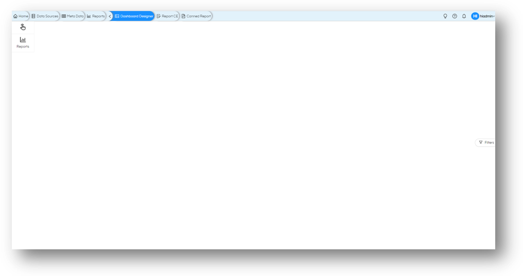
We shall start with selecting the reports that we need to be part of the dashboard.
Click on Reports on the Tool Shelf and navigate to the reports. Simply drag and drop the reports on the dashboard. (Alternatively, you can double-click on the reports to get added to it). The reports will get added as per the default settings of the dashboard. Let us add all the reports that we need for now, we will see how to use this space more effectively.
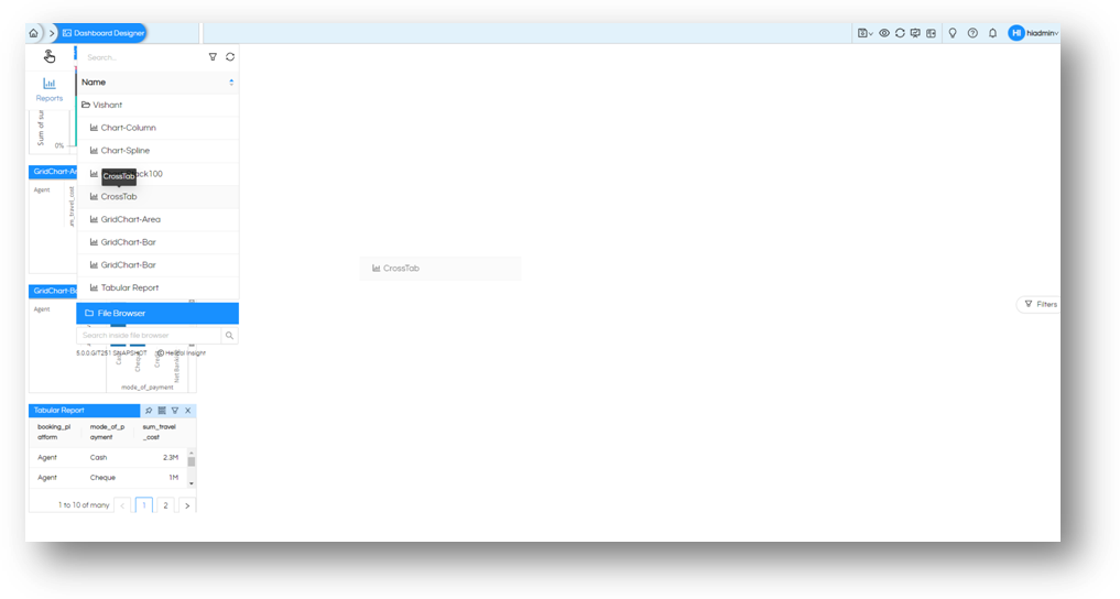
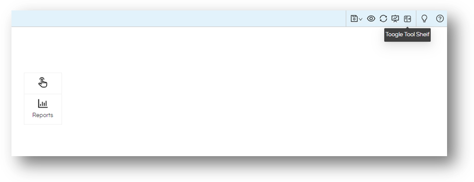
As you start clicking the reports will get added. In case if “Tool Shelf” is interrupting, we can either drag the tool shelf out of the view and place it at another location using the Hand icon (above reports) to pick up the tool shelf and drop it at convenient location. For now, we shall close the tool shelf from the taskbar on top right as shown on the image. (You can always switch the tool shelf back on and add more reports as and when needed.)
Layout: Resize and Reposition
Once we have the selected reports, we can plan the layout of the dashboard. Resize and reposition the reports as per the requirement. To reposition you can simply drag and drop to the new location. To resize it you get a handle at the bottom right of the report as shown in image.
Reposition (drag and drop)
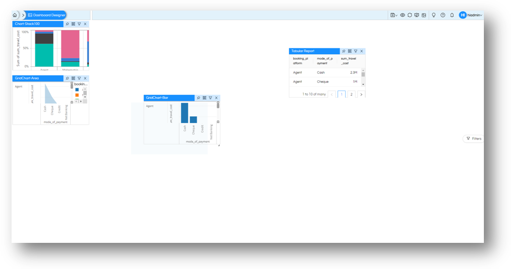
Resize (Click and drag the bottom-right handle)
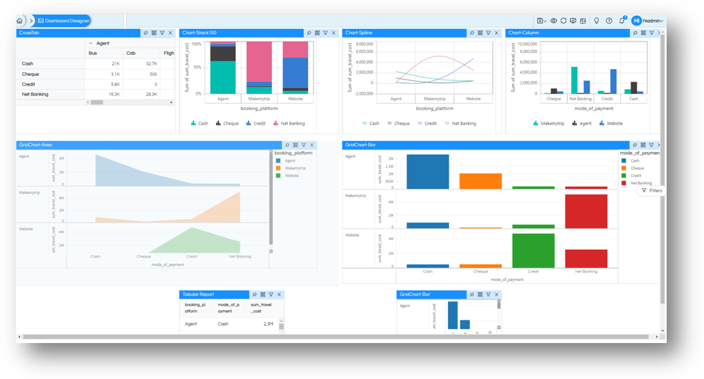
Besides drag-drop, another way to arrange the reports is via “Alignment” option. Using this you can precisely position and size the reports (and other objects) on the screen.
To access “Alignment” option, right click on the report which needs to be aligned. You can specify the starting point of the report from Top and Left of the dashboard and you can specify the height and width of the report.
NB: that if the objects tend to overlap each other, the dashboard may not allow it. If you are dragging and dropping, then the shaded area will decide where the report will actually drop off. If you are doing via Alignment option, the existing report will be pushed out (and all reports in the way will be shifted accordingly)
There are various other right click operations like Header, Shadow, Border, Alignment, Settings, Filters, Advance etc which can be used for various operations.
Dashboard Filters
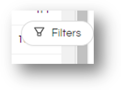
Next important step is to make the Report Filter as Dashboard Filters. Process of adding and applying filters have been simplified in Helical Insight. Let us get started with it.. While you are editing the dashboard there is button to open the Filters on your screen
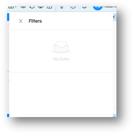
On clicking you will see the Filter panel. This panel will be shown to the users of dashboard. (If your settings are default, it will be on right side of the dashboard.)
Check on any report that has filters, and on top right there is a filter button. If you move over to the filter button the list of filters that this report had, will be listed. Click on any of the filter to make this as a dashboard filter. You will get the confirmation message, and if your Filter panel is open, you will also see it gets added to the panel immediately.
Alternatively, you can right-click on report and select Filter from the menu. You can select your filters from here too.
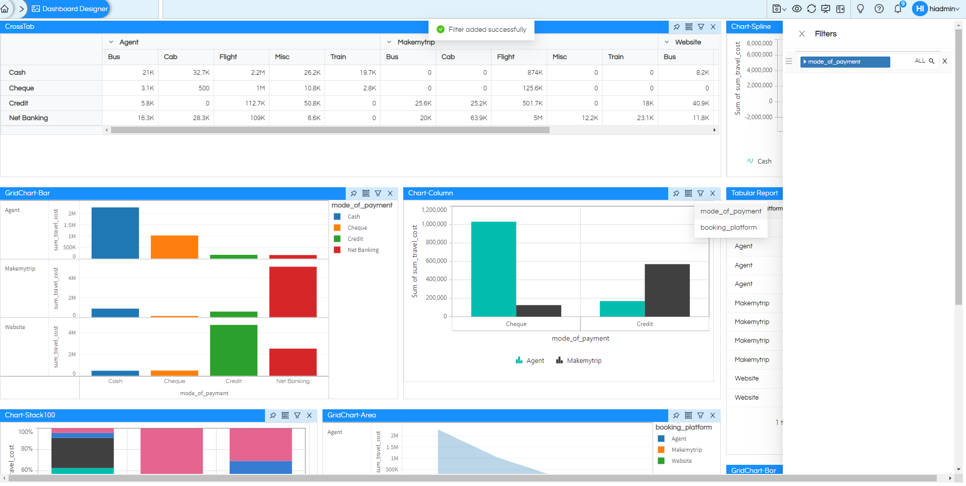
Now any report which have this filter, will listen to values of the filter from dashboard and change automatically. There is no need to do anything else. You can add more filters as per your need.
Try changing the values of the filter and see the effect on this report (and any other reports that had same filter). As you can see in the below image there are multiple filters,
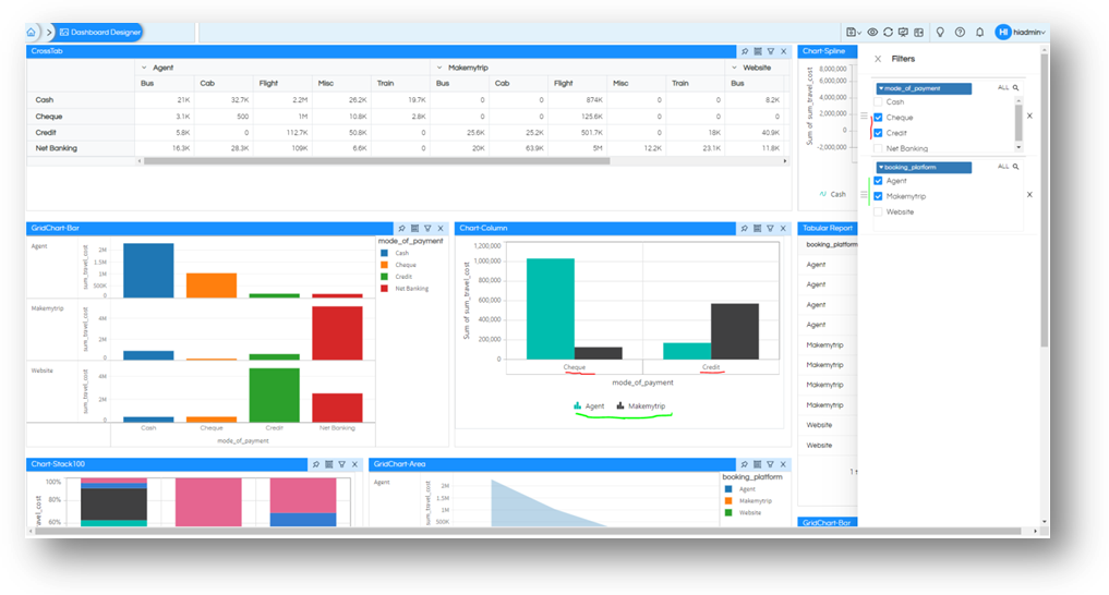
To know more about Dashboard filters, changing location of filter panel, enable disable “Apply” option by default and more. Read here.
Customization and Settings
By default, when you add the reports, they have the headers as their names you have saved them with. This is changeable and also there is more to it. There are lot of customization available via-right click. Right clicking on report gives you additional option for the report. Right clicking on dashboard (empty space outside the reports) will show you more about the options on dashboard.
Try right-clicking on a report. This gives access not only to changing “Header”, but also other customizations like “Border”, “Shadow”, “Background”, “Alignment”. Further, “Settings” of the report, “Filters” of the report “Advance” features to add your custom code (HTML, CSS or JavaScript codes) can also be accessed.
Dashboard gives you additional options to access Dashboard level “Settings”, “Grid Settings”, “Filter” settings. This gives you entire control of the dashboard. You can specify how to divide the screen area into columns or rows and now precise should the divisions be. What should happen on screens of different sizes (for mobile users, tablet users, etc…) Where should the Filter panel be. When you add a new report where should it be added on dashboard. Read more about alignment, usage of columns with alignment click here.
To know more about them and how to use right-click operations, read here.
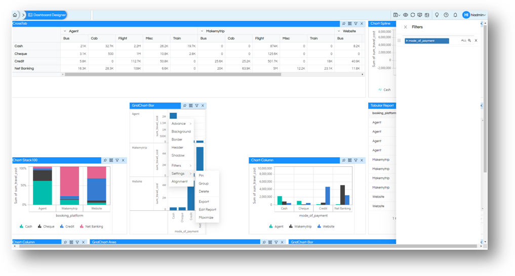
Taskbar
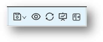
Before we finish our discussion. Let us take a look at top right of the screen, at the “Taskbar”. Same place we switched off our “Tool Shelf”, we also have option to “Save” our work. Do not forget to save your efforts before you leave.
You will have additional options to “View” the dashboard as a user. View dashboard as on different devices. Or refresh the dashboard with the latest on reports. There are other options like “Refresh”, “Preview” as well through which you can refresh the dashboard to see latest data as well as preview the dashboard to see how it is looking now.
Thank You,
Helical Insight
