In this blog we are going to provide a high level overview of the self service report creation interface of Helical Insight 5.0. For every sub functionality there are detailed documents which can be referred to. With version 5.0 onwards we have introduced a new version of reporting interface whose description we are going to provide here.
Pre-requisite: You already have created a metadata with the tables and views that you need for reporting purposes.
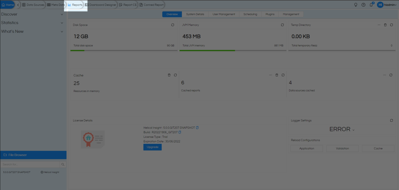
Step 1: Open the reports module
In HI-5 the reports module can be accessed in multiple ways. For now, let us expand the navigation bar and select ‘Reports’ as shown in screenshots
Step 2: Select the metadata
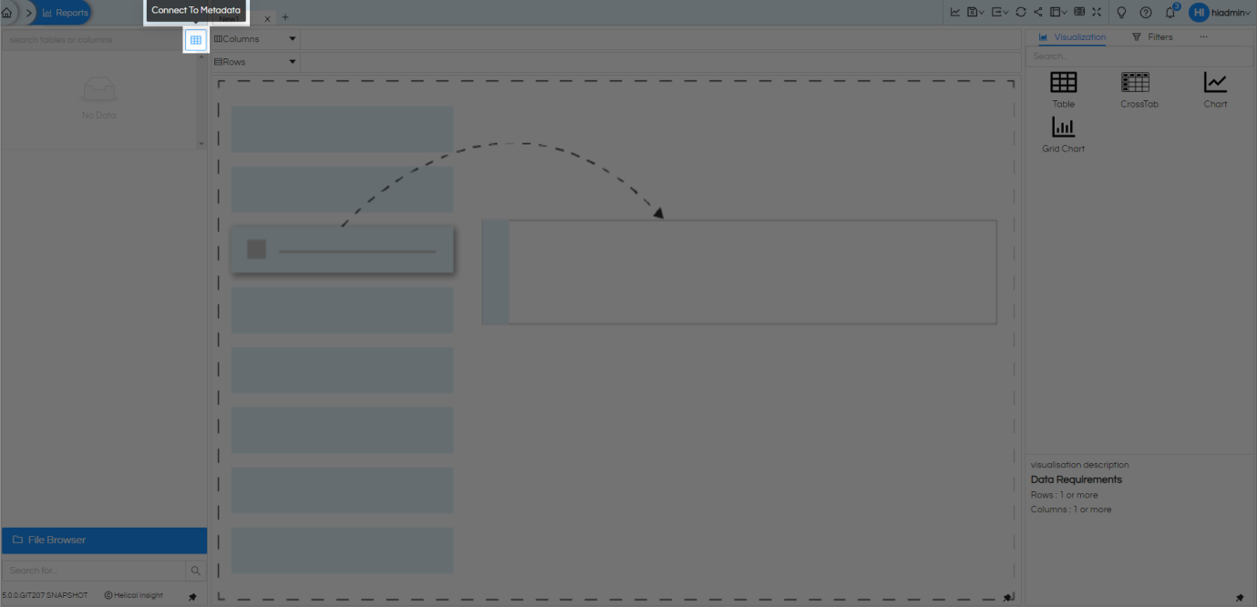
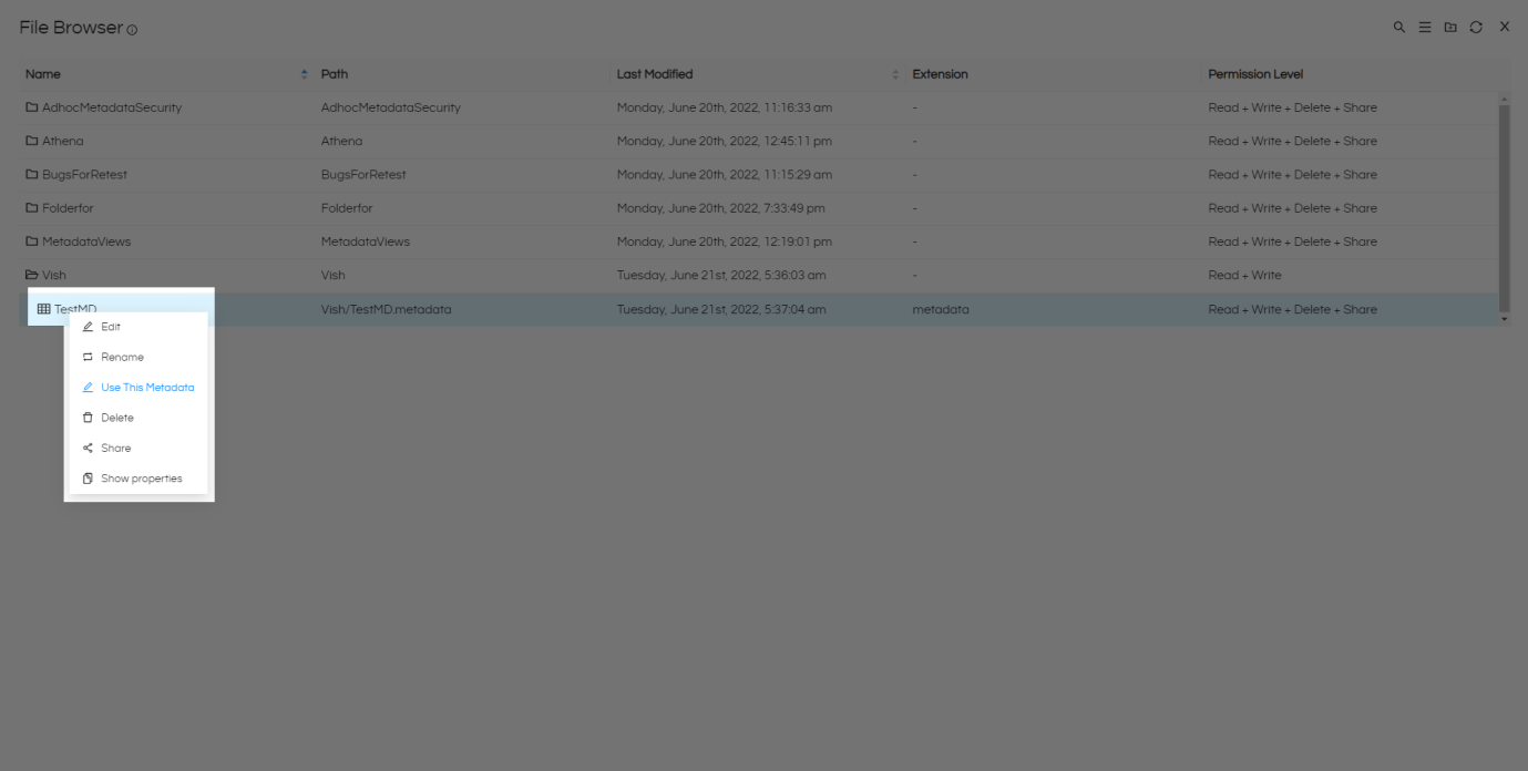
Once you are on the Reports module, it sets up for you to start creating new reports from the existing metadata. This will open the File Browser specifically for metadata files. Select the metadata you have already saved. We shall select the metadata we have created from sample database. Once you have found and selected the metadata file, simply double click; or right click and select ‘Use This Metadata’ in the option
Step 3: Selecting the columns for report
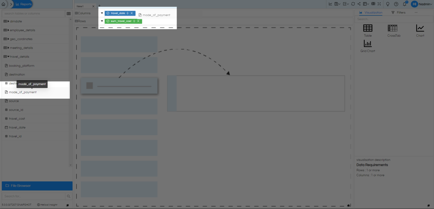
Once we have the metadata, we can simply drag the available fields as per need and place them into Rows and Columns for this report. Further, you can right click on fields and add them to Column or Row, there are other options also which are visible when we right click on the field like Add to marks, Add to Filters as well.
When a field has been dragged there, there are a lot of other functions which can be applied like
- Sorting
- Aggregate functions
- Apply before Aggregate
- Groupby
- Functions
- Hide
- Fetch and Hide
Step 4: Generate a basic report
Once you have selected the columns and rows for the report. Click on Generate button to get the tabular view of the report. This is your basic report in tabular format, without any filters or parameters and visualization. Upcoming steps will be to customize it further to get exactly as per your business needs. Continue reading further.
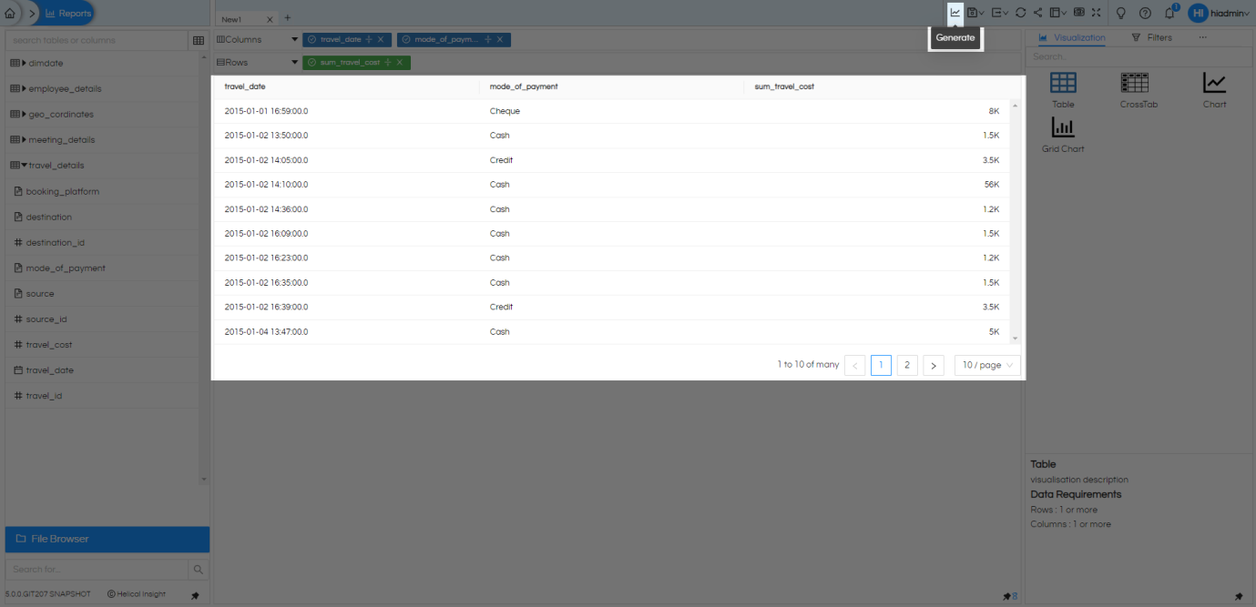
Before we move further, lets take a look at our selected columns and rows for a moment, and understand about it.
- By default, all selected columns are aggregated and used. Report can be formed either by having all aggregated columns, or all direct database values. We cannot have aggregation on few columns in the report.
- All numeric (integers, float, double, …) are considered as measures. All non-numeric fields (date, string/text, …) are considered as dimensions. This can be changed as per the needs.
- Before applying any visualizations or adding any filters it is recommended to have a tabular report generated so that we have something to work on as we go along.
- If the list of available fields is large in metadata, system by default apply pagination and loads only few fields for selection (when being viewed in the tabular report). You can go down the list and click to load more. This reduces the load on database server and improves performance.
- Once the list of fields is on screen you can save time by searching it on the metadata panel directly. This will search in whole metadata and find all fields or tables matching with search string, as you type it.
- Among the selected fields in this report, you also have many options, if you click on the arrow button next to Columns or Rows, you will find an easy way to Remove all fields in that area, Swap column and rows, create a Custom Column(s) when you have some calculations to be performed instead of displaying a column value directly. If you have certain column hidden from the report (Hide), you can reveal to see those columns too with these options.
Okay, now that we understand more about the reports and the column selection process. Let us make this flat, tabular report into more usable information by applying some visuals.
Step 5: Applying Visuals
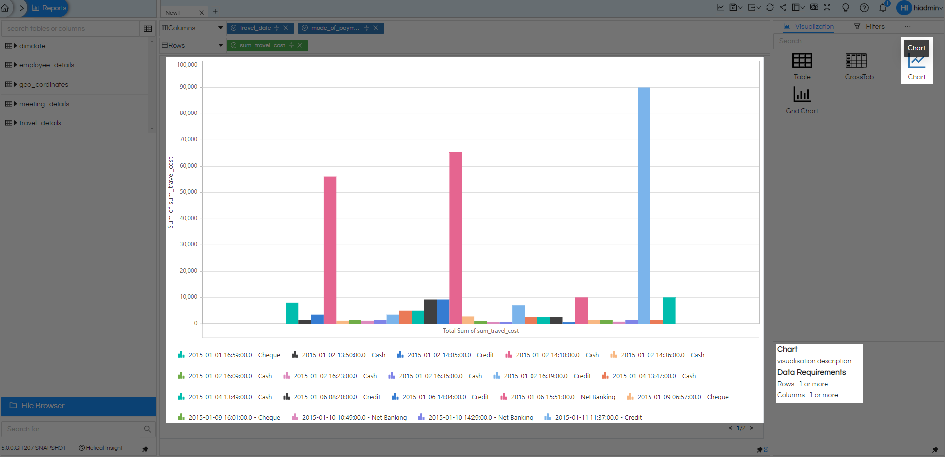
Once you have the data in raw tabular format which is generally the direct output of SQL query. The next thing is to make it appear in the way we want to see it. Visualizations are on the panel to the right and we have options like Table, CrossTab, Chart, Grid Chart which can be used to create some basic visualizations for your reports. Let us select the select Chart. With just one click your tabular report will become a colourful chart.
Please note that every visualization has some field requirements. The description of visualization and data requirements are shown at the bottom right section (like a grid chart should have atleast one field in rows and columns). If your selected fields do not make up to the requirements, you may not be able to generate that visualization.
Step 7: Filter (often called as Input parameters also)
Most of the times, if not always, we do not want to see the whole of the database on the report. We will want some kind of filtering of the data based on needs. For example if we are seeing the sales report we may want to have filter to see it for specific location, specific salesperson, specific time period etc. Let us apply some filter to our current report.
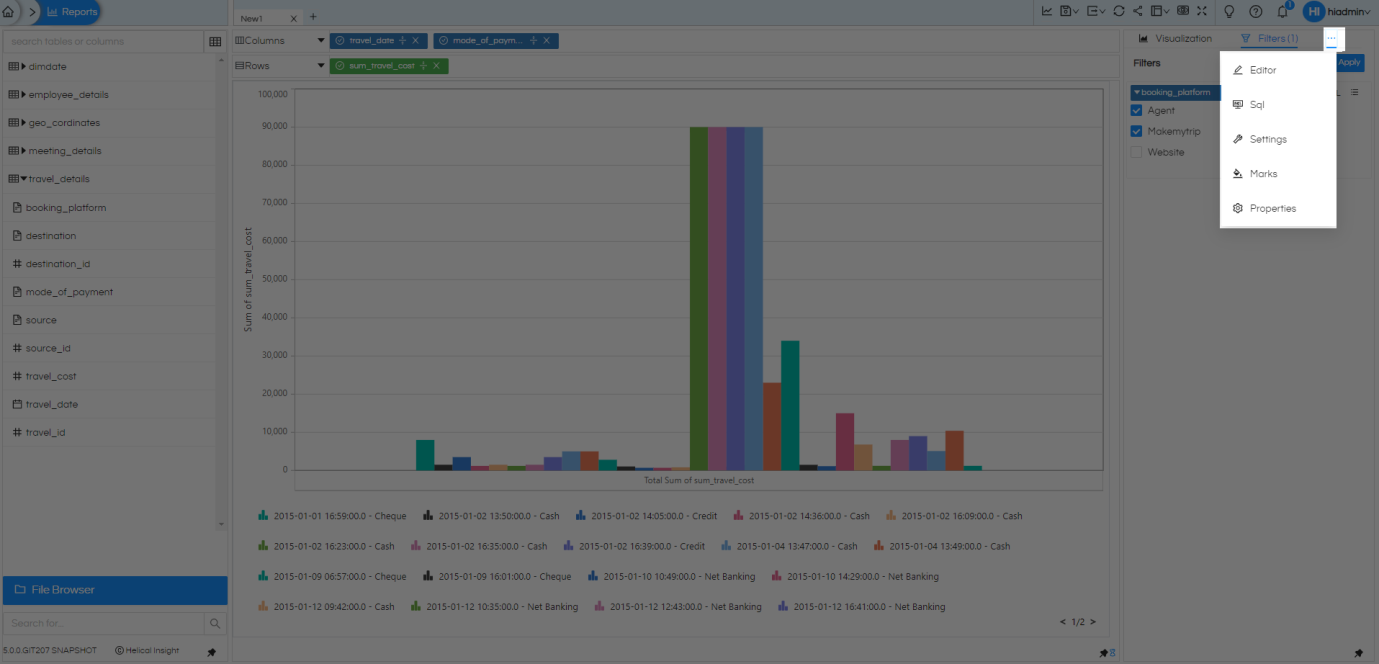
Note: If your screen width allows, you will see Filters option next to visualization. Otherwise, not to worry, you will have meatball menu (the three dots) next to Visualization. This menu option will give you more options within the reports for your various needs. Let us first see the ‘Filters’ and we will showcase more. Let’s select Filters for now.
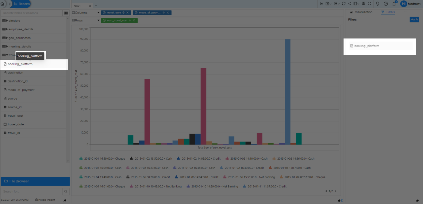
To add filters, you can drag fields in the Filters area or select intended field, right click and select Add to Filters. Once you have the filed in the right place, it will fetch the available values from database and show you the check boxes. you can simply make selection based on your needs and apply. If you want to select everything, there is shortcut next to filter name as ‘ALL’ (not selecting any filter value also behaves similar to selecting ALL). You may use it, and it will apply all values and disable any selection in the checkboxes. Next to it there is a hamburger icon with many more options like filtering conditions, advanced filtering options, cascading filtering, filtering value selections for date kind of data etc.
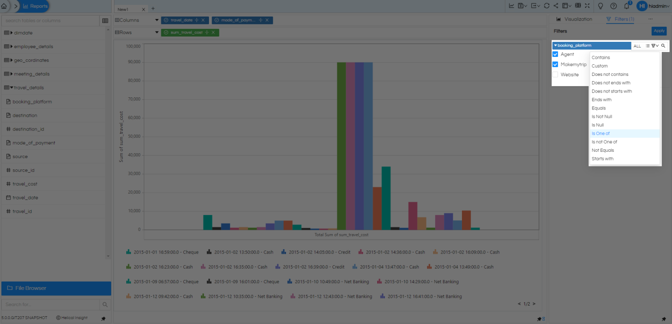
The above is the process to give you a basic filtered report as per your needs, most often this is what clients use. But this is not all, Helical Insight self service reporting interface give you a lot more than this.
- There is an option to add custom JavaScript and HTML CSS in CSS placeholder of Editor. Read more.
- SQL: This shows the SQL which is getting generated based on column and rows selected, aggregation and functions that are applied, filtered columns and anything that is restricted by metadata or other places. Note that this is SQL viewer only, you can not edit the SQL query which is getting generated.
- Settings where you can control the sample size i.e., number of rows SQL needs to fetch, or if we need to run report on whole data. We can also change metadata to point it to some other metadata. Read more
- Marks can be used to change the visualization as well as update your visualization look and feel based on needs. This feature depends on the selected visualization. Not all visualizations will have same options. Read more.
- Properties of current report like fonts, padding, spacing and positioning etc. Read more.
- Further, you can click on (+) and open simultaneously multiple reports tabs inside the application. You need not to open multiple browser windows for this anymore. Note that more than 4 tabs can not be opened at the same time in a single window.
- At the top we also have options like
- At the top we also have options like Generate (used for generating visualization after making any changes), Save (save the report), Save As (save a copy of the report – file browser opens to do the same), Export (in options like CSV Excel), Cache Refresh (to show the latest data from the Database – learn more here), Share, Layout (change layout by hiding various components like Metadata shelf, Tools Shelf, Fields Shelf), Preview, Full Screen, Tutorial, Help, Notification.
- The reports created from this self service reporting interface are saved as extension .hr

Thank You,
Helical Insight
