The basis of everything on dashboard is the grid settings for the dashboard, it should be the first setting one should visit so that we can make sure that dashboard works the way we expect it to be. Let us understand what these settings are and how do we make use of it.
Right-Click on dashboard and in context menu find Grid Settings. You will have 3 sub-options in it viz: Breakpoints, Columns, Grid. All these options together will make your grid be usable and will give you lots of options for establishing controls on your dashboard layout behaviour. Let us start with Breakpoints
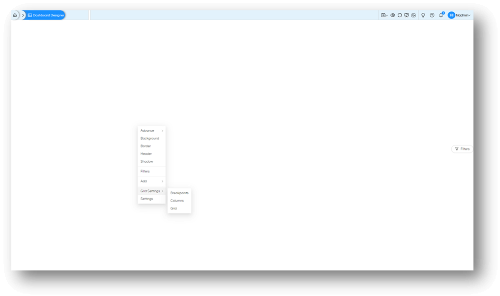
Step 1: As mentioned above, right-click on dashboard (in blank area of dashboard, not on report or any other object). On context menu select Grid Settings, then select Breakpoints. This will open the drawer (panel) with 5 screen options.
Step 2: This is the place where you define screen sizes based on pixel values. In the below example we are keeping Large Screens as 1200 pixel wide. This means whenever the user is viewing dashboard on screen of 1200 or more pixel, the settings of “Large screens” will get applied. Similarly, there are total of 5 different screens that you define.

Step 3: Once you have defined your screen calculations, you can move to next set of settings Columns. You can go back to dashboard and right-click and follow the menu to open the option. Alternatively, there is a simpler way to switch between drawers (panels). The Global Menu button can be used for this. Select Grid settings and Columns.
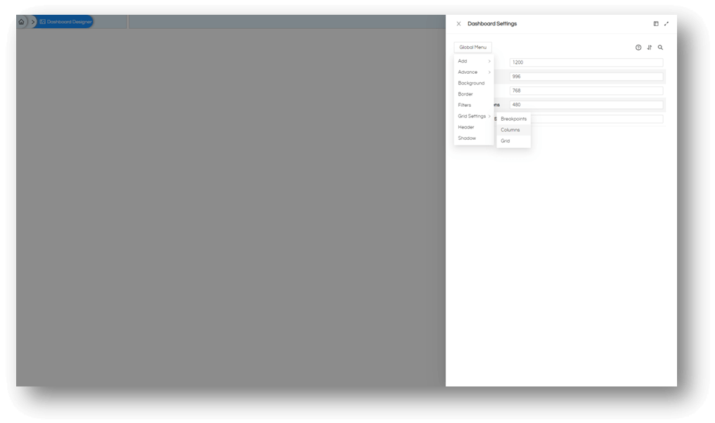
This is a quick way to switch between different options for dashboard (or any object under consideration).
Step 4: Based on the way you have defined the screens; you can now divide the screens into number of columns. In the below example, the Large Screen is divided into 24 columns. A viewer of this dashboard with large screen will see 24 columns of information. If the same dashboard is open on a Medium Screen the dashboard will adjust itself and show only 12 columns of information while the second half of the screen (out of 24), will be rearranged and shown to user on smaller screen accordingly.
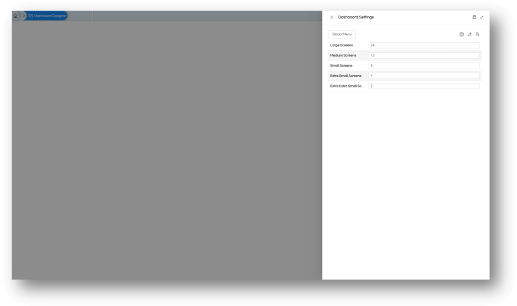
Thus, it is quite evident that Breakpoints and Columns settings goes hand-in-hand.
Further to note, that the precise width of a report will be calculated based on number of columns, it can be 3 column width, or 4 column width, but nothing in between. If you want to have a granular level of control of sizing, this can be controlled with hight number of columns, but ensure you understand how will it be rendered on smaller screens.
Step 5: The third set of Grid Settings is Grid. Again you can open it from Global Menu or from dashboard directly.
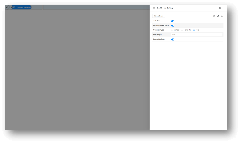
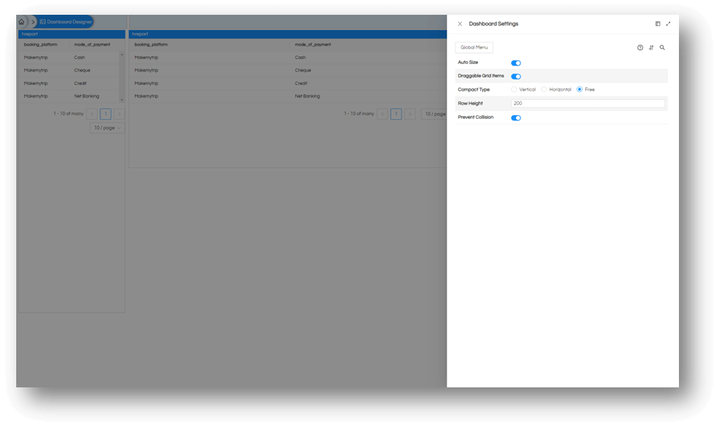
Step 6: The settings available on this drawer (panel) are
- Auto Size: this is a switch based on your needs you can let the system auto-size objects for you based on screen settings
- Draggable Grid Items: this is a switch if you want to enable drag and drop feature of the dashboard, or want to disable it.
- Compact Type: this tells the system, if there is space available to the left or to the top how the system will compact the objects and reduce the total space consumed. If you are aligning some reports away from top and/or left margins, this is the place you will change.
- Row Height: This defines the unit height of the objects defined in pixels, in the above example it is 100 and if the object is of 2 unit in height, it will be displayed for 200 pixels in height. If the unit is set to 200 pixels and it is 1 unit length, it will have same output but will have different calculations for your alignment options as shown below. You can gain precise control over height of reports with this parameter.
- Prevent Collision: This is the switch which tells system regarding overlapping objects, if while dragging something is going on top of each other you can prevent such collisions and let system stop you from disorienting everything on dashboard.
Thank You,
Helical Insight

