Map visualization enables users to analyze and understand spatial data in visual format.Map in Helical Insight tool allows user to represent geographic data, by plotting data points on maps which might remain hidden in tabular data.
Prerequisites to work with Map visualization in HI version 5.1.0 :
1. To generate map visualization we need GeoJSON data of countries,states and cities ,etc.
2. To create map report user needs to add dimension field in column/row shelve which is having geographical data in it.Also we can use co-ordinate fields (Latitude and Longitude) to create map visualization.
Note :For generating report with latitude and longitude fields , both the fields needs to present in the report , if any of the field is not present chart will not get generate.
3. After adding field into column/row shelves user needs to set Geographical role to field as per data.
Follow below steps to create Map visualization :
1. Connect to any metadata in Report module and add any dimension field which is having GeoJSON data in it.
2. For.Eg.here we are creating map report with Cities data.Add ‘destination’ field in column shelve.
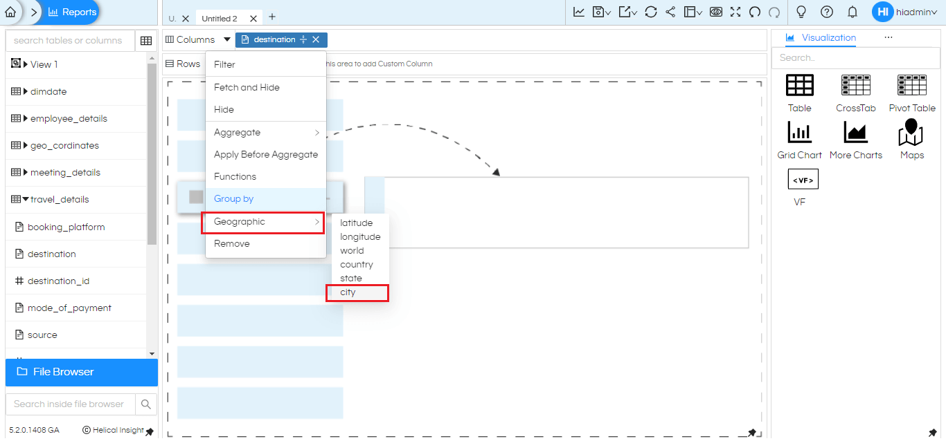
3. Click on ‘destination’ column and click on ‘Geographic’ and set role as city.Similar way you can set role as per data present in field (world,country,state).

4. Now click on ‘Map’ in visualization tab.The map report will create by plotting cities data.
5. User can generate three types of sub-visualization under map such as Point , Line and Heatmap.
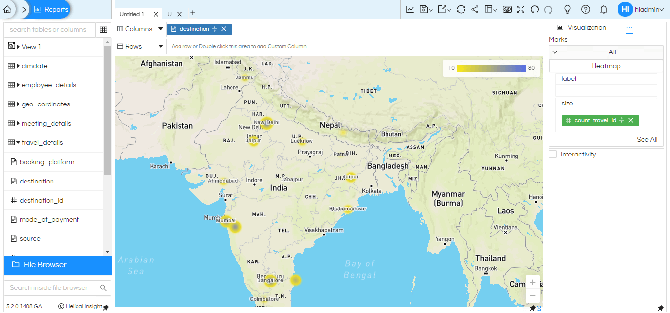
6. Here we creating sample example of Heatmap under Map visualization.
7. To create Heatmap in map Size mark field is important.Hence add ‘count_travel_id’ in size mark field and regenerate the chart.We can see that map is generated with count of travel id’s for each city.

Similar way user can create different sub-visualizations under map like Point and Line by providing required configuration and customize the map chart by using Report properties.
Thank You
Kedar Ingale
Helical Insight
