Line chart (like bar, line, area etc) is a graphical representation of data based on statistics and numerical values. An axis chart uses the 2 axes- x-axis and y-axis to. One of the axes represents the category which we call it a Dimension, while the other axis represents the numerical magnitude of the observation which we call as a Measure.
Please note that the below properties will not only work for bar chart but it will work for any axis chart i.e. line, bar, area etc. Also it will work only in case of “Grid Chart” and “More Charts”.
Based on structure of bars and number of parameters we can show bar in following ways:
- Stacked
- Grouped
- Percentage
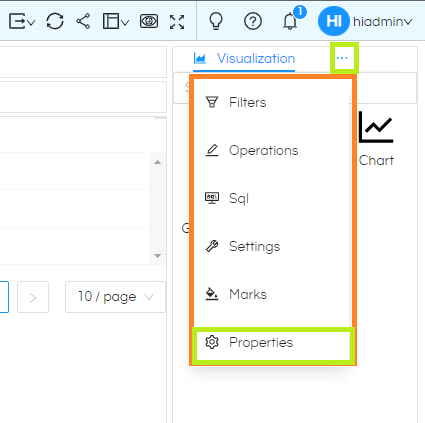
So to see bar in different format on report, first select the meatball icon on top right. . List of additional menu options will appear. Select ‘Properties‘ from this list.
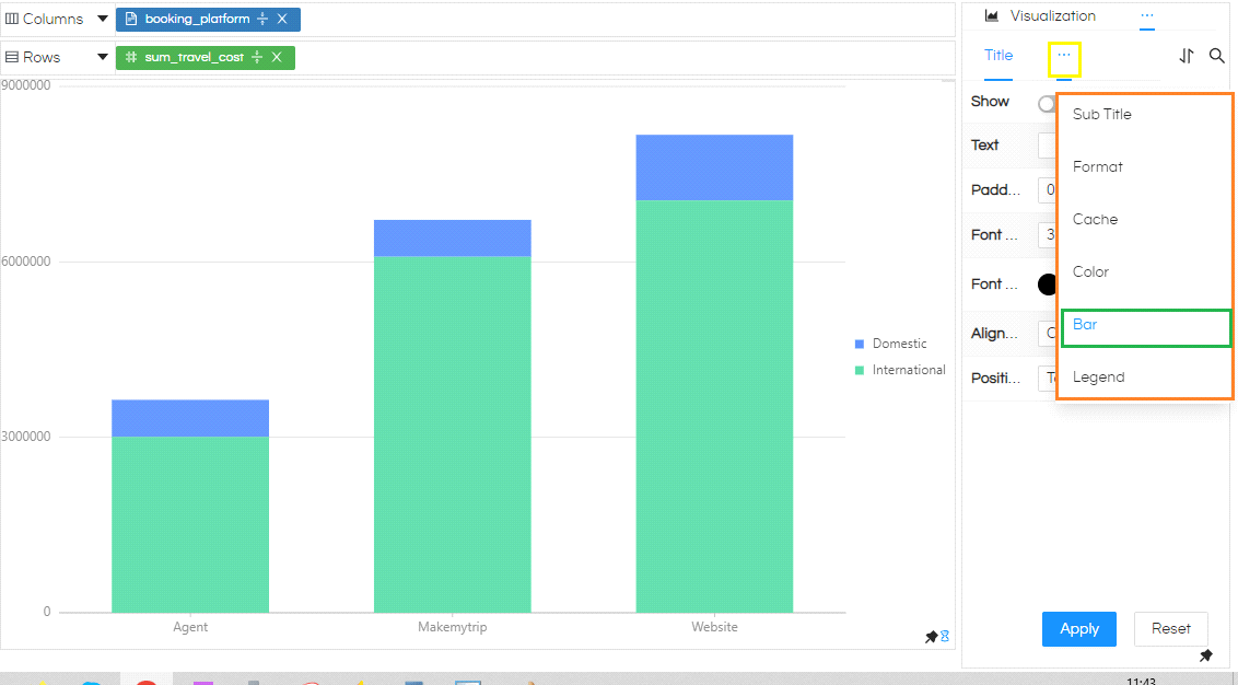
Again, select the meatball icon within properties in front of Title. A list of additional options for Properties will appear. Select Bar from here.
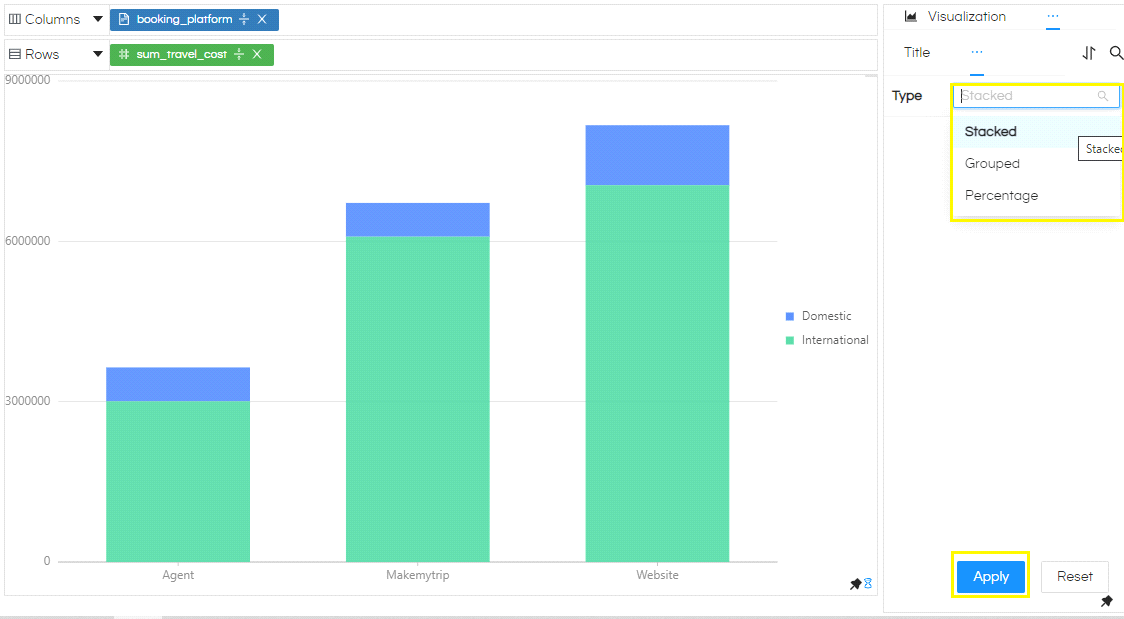
After selecting Bar, on the right we can see Type of Bar Charts i.e, Stacked, Grouped and Percentage. By default, it is always Stacked Bar Chart. In stacked bar chart, all the values are stacked on top of each other. In the example report below, travel_cost for both travel_type are stacked on each other for all the three values of booking_platform.
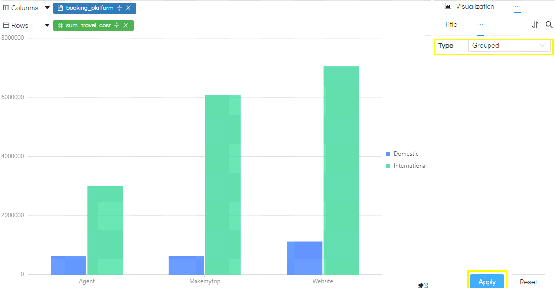
For Grouped bar, a separate bar will be for each parameter will be shown next to each other as in the image below.
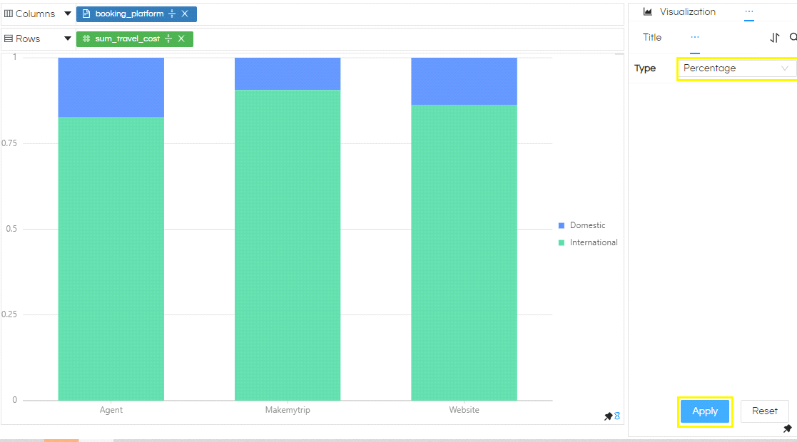
The third way in which the Bar chart can be shown is Percentage bar chart. Where the stacked bars fills up till the top where each value contributes based on contribution of their value in the total. In the below image, on the y-axis the values range from 0 to 1. Here for each value in booking_platform, percentage of expenditure by each Domestic and International travel_type is shown.
Reset will reset the report to original status i.e, Stacked Bar Chart. Always remember to select Apply after choosing Reset.
NOTE: From version 5.2.2, a new property has been added . Via using this property in case if you can specify the width a bar chart can have. This is not applicable to Grid Charts. For normal Charts, it is applicable to horizontal charts as shown in below image.
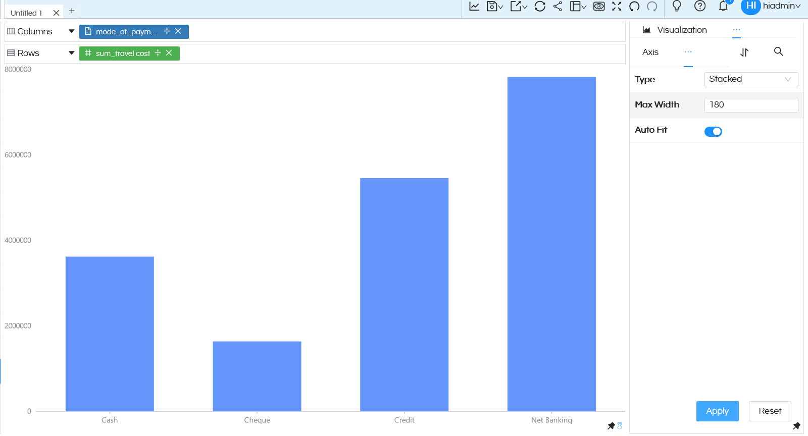
Max Width: Generally bar charts width is assigned by default by chart itself (which is also recommended). But in case if you would like to manually specify the width, you can specify it here by Max Width property. Maximum max width property can be only 180.

