In this blog, we are going to cover how-to Align reports in Dashboard Designer as well as the other advanced options of grid settings which can be used along with alignment
Using Alignment option with respect to Grid Setting’s column we can easily set the component’s height and width alignment for screen size which will look good in the dashboard, or another way you are free to resize and reposition the report as per your need.
Alignment Option: There are two ways of aligning a component
Method 1: first one is when you hover over a component at the bottom right of the component you can see option of sizing as well as simply clicking on the component and placing it wherever you would like. This is an easier method but it might not allow you to have very granular pixel perfect control.
Method 2: When you right-click on any component (not on the dashboard background) you will get an Alignment option. The alignment option allows you to set the position of the panel as well as the size of the component (Grid-Top, Grid-Left, Grid-Height, and Grid-Width). Grid-Top specifies the position from top, Grid-Left specified the position from left, Grid-Height specified the height of the component and Grid-Width the width of the component. Note that the numbers in alignment are not in terms of pixel, rather it is in terms of columns (more details below). Here we specify the number which works in conjuction with Grid Settings > Columns portion explained more below.
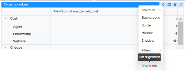
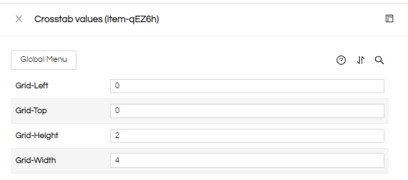
The height and width specified here has to work in conjuction with the column settings (using Large Screen, Medium Screen, Small Screen, Extra Small Screen, and Extra Extra Small Screen). So, let’s start here to understand how we can set the proper alignment as per Grid Setting.
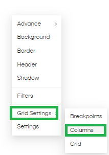
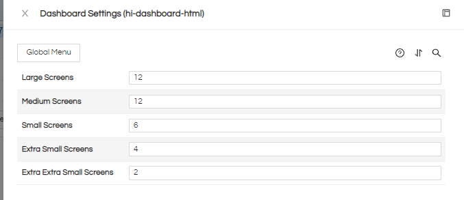
When you right-click on the dashboard background here you can see Grid settings, this Grid-setting has Column options, here five options are available as per the columns, these options will help to set the proper alignment as per the screen size.
Large Screens: By default, you can see that large screen has 12 columns, now if you add 3 reports and every report has grid-width of 4 then it will become total 12 and occupy entire width. All the reports will come in a single row. Whereas in case if you had specified Grid-width of each report as 6, then first 2 reports will come in one row and third report will come in second row.

For width use right-click on that report to set the alignment like this, each report is divided equally. Now, this is all set as per the large screen size.

This is working for your selected screen as well. If you would like to have some margins on the left and right side then you can accordingly leave 1 column space and have Grid-Left as 1.

You can have more number of columns also, that will allow you more size wise granular controls.
- Medium Screens: This will work the same as the Large Screen size because here also we have specified 12 columns.
Here also you can increase the number of columns and accordingly change the grid-width being assigned for more granular control. If you would like to have some margins on the left and right side then you can accordingly leave 1 column space and have Grid-Left as 1. - Small Screens: By default, the small screen has 6 columns which means that may be we can put 2 reports and each report can have width of 3, since 3=3= 6 columns both the reports will come in a single row.
Here also you can increase the number of columns and accordingly change the grid-width being assigned for more granular control. If you would like to have some margins on the left and right side then you can accordingly leave 1 column space and have Grid-Left as 1. - Extra Small Screens: Similar way by default, the Extra small screen has 4 columns, and we can have 2 reports each with the grid-width of 2. So both of them will come in a single row. If we increase the grid-width of those reports to say 3, then they will come in two separate rows. we can use this column for Ex (2*2) =4. Here we are selecting 2 reports and now we are going to divide these two reports as per Extra small screen size which is 4 and Grid-width will be 2*2 for two reports
- For width use right-click on that report to set the alignment like this, each report is divided equally. Now, this is all set as per the small screen size.
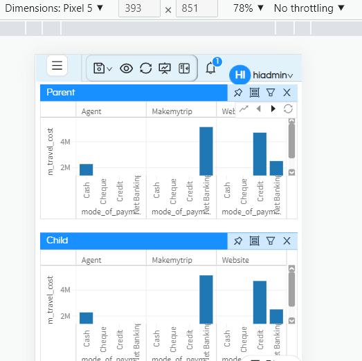
Here also you can increase the number of columns and accordingly change the grid-width being assigned for more granular control. If you would like to have some margins on the left and right side then you can accordingly leave 1 column space and have Grid-Left as 1.
Specifying the definition of screen sizes
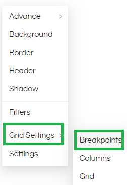
Grid Settings has another Breakpoints option as shown in the image. It comes with a default values (in terms of pixel) of what a screen size is. You can also custom define your respective screen sizes as well over here. For example if you are going to view the dashboard in big screens like TV or projectors then these settings would be more useful, in most of the cases there is no need to change these settings:
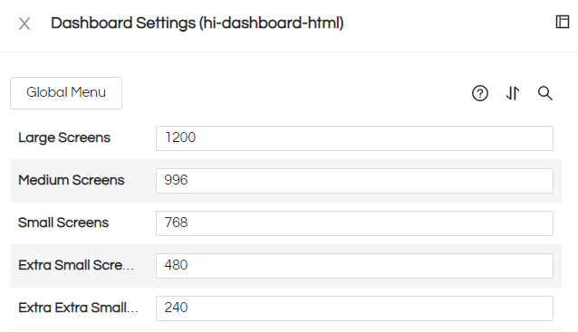
Large Screens: This setting will be used for large screen, any screen having more than 1200 pixels will be categorized as large screens and will be using the will only use for the large screen like a projector and the value should be always greater than or equal to 1200.
Medium Screens: This will only use for the medium screen like an iPad and the value should be always greater than or equal to 996.
Small Screens: This will only use for the small size screen like Android Phones and the value should be always greater than or equal to 768.
Extra Small Screens: This will only use for the Extra size screen and the value should be always greater than or equal to 480.
Thank You,
Helical Insight

