In Open Source BI Helical Insight application version 5.2 onwards, we have also started providing support of Maps visualization. In this document, we are covering how to create map based on different criteria andvarious configurable properties of map.
NOTE: By default, we are using Map Box plugin for map visualization in Helical Insight. If you will not configure the access token from Map Box into properties file then map will still generate, but you will not able to see any layers (like the background) and map will look like this:
In order to add the layers, it is mandatory to configure access token into our properties file.
From version 6.1.0.826, we are supporting two mapping engines within the product.
(A) First one is an open source map called as OSM Or OpenStreemap. Click here to learn how to configure and use OSM maps.
(B) Mapbox : Mapbox is a paid mapping engine. Get your access token from Map Box website. Reference provided here
Once you get the token then open the file map.properties file located at
“../hi/hi-repository/System/Admin”. Configure the token under tag “mapbox.token”.
Token will look something like this (below is a dummy non functional token):

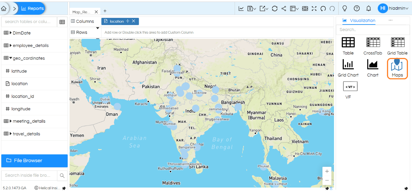
Once done, save the file and restart Helical Insight application. Once token is configured, you will be able to see the layers in Map visualization like below:
1. Create map based on different criteria:
We can create map either using latitude-longitude, world, country, state or city. In order to create a map, it is not mandatory to have any Measures (aggregated fields with either sum, max, min, count, avg etc. applied).
We can simply drag a dimension field into either Columns or Rows which is having any of this data (latitude-longitude, world, country, state or city). In case if you have latitude-longitude in your data, then you can simply drag latitude into Columns and longitude into Rows in order to generate Maps visualization.
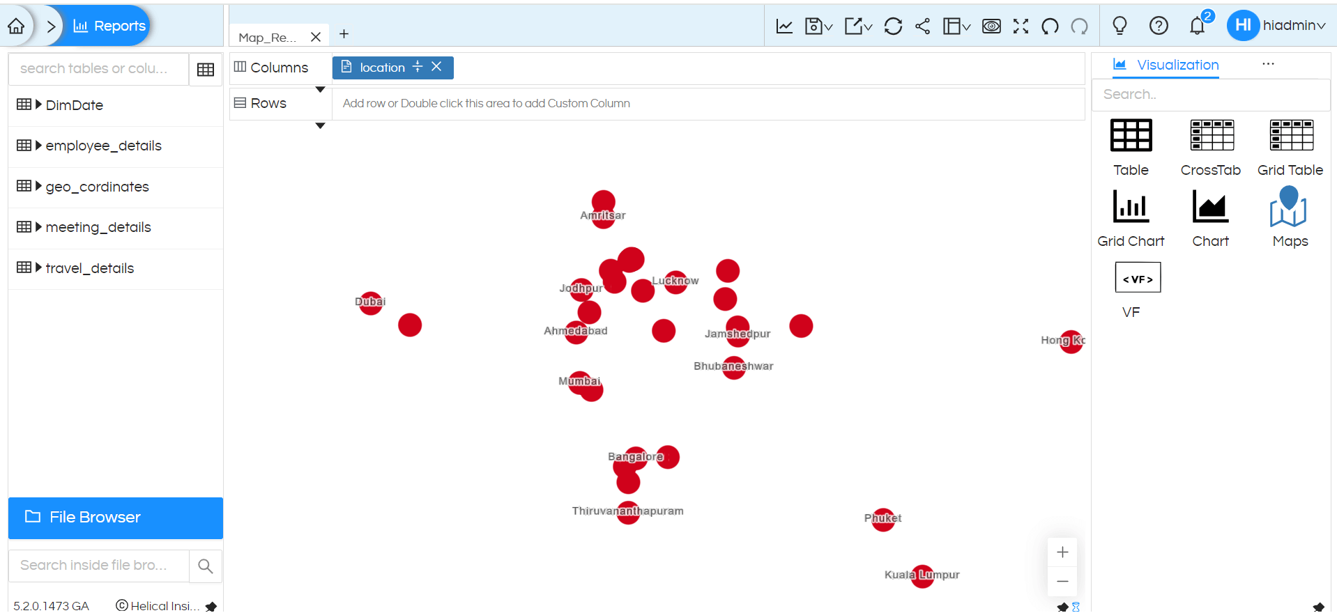
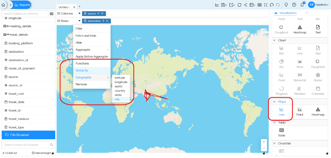
– Creating Map using either country, state or city info:
If we drag a field which has the required information (like world, country, state or city), then click on that field, in the dropdown go to Geographic and select exactly based on the which is present in that specific field. Like in this example the data we have is Country wise information, hence we have selected Country. Then click on the Line or Point or Heatmap under Maps from the Visualization list to generate a map.
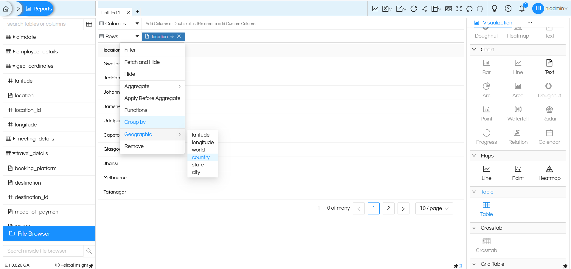
– Creating Map using latitude-longitude:
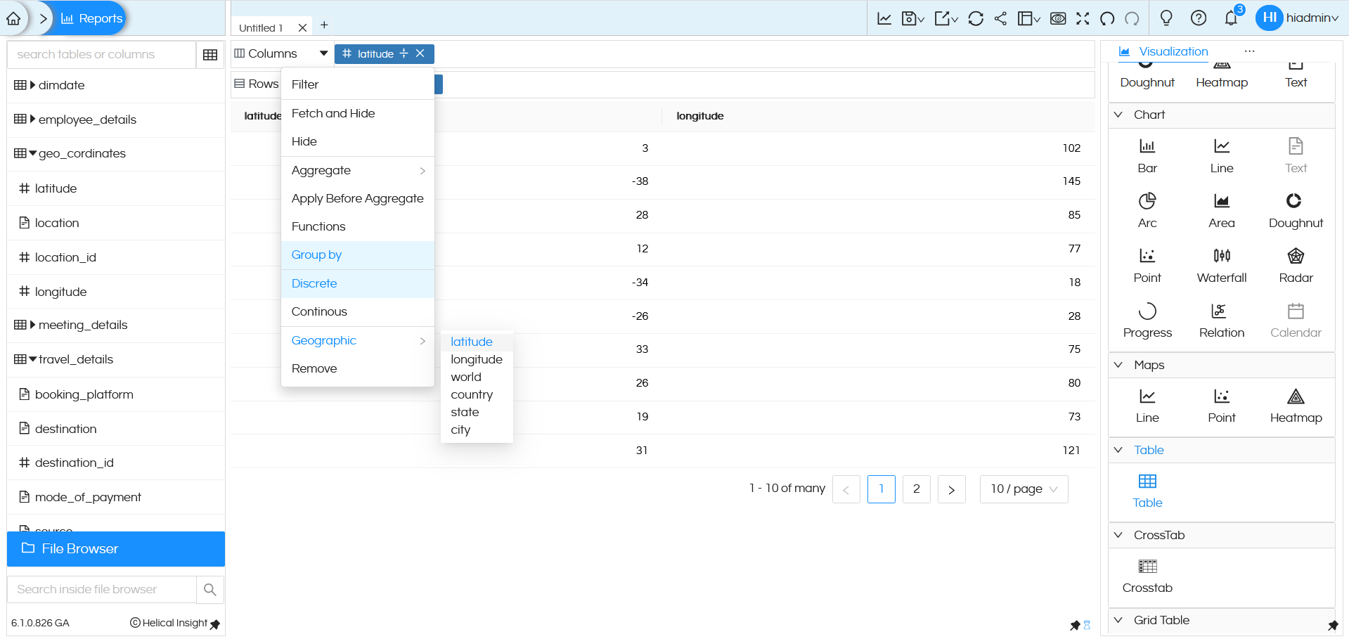
NOTE: Since latitude and longitude are numeric fields, when you drag latitude (into Columns) and longitude (into Rows) by default Helical Insight will apply sum on it. Make sure you remove sum (aggregate) from it and then apply Group By, then make it Discrete. You can apply these functions by clicking on the dragged column, a popup will appear with these options.
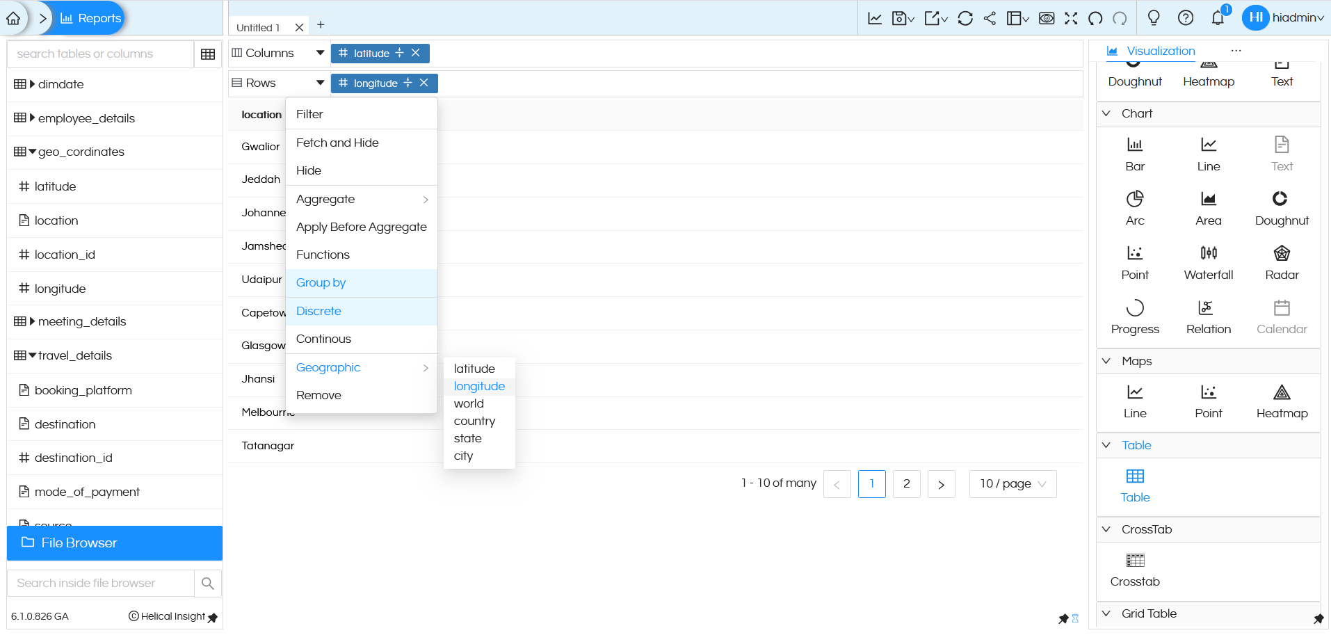
Once this configuration is done, you can click on Line or Point or Heatmap under Maps to generate the map.
Let us look into each of this in more details
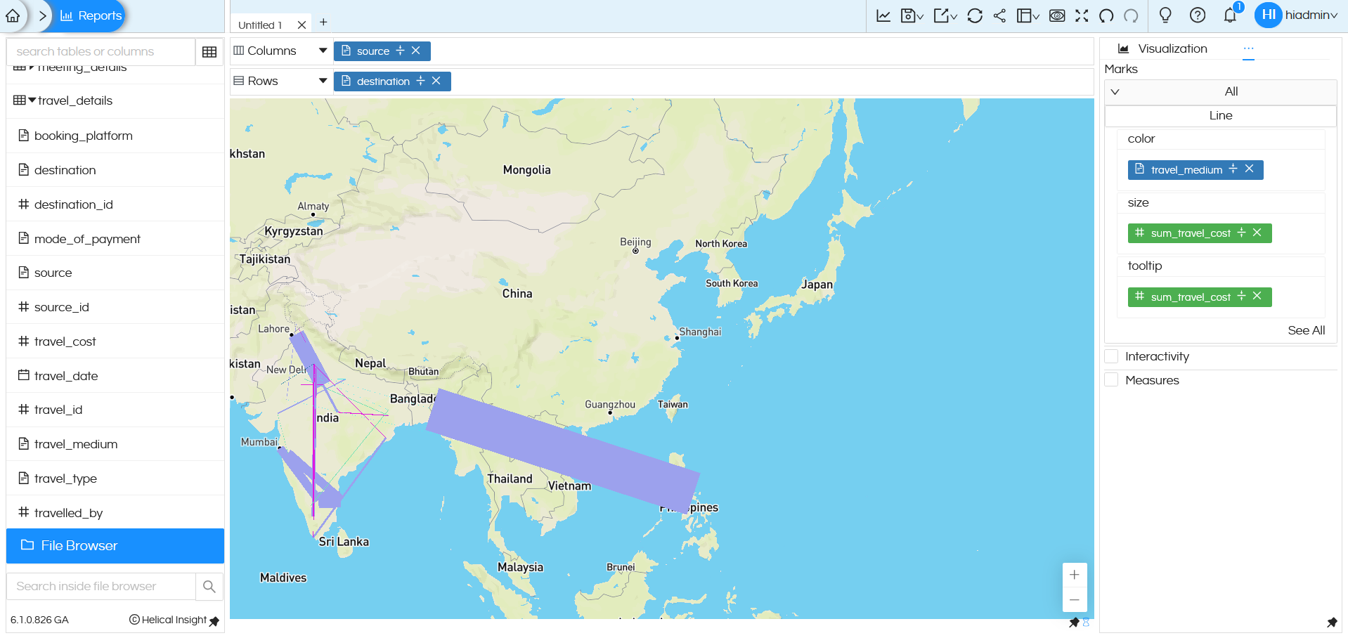
Maps Line:
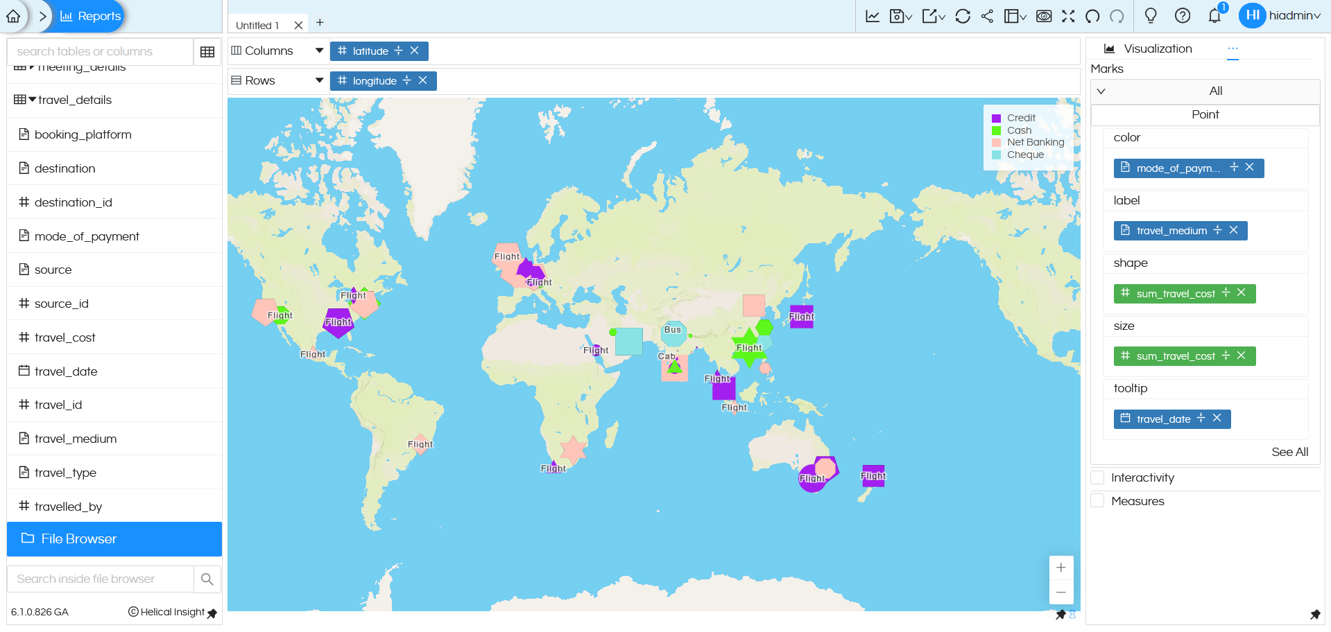
Line will try to joint 2 different coordinates of map. Hence when we are using Line, we ideally should have 2 fields (like Source_City and Destination_City).
In the above image you can see that we have “Source” and “Destination” which are connected by lines. There are additional configuration options available, such as customizing color, size, and tooltip, which are important while using the map feature.
-
Color:
It decides how each line is colored on the map.
In the above example, travel_medium is used for color. So, each travel medium (like flight, train, bus, etc.) is shown in a different color. This makes it easy to quickly identify different travel modes on the map. You can customize the colors based on your preference. Click here to learn more:
-
Size:
It controls the thickness of the lines on the map.
In the above example, we have dragged sum_travel_cost into size.
The thickness of each line depends on the total travel cost.
If the travel cost is high, the line appears thicker; if the travel cost is low, the line appears thinner.
-
Tooltip:
Tooltip shows extra details when you hover over a line on the map.
In the above example, we have dragged sum_travel_cost into tooltip.
When you hover on the line, you see the total travel cost value.
https://www.helicalinsight.com/changing-color-on-a-report-in-helical-insight-5-0/
https://www.helicalinsight.com/color-palette-use-a-custom-color-theme-for-charts/
Maps Point:
Point chart will create individual points based on the latitude/longitude or country/state/city. As shown in the image below, drag the Latitude field to Columns and the Longitude field to Rows. By default these fields will apply sum on it. Make sure you remove sum (aggregate) from it and apply Group By, then make it Discrete. Once this configuration is done, you can click on Point under Maps to generate the map.
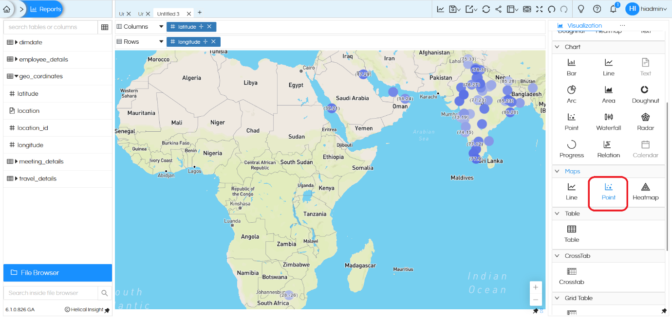
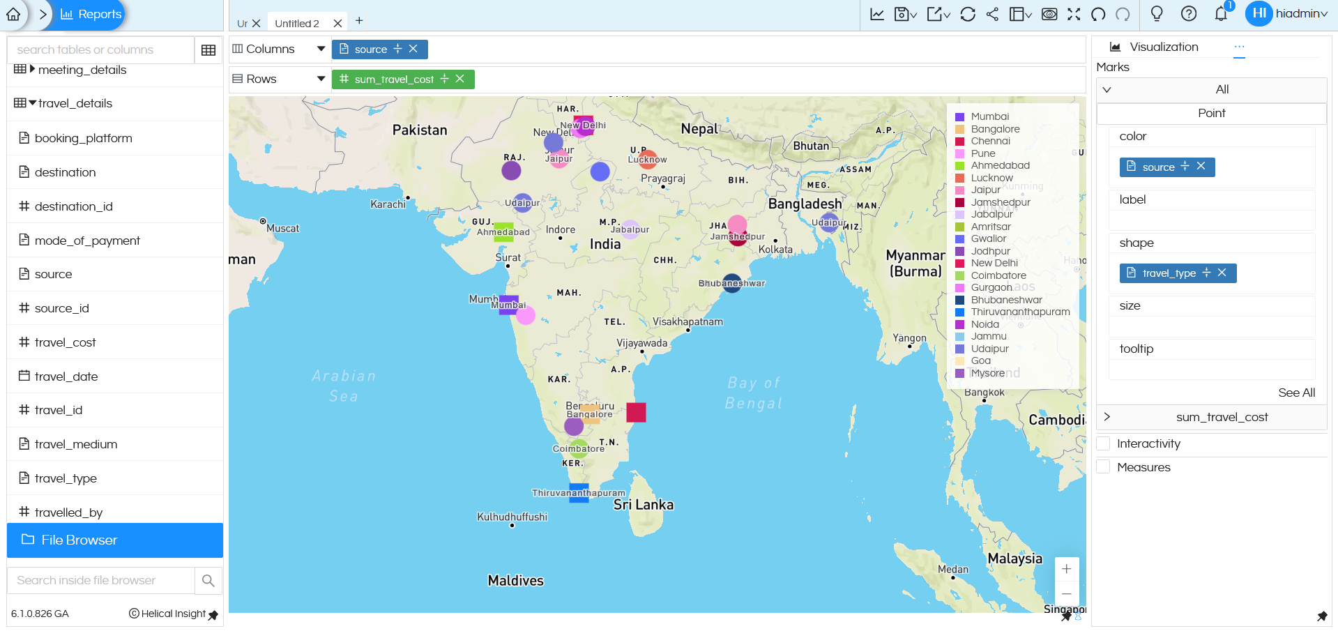
We can do other customizations to the point map using Marks like color, label, shape, size and tooltip.
-
Color:
Color determines the color of each point on the map.
In the above example, color is set to mode_of_payment. Each mode of payment (Credit, Cash, Net Banking etc.) is displayed in a different color. This makes it easy to visually identify payment methods used at different locations.
-
Label:
label controls what text is displayed on each point.
In the above example, label is set to travel_medium. The travel medium (Flight, Bus, Train, etc.) appears as text on the map points. This helps you quickly understand how people traveled from each location.
-
Shape:
shape
controls the symbol used for each point.
In this example, shape is set to sum_travel_cost, so different shapes (like square, circle, triangle etc) are displayed based on the travel cost values.
-
Size:
size controls how large each point appears on the map.
In this example, size is set to sum_travel_cost. Higher travel cost is represented by a larger point, while lower travel cost is shown with a smaller point.
-
Tooltip:
tooltip shows extra details when you hover over a point on the map.
In the above example, travel_date is added to tooltip.
When you hover over a point, you can see the travel date.
Maps Heatmap:
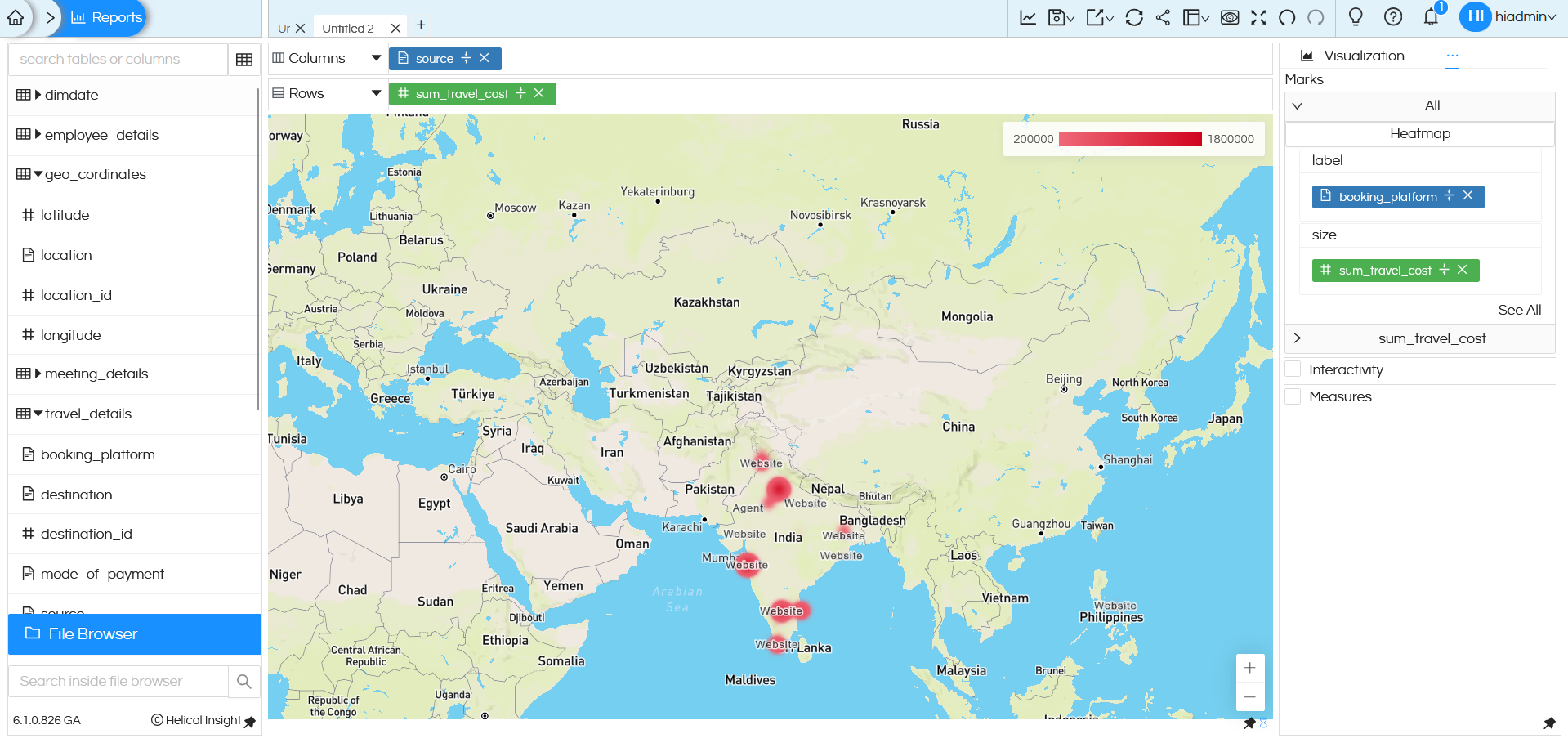
Similarly, Heatmap can be used in which a color gradient can be used to show the value across the map. The color gradient is flexible which can be changed. The same is shown below:
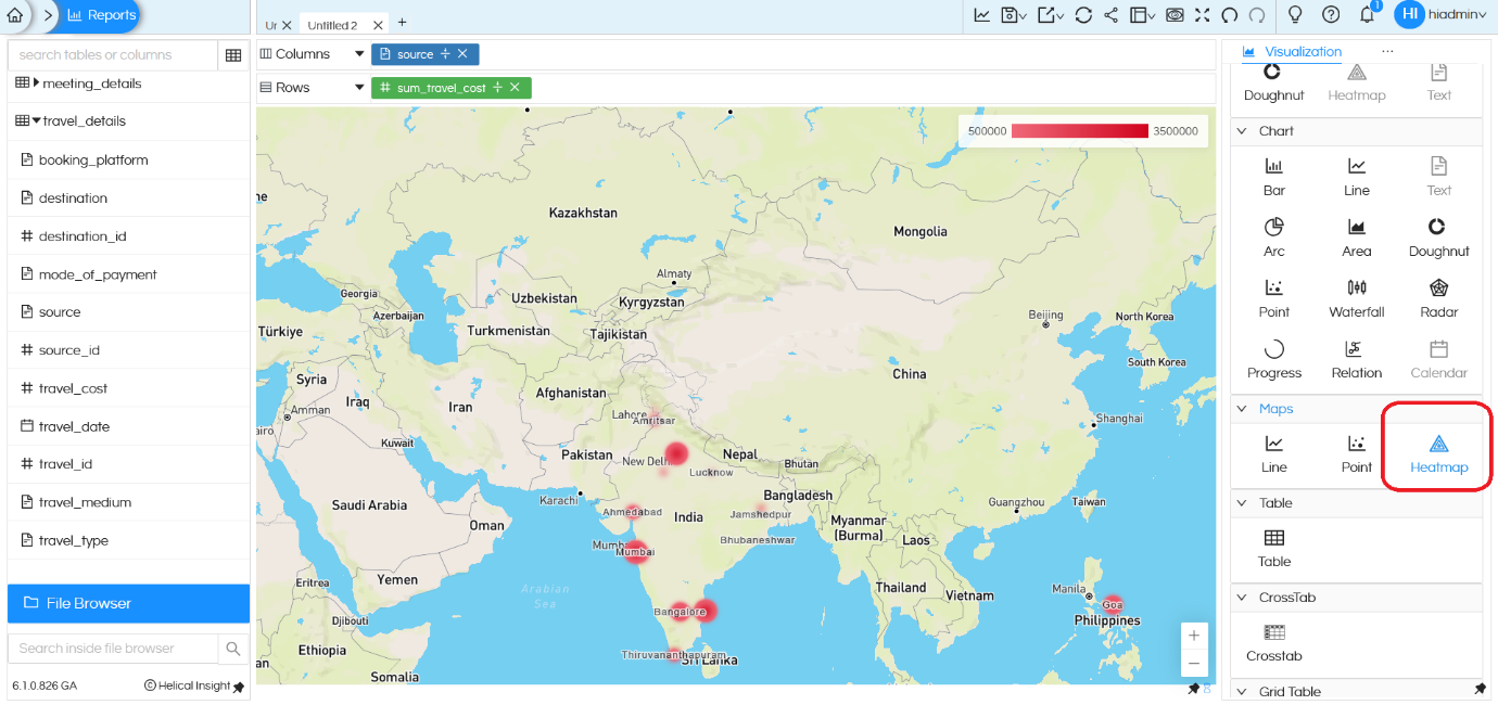
There are additional configuration options available for the Heatmap, such as customizing label and size.
NOTE: Heatmap is not working with OpenStreeMaps, it is only working with Mapbox.
-
Label:
label determines the text displayed on the heatmap points.
In the above example, label is set to booking_platform. The booking platform name appears on the heatmap locations (such as Website, Agent). This helps you understand which platform contributes to the travel cost at each location.
-
Size:
size controls how large each point appears on the map.
In this example, size is set to sum_travel_cost. Points become larger as travel cost increases and smaller as travel cost decreases. This makes it easy to visually compare travel costs across locations.
Apart from the interactivity can be used which can allow to have drill down/Inter panel communication and drill through just like we do it for other charts.
2. Properties of Maps:
In this section, we will learn about how to use Properties of maps.
NOTE: Other generic properties(like Formatting, Cache, Header etc) works as it is on the map and along with that there are few Properties which are specific to Map.
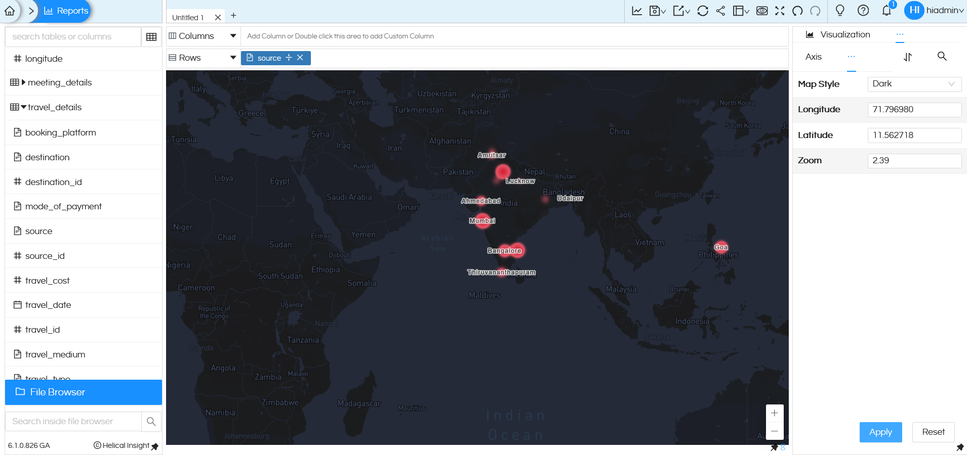
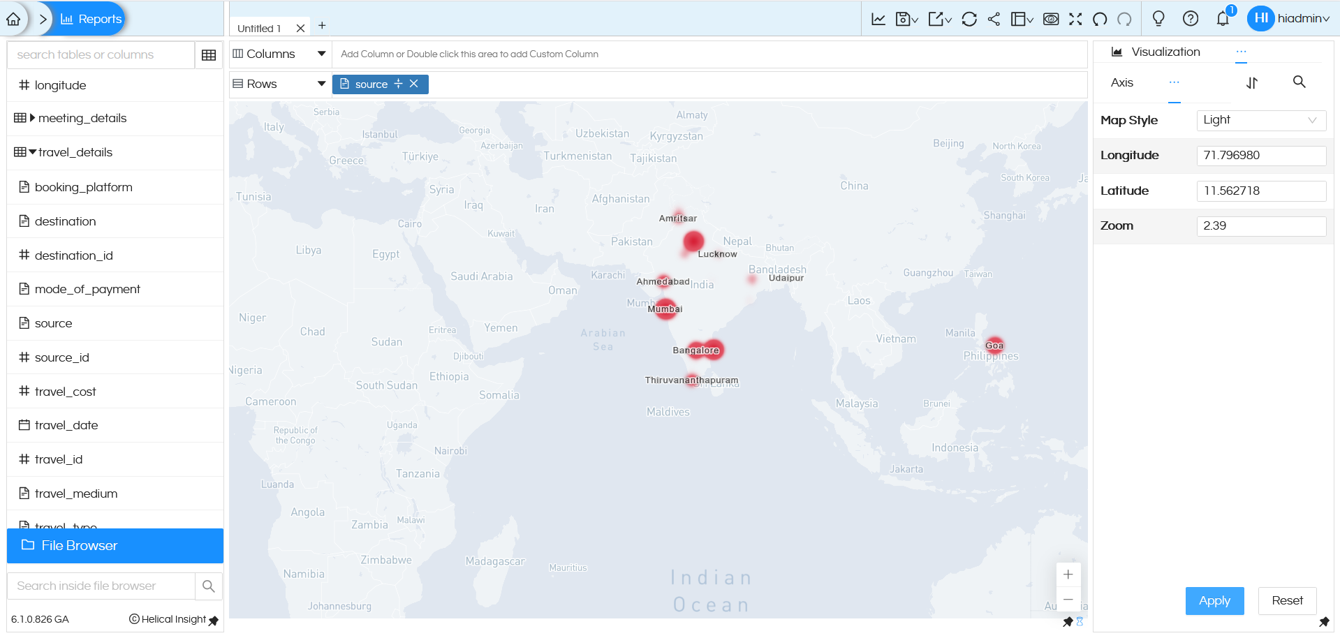
– Map Style ->By default, it is Normal. You can change it to Dark and Light from the drop down.
In Dark mode, it will look like below:
In Light mode, it will look like below:
– Similarly, below properties are present
Latitude: Sets the latitude for the center of map. (latitude range varies from -90 to 90)
Longitude: Sets the longitude for the center of map. (longitude range varies from -180 to 180)
Zoom: Sets the zoom level of the map. (zoom range varies from 0 to 22)
For example, let us assume that zoom value is 3 as default, if you change this Zoom as 1 then it will be zoomed out and if you change this Zoom as 5 then it will be zoom in. Here you can hardcode, in case if you want to set any of these properties dynamically, then Operations functionality has to be used.
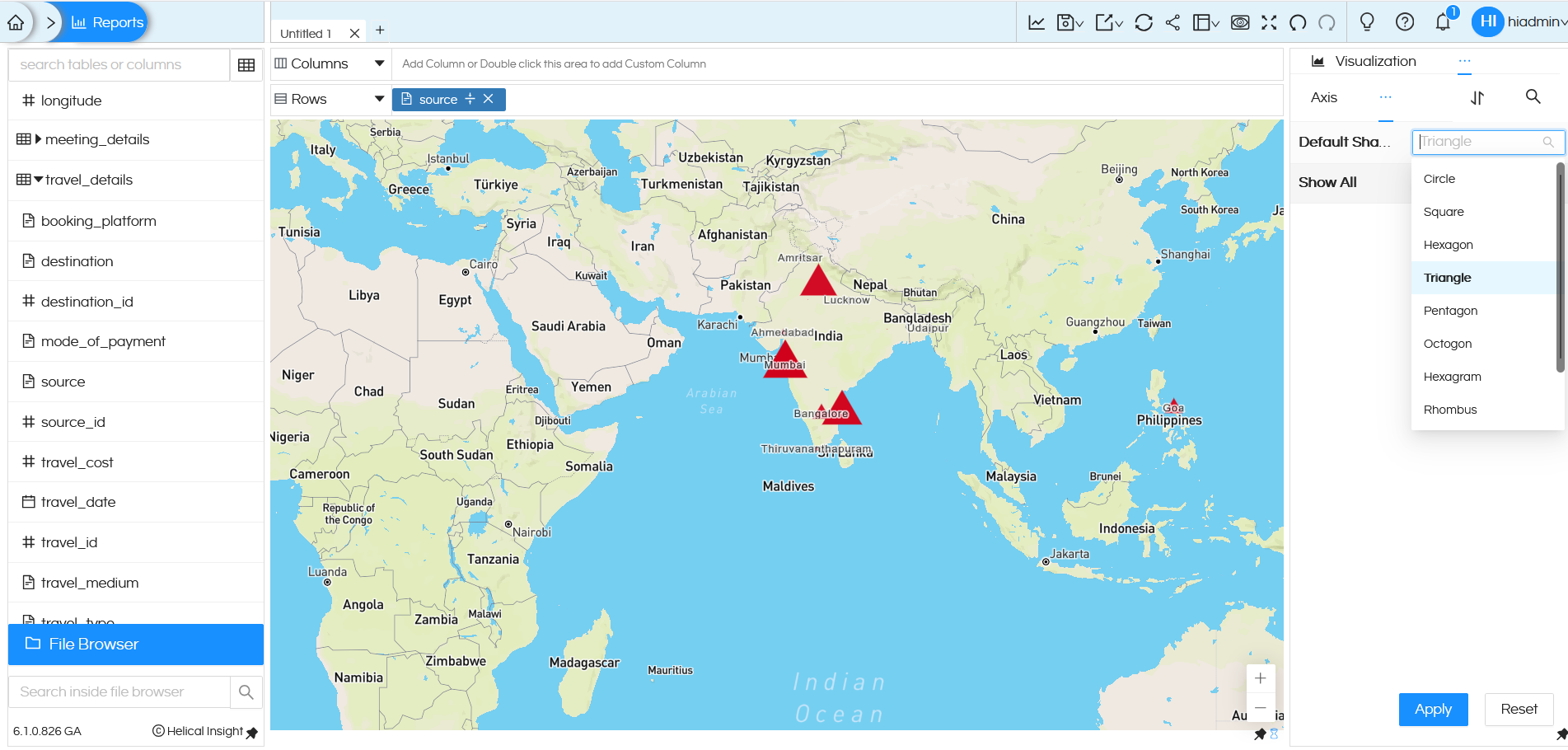
3. Shape Customization
In addition, the Maps includes a property known as Shape, which will be explained in the following section. By default when a map chart is created, the data points is in the shape of circle. But in case if you want to use some other shape then this property can be used. There are many other shape options which are available. Also it is possible to create your own custom shapes also.
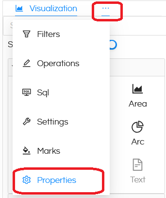
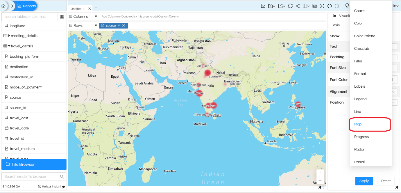
In order to do this go to Properties section by clicking on the three dots next to Visualization. When you are here, click on the three dots next to Axis and select Shape.
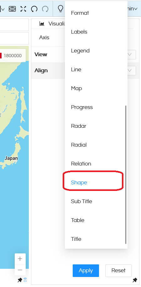
In the shape, there are various options which are present (like Circle, Square, Hexagon, Triangle, Pentagon, Octagon, Hexagram, Rhombus). Based on the value selected, the map can change. For example in the below image we can see that the map is showing data in Triangle.
Adding custom shapes: There could be requirements in which there might be a need to add custom shapes also (apart from the shape which are shown in the above list). In order to do that it is a must that a dimension/measure has already been added in the Shape section of Marks category (as shown below).
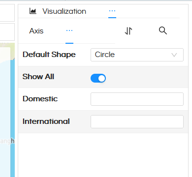
Now in ‘Shape’ property option, when you click on Show All, based on the dimension/measure put, you will get those placeholders (as shown in below image).
Then in those placeholders, you can directly put the image link
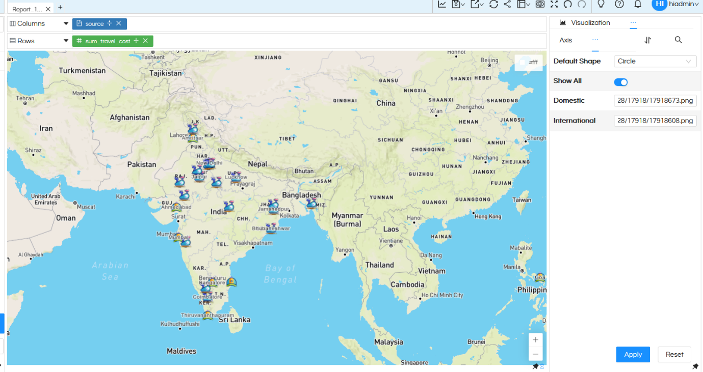
So you can see in the above image, for Domestic and International we have used a custom marker icons with their path directly put in that placeholder and then those icons are getting used while generating the map.
Reach out on support@helicalinsight.com in case of any questions.
