Helical Insight version 5.0 onwards provides Table, Crosstable (also known as Pivot Table), Gridchart (which has got multiple further charting options) as well as Chart. This chart comes with some extensive set of charting options. Let us begin with example. Let us drag the fields bookng_platform and travel_cost to selected list (Columns or Rows: anywhere), generate a report and select Chart from the Visualization panel to the right.
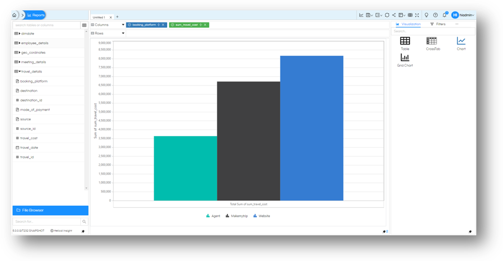
If you click on any of the bars, individual value for that bar will be shown.
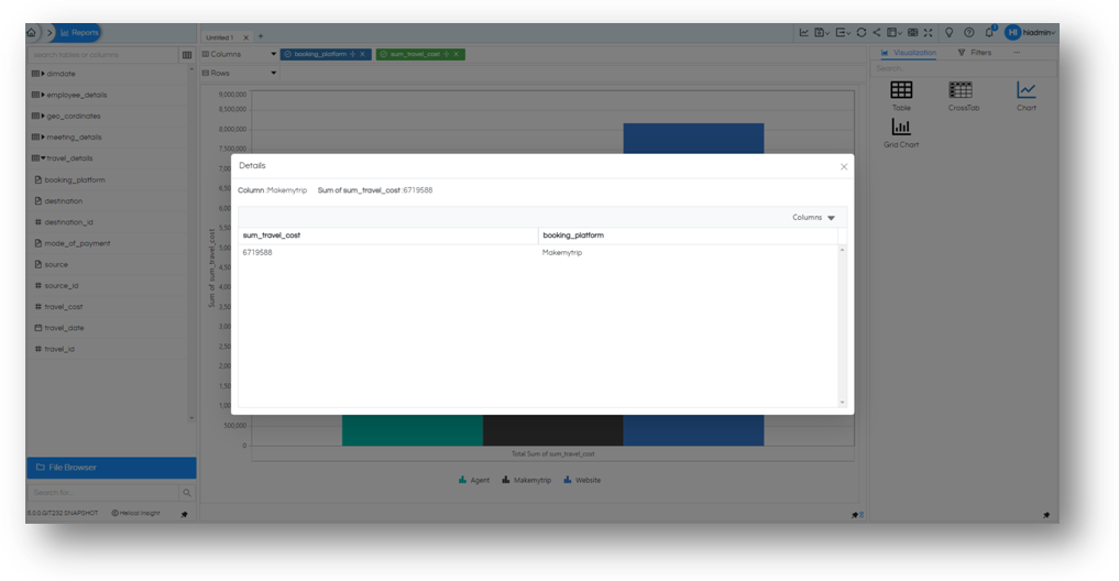
Always Aggregation
By default, the application applies Grouping on all columns all numeric Sum is applied. Let us remove that for now and generate the chart again. You will see that the results are same as before, the three bars one for each value in dimension.

This is because the charts are by default aggregated. Even if we have individual entries from SQL query, the output of the Chart will always be aggregated. Let us click on any single bar this time and see the values from which the chart is prepared. This specific feature is only present in these categories of “Charts” and not other visualization options like Table, Crosstab and Grid Charts.
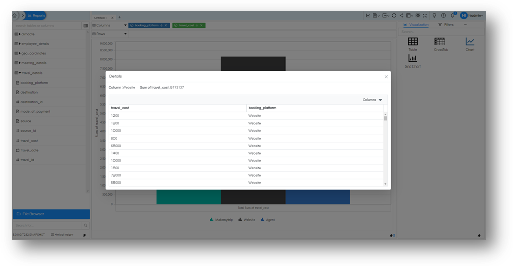
We will notice that we have individual values as generated from SQL query. It is evident that even if we have individual data point the chart will be rendered as an aggregated value. Therefore, unless you plan to drilldown to each granular level it is advised to always provide aggregated SQL query. This will improve system performance and reduce load on database server.
Adding more dimensions
The way we add dimension to either rows or columns decide how the chart will be generated.
Let us add one dimension to the mix, let’s take booking_platform, mode_of_payment and sum of total_cost all in Columns and generate the same Chart again. You will notice that for each combination of dimension there is a single bar. With length equals to the measure of that combination.
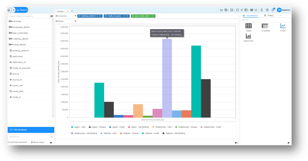
You can click on any one of the bars to see its details (as explained before).
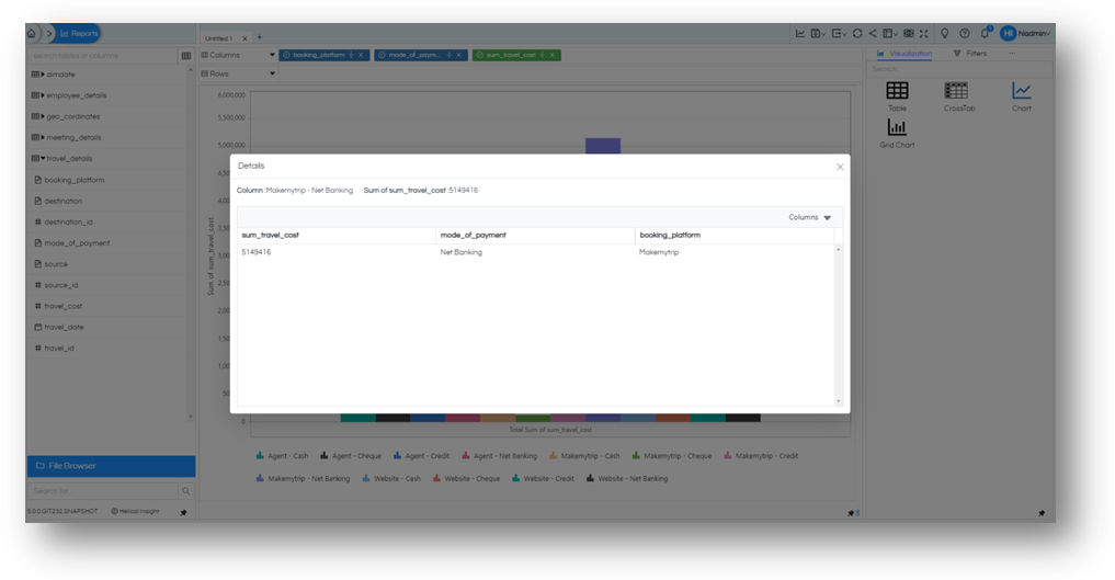
For a change let us do switching of one of the dimensions mode_of_payment to Rows this time and generate the graph again. You will notice how the graph rendering is changed.
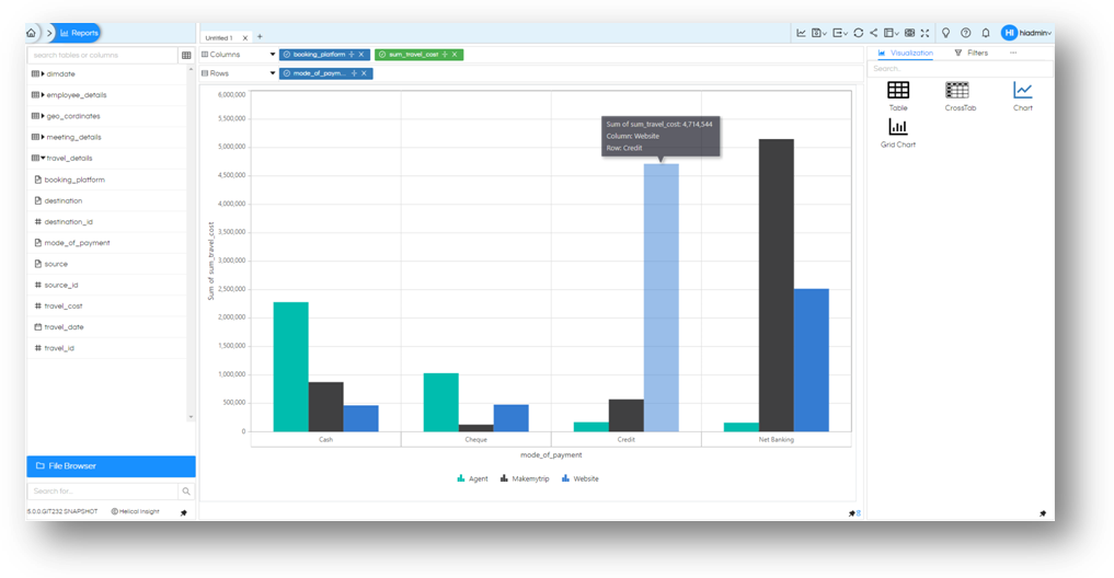
This time we do not have a bar for combination of input but a grouped bar chart. One group chart for each value in Rows. Grouping performed on dimensions used in Columns
Let us go a step further and add two more dimensions to the mix with the same measure. Columns will have booking_platform, mode_of_payment and sum of total_cost. Rows will have cancellation_reason and meeting_purpose. And let us generate the report one more time.
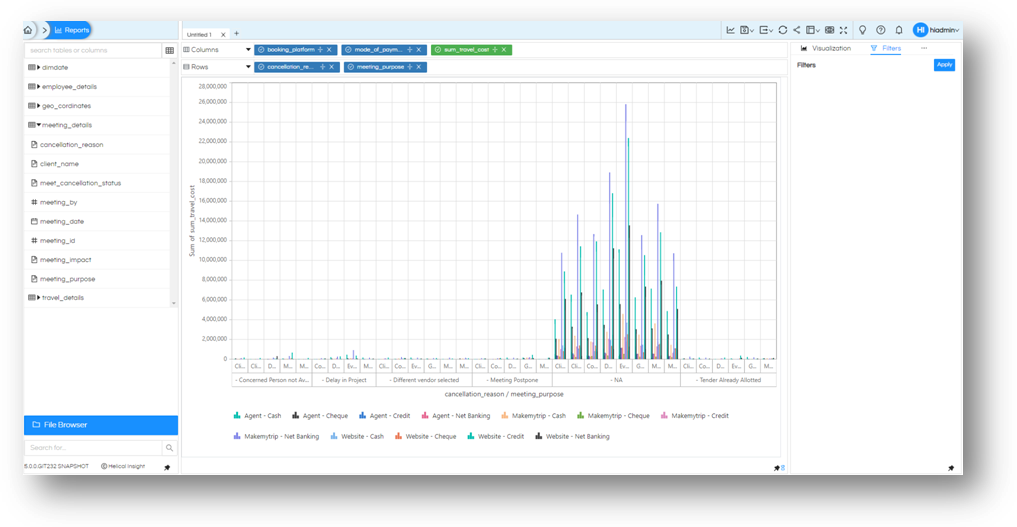
You will notice, that it has generated a individual chart for cancellation_reason. For each of the reason, there is a split on meeting_purpose. These are the two dimensions in rows. Further, for each of the reason and purpose we have a grouped bar chart with combination of values of booking_platform and mode_of_payment.
Thus, a chart will be generated for each value of dimension mentioned in Rows, and grouping will be done on each dimension mentioned in Columns.
Marks
Options for this chart can be seen under ‘Marks’ option on the panel to the right. If not visible, select the meatball icon and select Marks
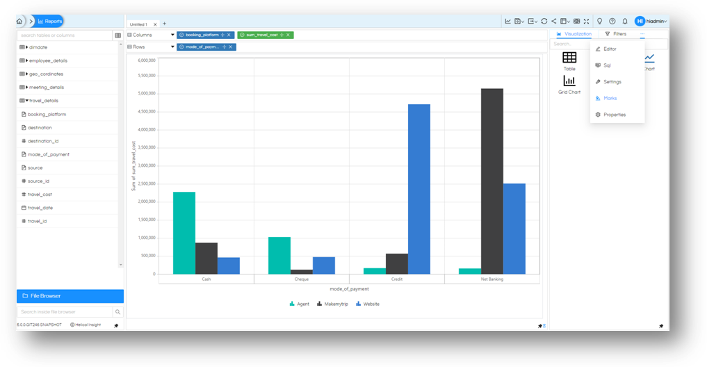
In the Pane expand the ‘All’ Option. You will notice that it shows a ‘Column’ in the value. This is what our chart currently is rendered as.
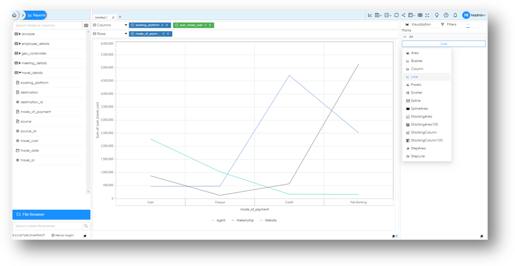
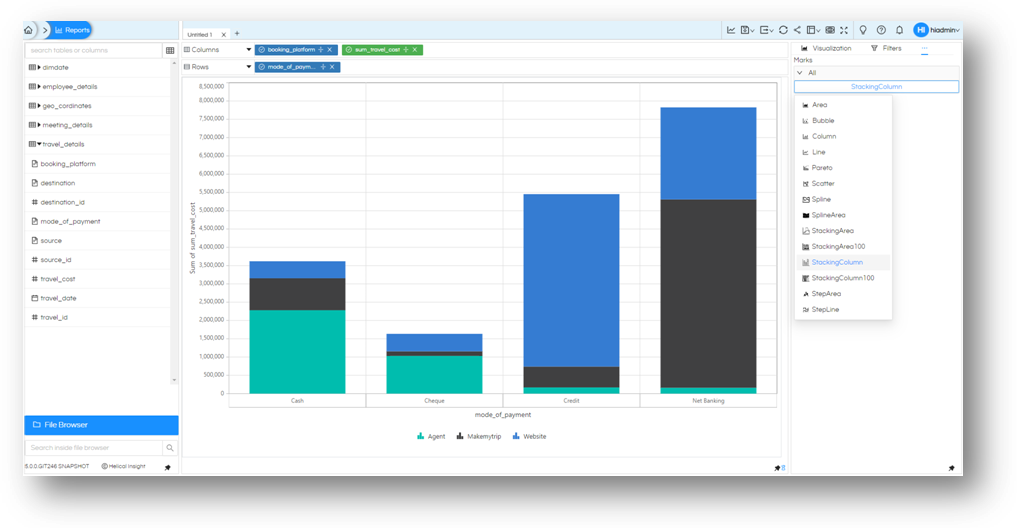
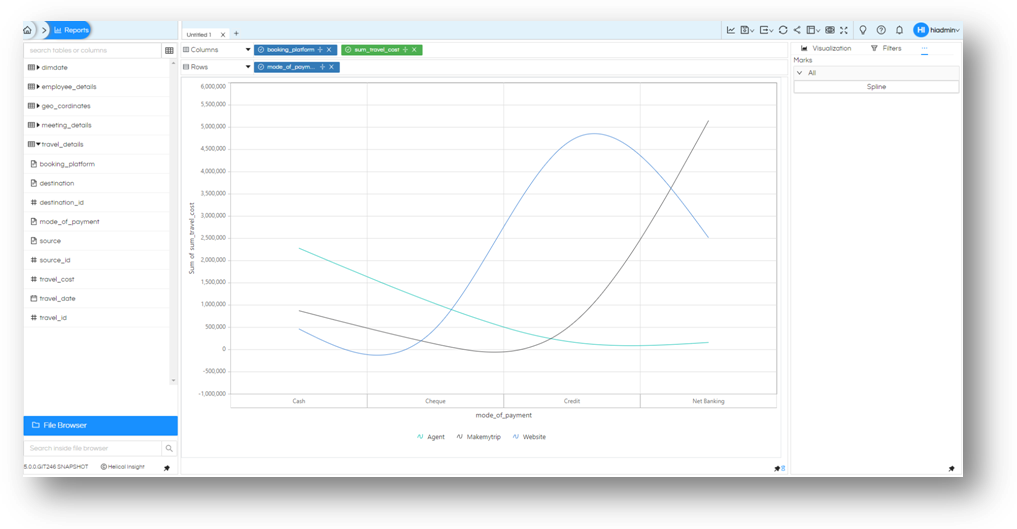
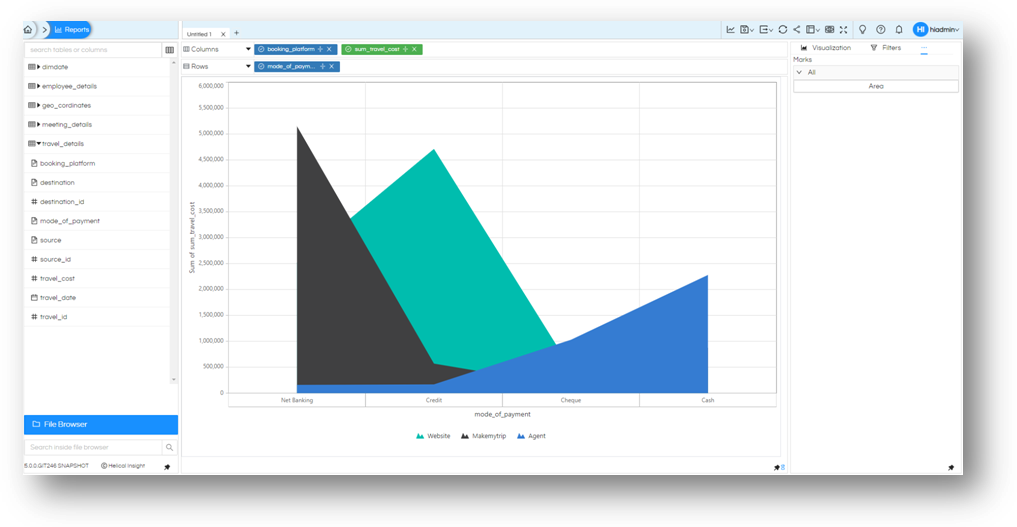
Click on it and it will show you the charts that we can apply. If the current field selection matches the chart, it will be rendered. There are plently of charting options which becomes visible which includes Area, Bubble, Column, Line, Pareto, Scatter, Spline, SplineArea, StackingArea, StackingArea100, StackingColumn, StackingColumn100, StepArea, StepLine.
Below are some of the screenshots for Line, StackingColumn, Spline, Area
- Line
- StackingColumn
- Spline
- Area
Thank You,
Helical Insight
